Project Report
P8105:Final Project Report
Runze Cui (rc3521), Zhengwei Song (zs2539), Shangsi Lin (sl5232), Yunxi Yang (yy3297), Jiahe Deng (jd3924)
Introduction
Motivation
With the spread of COVID-19 enters its third year, the human society seem to have accepted its existence and accepted it as part of our daily lives. However, that doesn’t mean COVID has stopped its harm on the public. with the huge amount of studies on COVID-19 in multiple different disciplines of studies, researchers and scholars have understand its influence more than ever, and agreed on the fact that COVID has disproportionately harmed certain groups of people more than others due to race, economic, or social status.
With interest in investigating more on factors that can influence people’s chances of getting the disease, the builders of this website decided to look specifically into one state of America: California. California is chosen due to its large geographic area, relatively large population size, and relatively modern infrastructures. It is likely that California’s picture during the pandemic can be interpreted as a reference to other regions with high population across the world. Since COVID-19 is a highly transmissible disease to start with, this is ideal knowledge that analysts want to gain insight on.
Initial questions
Our initial questions is how does different factors(e.g. Race, Age, Demographic factor, gender) influence on the hospitalization and disease odds for an individual or social group in the state of California. Particularly, does different sex groups have difference in their vaccination rate? In what parts of California tend to have the highest prevalence of the disease? How does the hospitalization rate differs among each racial group? Are teenagers being considered as a vulnerable group towards the virus, judging based on the data set we have?
Data Source
CHHS
A major part of the data used in this investigation originally came from California Health and Human Service Open Data Portal. This is a website with numerous databases, directly held by the agency of California health and human services, abbreviated as CHHS. California health and human service is the state agency tasked with administration and oversight of “state and federal programs for health care, social services, public assistance and rehabilitation” in the U.S. state of California. The agency is headed by the Secretary of the California Health and Human Services Agency, with headquarters in Sacramento. Many of the laws in the California Health and Safety Codes are enforced by it.
This data portal includes data related to public health activities across the state of California. Most of which is collected at the county level but there are also data sets that contains data at individual level.
The three specific datasets that will be used for this investigation later is listed below, extracted from the site by simply downloading them into the R project:
First data set : This data set focuses at information such as demographic category, total cases, case percentage, death, and report date related to COVID-19 in different counties of the state of California.
Second data set : This data set focuses on the COVID-19 disease information on vaccination status, including variables such as vaccinated cases vs. unvaccinated cases, vaccinated death vs. unvaccinated death.
Third data set: This data set is focused on the hospitalization by county in California. Besides recording the amount of people that are hospitalized, it offers comparison between the hospitalized COVID confirmed patients, and ICU suspected covid patients in the region.
Opendatasoft
In order to present an interactive map to users that contains population infected by time in different counties, analysts referred to geographic coordination data online for each county.
Opendatasoft is a French company that offers data sharing software. Based in Paris, it also has a subsidiary in Boston (United States) and an office in Nantes(France). Opendatasoft has developed a tool for sharing and reusing the data of companies and public administrations. Its software lets people organize, share, and visualize any type of data. The software can be used by both private companies and public entities. The geographic data set this investigation is interested in from Opendatasoft is information about US County Boundaries.
USA.com
This is a website contains data about states, metro areas, counties, cities, zip codes, and area codes information, including population, races, income, housing, etc. In this investigation, data extracted from this website is about county areas in California through this link.
Employment Development Department
Since 1935, the Employment Development Department(EDD) had been connecting with job seekers and employers in an effort to build the economy of Golden State. Mean while it has been collecting data related to employment each month by industry data for California and sub-state areas. One of its data set is current industry employment and unemployment rates for counties, which could produce insightful result through this investigation by connecting data like unemployment rate to the prevalence of disease or hospitalization rate.
Data Cleaning
The data cleaning process is being presented in the index page, you can go to there by clicking on the button at the upper left corner.
Exploratory Analysis
Outcomes by County
Start our exploration of the data set by focusing on two variables of
interest: COVID prevalence and death rate.
These two variables are being hypothesized to have correlation with
other demographic variables such as age, gender, race, unemployment
rate, etc.
Prevalence across county
point <- format_format(big.mark = " ", decimal.mark = ",", scientific = FALSE)

demo_plot = demo %>%
    filter(!county_name %in% "Out of state") %>%
    group_by(county_name, population) %>%
    summarize(total_cases = sum(reported_cases),
              total_deaths = sum(reported_deaths),
              prevalence = total_cases/mean(population)) %>%
    ungroup() %>%
    mutate(county_name = fct_reorder(county_name, prevalence)) %>%
    ggplot(aes(x = county_name, y = prevalence, color = county_name)) +
    geom_point(alpha = 1) +
    theme(
      legend.position = "none"
    ) +
    labs(x = "County",
         y = "Prevalence",
         title = "Prevalence Across County") +
    theme(axis.text.x = element_text(angle = 60, hjust = 1)) +
    scale_y_continuous(labels = point)

ggplotly(demo_plot, width = 800, height = 500)
Until November 2022 (information given by data source), we can observe that the COVID prevalence ranges from as low as 0.094 to nearly 0.386 by county in California, suggesting a roughly 4.1x difference between the minimum and maximum. As a new study from the Centers for Disease Control and Prevention (CDC) revealed, the percentage of Americans who have been infected with COVID-19 is approximately 30% in November 2022. Taking the prevalence of 30% as the baseline for further comparisons, it is worth noticing that around 80% of counties in California have a moderate level of prevalence falling between around 16% to 29%, and around 10% of counties show a quite low prevalence below 15%. Only 6 out of 58 counties in California shows prevalence of above 30%. The COVID infection in California seems relatively controllable to a large extent compared to the general prevalence level across the United States. As for the prevalence differences, it may be caused by some other differentiable factors across counties, and we would like to further discuss about it in later parts.
Death Rate across County
point <- format_format(big.mark = " ", decimal.mark = ",", scientific = FALSE)

demo_plot_1 = demo %>%
    filter(!county_name %in% "Out of state") %>%
    group_by(county_name) %>%
    summarize(total_cases = sum(reported_cases),
              total_deaths = sum(reported_deaths),
              death_rate = total_deaths / total_cases) %>%
    mutate(county_name = fct_reorder(county_name, death_rate)) %>%
    ggplot(aes(x = county_name, y = death_rate, color = county_name)) +
    geom_point(alpha = 1) +
    theme(
      legend.position = "none"
    ) +
    labs(x = "County",
         y = "Death Rate",
         title = "Death Rate Across County") +
    theme(axis.text.x = element_text(angle = 60, hjust = 1)) +
    scale_y_continuous(labels = point)

ggplotly(demo_plot_1, width = 800, height = 500)
We can observe that the death rates range from as low as 0.00% to 1.76% by county in California. The density graph suggests a quite centralized distribution of death rates across counties, that most counties’ death rates fall between 0.25% to 1.25%. As for the minimum value from this data set, there is so far no recorded death so as 0% death rate in Alpine. As for the maximum, Siskiyou’s recorded death rate is 1.76% in November 2022, which is a little bit higher than the average country-wide death rate of 1.09% (data reported by John Hopkins University’s Coronavirus Resource Center). Considering the difference shown in death rates across counties, we will investigate the associations between this outcome variable and other potential factors in the following section.
2. Worst & Best conuties for outcomes
Worst counties for each COVID outcome
Furthermore, we zoom in on the pandemic responses and extract the 10 worst COVID outcome results, i.e. highest prevalence and highest death rates, in corresponding counties, and plot them as bar charts for a more straightforward visualization.
demo_worst_1 =
    demo %>%
    filter(!county_name %in% "Out of state") %>%
    group_by(county_name, population) %>%
    summarize(total_cases = sum(reported_cases),
              total_deaths = sum(reported_deaths),
              prevalence = total_cases/mean(population)) %>%
    select(county_name, prevalence) %>%
    arrange(desc(prevalence)) %>%
    head(10)

demo_worst_2 =
    demo %>%
    filter(!county_name %in% "Out of state") %>%
    group_by(county_name, population) %>%
    summarize(total_cases = sum(reported_cases),
              total_deaths = sum(reported_deaths),
              death_rates = total_deaths/total_cases) %>%
    select(county_name, death_rates) %>%
    arrange(desc(death_rates)) %>%
    head(10)

cbind(demo_worst_1, demo_worst_2) %>%
    knitr::kable(digits = 4,
                 caption = "Worst counties for each COVID outcome",
col.names = c("County for Prevalence", "Prevelence", "County for Death Rate", "Death Rate"))| County for Prevalence | Prevelence | County for Death Rate | Death Rate |
|---|---|---|---|
| Kings | 0.3864 | Siskiyou | 0.0176 |
| Imperial | 0.3483 | Shasta | 0.0168 |
| Lassen | 0.3356 | Sierra | 0.0162 |
| Los Angeles | 0.3249 | Calaveras | 0.0156 |
| San Bernardino | 0.3065 | Tehama | 0.0156 |
| Tuolumne | 0.3034 | Trinity | 0.0147 |
| Riverside | 0.2853 | Imperial | 0.0144 |
| San Diego | 0.2785 | Inyo | 0.0132 |
| Madera | 0.2780 | Tuolumne | 0.0130 |
| Del Norte | 0.2722 | Stanislaus | 0.0128 |
demo_worst_pre_plot =
    demo_worst_1 %>%
    mutate(county_name = fct_reorder(county_name, prevalence)) %>%
    ggplot(aes(x = reorder(county_name, prevalence, decreasing = T), y = prevalence, fill = county_name)) +
    geom_bar(stat = "identity", width = 0.5) +
    theme(
      legend.position = "none"
    ) +
    labs(x = '',
         y = "Prevalence",
         title = "Worst Prevalence") +
    theme(legend.title = element_text(size = 5),
          legend.key.size = unit(0.3, 'cm'),
          legend.text = element_text(size = 4)) +
    theme(axis.text.x = element_text(angle = 60, hjust = 1)) +
    theme(
          axis.title.x = element_text(size = 6),
          axis.text.x = element_text(size = 5),
          axis.title.y = element_text(size = 6),
          axis.text.y = element_text(size = 5)) +
          scale_y_continuous(labels = point)

demo_worst_dea_plot =
    demo_worst_2 %>%
    mutate(county_name = fct_reorder(county_name, death_rates)) %>%
    ggplot(aes(x = reorder(county_name, death_rates, decreasing = T), y = death_rates, fill = county_name)) +
    geom_bar(stat = "identity", width = 0.5) +
    theme(
      legend.position = "none"
    ) +
    labs(x = '',
         y = "Death Rate",
         title = "Worst Death Rate") +
    theme(legend.title = element_text(size = 5),
          legend.key.size = unit(0.3, 'cm'),
          legend.text = element_text(size = 4)) +
    theme(axis.text.x = element_text(angle = 60, hjust = 1)) +
    theme(
          axis.title.x = element_text(size = 6),
          axis.text.x = element_text(size = 5),
          axis.title.y = element_text(size = 6),
          axis.text.y = element_text(size = 5)) +
          scale_y_continuous(labels = point)

demo_worst_pre_plot + demo_worst_dea_plot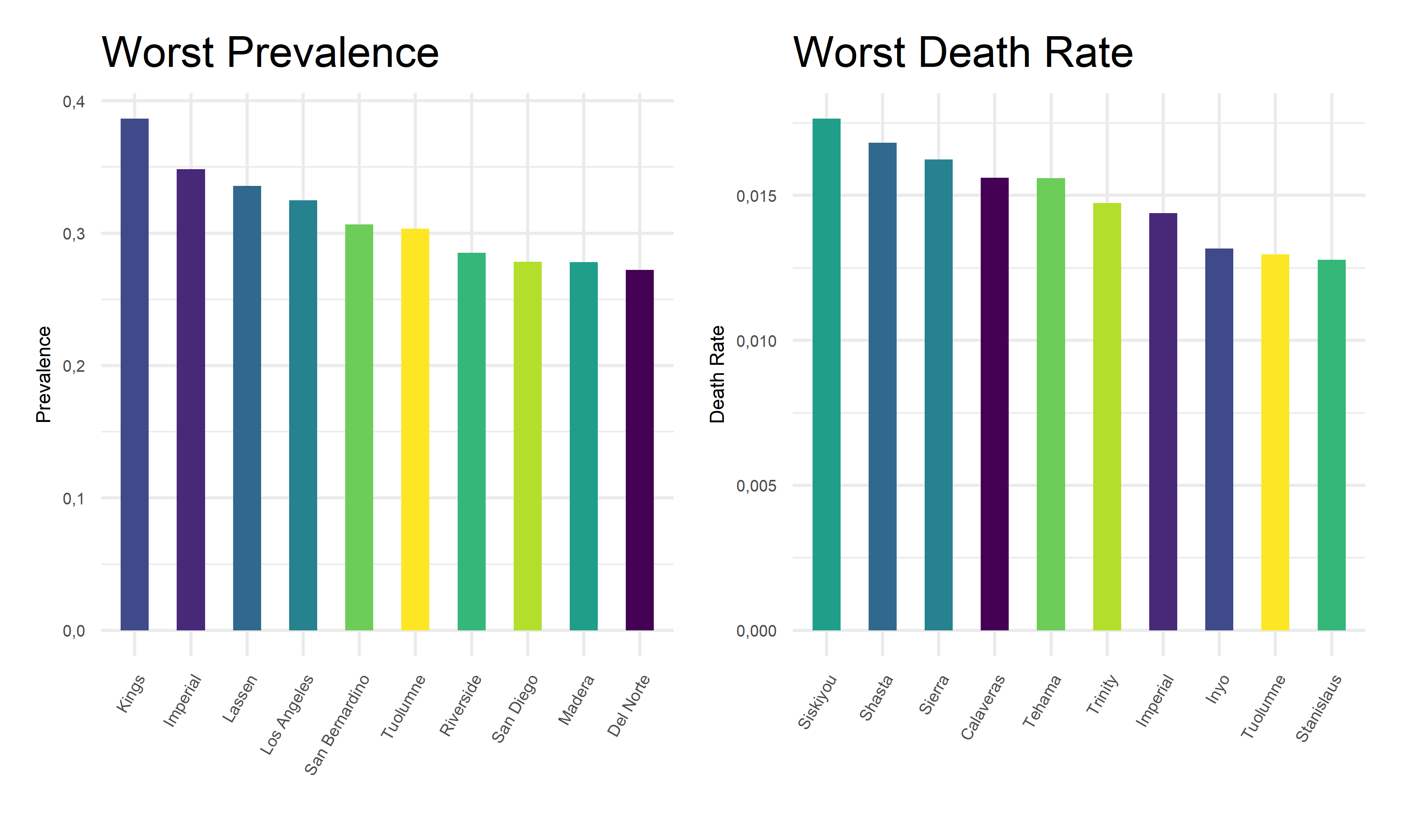
Best counties for each COVID outcome
Also, we extract the 10 best covid outcome results, i.e. lowest prevalence and lowest death rates, in corresponding counties.
demo_best_1 =
    demo %>%
    filter(!county_name %in% "Out of state") %>%
    group_by(county_name, population) %>%
    summarize(total_cases = sum(reported_cases),
              total_deaths = sum(reported_deaths),
              prevalence = total_cases/mean(population)) %>%
    select(county_name, prevalence) %>%
    arrange(prevalence) %>%
    head(10)

demo_best_2 =
    demo %>%
    filter(!county_name %in% "Out of state") %>%
    group_by(county_name, population) %>%
    summarize(total_cases = sum(reported_cases),
              total_deaths = sum(reported_deaths),
              death_rates = total_deaths/total_cases) %>%
    select(county_name, death_rates) %>%
    arrange(death_rates) %>%
    head(10)

cbind(demo_best_1, demo_best_2) %>%
    knitr::kable(digits = 4,
                 caption = "Best counties for each COVID outcome",
col.names = c("County for Prevalence", "Prevelence", "County for Death Rate", "Death Rate"))| County for Prevalence | Prevelence | County for Death Rate | Death Rate |
|---|---|---|---|
| Modoc | 0.0945 | Alpine | 0.0000 |
| Sierra | 0.0989 | Mono | 0.0025 |
| Trinity | 0.1067 | Plumas | 0.0035 |
| Siskiyou | 0.1225 | Santa Cruz | 0.0042 |
| Alpine | 0.1235 | San Mateo | 0.0043 |
| Humboldt | 0.1667 | Solano | 0.0044 |
| Colusa | 0.1700 | Sonoma | 0.0049 |
| El Dorado | 0.1712 | Napa | 0.0049 |
| Mariposa | 0.1774 | Colusa | 0.0057 |
| Marin | 0.1775 | Alameda | 0.0058 |
demo_best_pre_plot =
    demo_best_1 %>%
    mutate(county_name = fct_reorder(county_name, prevalence)) %>%
    ggplot(aes(x = reorder(county_name, prevalence, decreasing = F), y = prevalence, fill = county_name)) +
    geom_bar(stat = "identity", width = 0.5) +
    theme(
      legend.position = "none"
    ) +
    labs(x = '',
         y = "Prevalence",
         title = "Best Prevalence") +
    theme(legend.title = element_text(size = 5),
          legend.key.size = unit(0.3, 'cm'),
          legend.text = element_text(size = 4)) +
    theme(axis.text.x = element_text(angle = 60, hjust = 1)) +
    theme(
          axis.title.x = element_text(size = 6),
          axis.text.x = element_text(size = 5),
          axis.title.y = element_text(size = 6),
          axis.text.y = element_text(size = 5)) +
          scale_y_continuous(labels = point)

demo_best_dea_plot =
    demo_best_2 %>%
    mutate(county_name = fct_reorder(county_name, death_rates)) %>%
    ggplot(aes(x = reorder(county_name, death_rates, decreasing = F), y = death_rates, fill = county_name)) +
    geom_bar(stat = "identity", width = 0.5) +
    theme(
      legend.position = "none"
    ) +
     labs(x = '',
         y = "Death Rate",
         title = "Best Death Rate") +
    theme(legend.title = element_text(size = 5),
          legend.key.size = unit(0.3, 'cm'),
          legend.text = element_text(size = 4)) +
    theme(axis.text.x = element_text(angle = 60, hjust = 1)) +
    theme(
          axis.title.x = element_text(size = 6),
          axis.text.x = element_text(size = 5),
          axis.title.y = element_text(size = 6),
          axis.text.y = element_text(size = 5)) +
          scale_y_continuous(labels = point)

demo_best_pre_plot + demo_best_dea_plot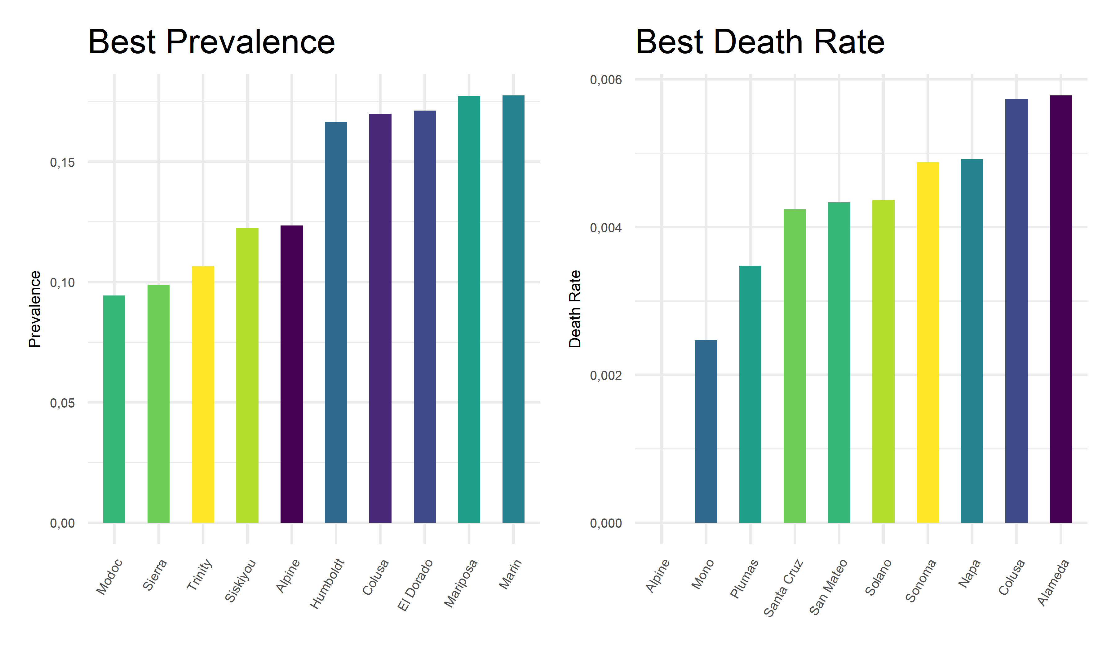
From the above tables and bar charts, Kings County responses to COVID with highest prevalence of 38.64%, and Siskiyou responses to covid with highest death rate of 1.76%. In comparison, Modoc has the lowest prevalence of 9.45% in California, and Alpine has no recorded death until November 2022. Upon observations, two out of ten counties with top prevalence, Imperial and Tuolumne, also have top death rates. And two out of ten counties with lowest prevalence, Alpine and Colusa, also have lowest death rates. While to be highlighted here, Siskiyou County has one of the lowest prevalence but the highest death rate among all counties. This preliminary observation indicates that it is hard to obtain an apparent relationship between the prevalence and death rates. Further steps are required to take in order to explore the associations and correlations between our two outcome variables, COVID prevalence and death rates.
Associations between outcomes across county
To find out the associations between two outcomes across counties, we decide to use bubble chart to visualize relationships between three numeric variables, death rates, prevalence proportion, and the population size for each county.
 demo_asso =
    demo %>%
    filter(!county_name %in% "Out of state") %>%
    group_by(county_name, population) %>%
    summarize(total_cases = sum(reported_cases),
              total_deaths = sum(reported_deaths),
              prevalence = total_cases/mean(population),
              death_rates = total_deaths/total_cases) %>%
    ggplot(aes(x = prevalence, y = death_rates)) +
      geom_point(aes(color = county_name, size = population)) +
      geom_smooth(method = lm, se = FALSE, color = "red", size = 0.4, aes(weight = population)) +
      labs(
        x = "Prevalence",
        y = "Death Rate",
        size = "Population",
        col = "County",
        title = "Associations Between Outcomes Across County"
      ) +
        theme(legend.title = element_text(size = 5),
          legend.key.size = unit(0.3, 'cm'),
          legend.text = element_text(size = 4)) +
    theme(axis.text.x = element_text(angle = 60, hjust = 1)) +
    theme(
          axis.title.x = element_text(size = 6),
          axis.text.x = element_text(size = 5),
          axis.title.y = element_text(size = 6),
          axis.text.y = element_text(size = 5))

ggplotly(demo_asso, width = 800, height = 500)
As we plotted, the values for each bubble are encoded by its horizontal position on the x-axis of prevalence, its vertical position on the y-axis of death rates, and the size of the bubble depends on the population size. The color of each bubble represent different counties in California to provide a visual sense.
On one hand, there is a positive best-fit trend line drawn on this plot which indicates a positive relationship between prevalence and death rates across counties, although this relationship is considerably weak. On the other hand, as the values on the horizontal and vertical scale decreases, we can only observe small bubbles on the bottom-left corners. And as the values on the horizontal or vertical scale increases, relatively large bubbles start to appear. To add on, the largest bubble of Los Angeles located on the top-right corner on this graph, indicating its relatively high prevalence and high death rate. These two perspective of findings may coincide with each other, suggesting a positive but weak relationship between outcomes across county.
Outcome by Demographic
Total cases : Daily growth rate of total cases by age
age_17 =
  age %>%
  filter(age_group == "0-17") %>%
  arrange(date) %>%
  mutate(lag = lag(total_cases)) %>%
  mutate(growth_perc = (((total_cases - lag) / total_cases)) * 100) %>%
  select(date, age_group, growth_perc)


age_49 =
  age %>%
  filter(age_group == "18-49") %>%
  arrange(date) %>%
  mutate(lag = lag(total_cases)) %>%
  mutate(growth_perc = (((total_cases - lag) / total_cases)) * 100) %>%
  select(date, age_group, growth_perc)


age_64 =
  age %>%
  filter(age_group == "50-64") %>%
  arrange(date) %>%
  mutate(lag = lag(total_cases)) %>%
  mutate(growth_perc = (((total_cases - lag) / total_cases)) * 100) %>%
  select(date, age_group, growth_perc)


age_65 =
  age %>%
  filter(age_group == "65+") %>%
  arrange(date) %>%
  mutate(lag = lag(total_cases)) %>%
  mutate(growth_perc = (((total_cases - lag) / total_cases)) * 100) %>%
  select(date, age_group, growth_perc)


age_all =
    rbind(age_17, age_49, age_64, age_65) %>%
    filter(date != "2020-04-22")
age_all_1 =
rbind(age_17, age_49, age_64, age_65) %>%
arrange(growth_perc) %>%
select(date, age_group, growth_perc) %>%
filter(date != "2020-12-23")
age_all_2 =
cbind(age_all, age_all_1)
head(age_all_2) %>%
knitr::kable(
caption = "Highest & Lowest Total Cases Growth Rate by Age",
col.names = c("Date", "Age", "Growth rate", "Date", "Age", "Growth rate"),
digits = 2
)| Date | Age | Growth rate | Date | Age | Growth rate |
|---|---|---|---|---|---|
| 2020-04-23 | 0-17 | 8.65 | 2021-06-29 | 65+ | -0.17 |
| 2020-04-24 | 0-17 | 7.42 | 2021-06-29 | 50-64 | -0.13 |
| 2020-04-25 | 0-17 | 2.69 | 2021-06-29 | 18-49 | -0.11 |
| 2020-04-26 | 0-17 | 4.24 | 2021-06-29 | 0-17 | -0.10 |
| 2020-04-27 | 0-17 | 8.82 | 2021-04-23 | 65+ | -0.01 |
| 2020-04-28 | 0-17 | 5.78 | 2020-12-30 | 0-17 | 0.00 |
Total Cases; Daily growth rate of total cases by gender
gender_M =
  gender %>%
  filter(gender == "Male") %>%
  arrange(date) %>%
  mutate(lag = lag(total_cases)) %>%
  mutate(growth_perc = (((total_cases - lag) / total_cases)) * 100) %>%
    select(date, gender, growth_perc)

gender_F =
  gender %>%
  filter(gender == "Female") %>%
  arrange(date) %>%
  mutate(lag = lag(total_cases)) %>%
  mutate(growth_perc = (((total_cases - lag) / total_cases)) * 100) %>%
  select(date, gender, growth_perc)

gender_all =
    rbind(gender_M, gender_F) %>%
    arrange(desc(growth_perc)) %>%
    select(date, gender, growth_perc)
gender_all_1 =
    rbind(gender_M, gender_F) %>%
    arrange(growth_perc) %>%
    select(date, gender, growth_perc)

gender_all_2 =
    cbind(gender_all, gender_all_1)
head(gender_all_2) %>%
    knitr::kable(
    caption = "Highest & Lowest Total Cases Growth Rate by Gender",
    col.names = c("Date", "Gender", "Growth rate", "Date", "Gender", "Growth rate"),
    digits = 2
)| Date | Gender | Growth rate | Date | Gender | Growth rate |
|---|---|---|---|---|---|
| 2020-04-29 | Male | 5.44 | 2021-06-29 | Male | -0.12 |
| 2022-01-09 | Female | 5.31 | 2021-06-29 | Female | -0.11 |
| 2020-04-23 | Female | 5.15 | 2020-12-23 | Male | 0.00 |
| 2020-04-24 | Female | 4.91 | 2020-12-30 | Male | 0.00 |
| 2022-01-09 | Male | 4.89 | 2020-12-23 | Female | 0.00 |
| 2022-01-16 | Female | 4.80 | 2020-12-30 | Female | 0.00 |
Total cases: Daily growth rate of total cases by race
race_ia =
    race %>%
    mutate(race_group = fct_reorder(race_group, total_cases)) %>%
    mutate(race_group = recode(race_group, "American Indian or Alaska Native" = "Indian/Alaska",
           "Native Hawaiian and other Pacific Islander" = "Hawaiian/Islander")) %>%
    filter(race_group == "Indian/Alaska") %>%
    arrange(date) %>%
    mutate(lag = lag(total_cases)) %>%
    mutate(growth_perc = (((total_cases - lag) / total_cases)) * 100)
race_asian =
    race %>%
    mutate(race_group = fct_reorder(race_group, total_cases)) %>%
    mutate(race_group = recode(race_group, "American Indian or Alaska Native" = "Indian/Alaska",
           "Native Hawaiian and other Pacific Islander" = "Hawaiian/Islander")) %>%
    filter(race_group == "Asian") %>%
    arrange(date) %>%
    mutate(lag = lag(total_cases)) %>%
    mutate(growth_perc = (((total_cases - lag) / total_cases)) * 100)
race_black =
    race %>%
    mutate(race_group = fct_reorder(race_group, total_cases)) %>%
    mutate(race_group = recode(race_group, "American Indian or Alaska Native" = "Indian/Alaska",
           "Native Hawaiian and other Pacific Islander" = "Hawaiian/Islander")) %>%
    filter(race_group == "Black") %>%
    arrange(date) %>%
    mutate(lag = lag(total_cases)) %>%
    mutate(growth_perc = (((total_cases - lag) / total_cases)) * 100)
race_latino =
    race %>%
    mutate(race_group = fct_reorder(race_group, total_cases)) %>%
    mutate(race_group = recode(race_group, "American Indian or Alaska Native" = "Indian/Alaska",
           "Native Hawaiian and other Pacific Islander" = "Hawaiian/Islander")) %>%
    filter(race_group == "Latino") %>%
    arrange(date) %>%
    mutate(lag = lag(total_cases)) %>%
    mutate(growth_perc = (((total_cases - lag) / total_cases)) * 100)
race_multi =
    race %>%
    mutate(race_group = fct_reorder(race_group, total_cases)) %>%
    mutate(race_group = recode(race_group, "American Indian or Alaska Native" = "Indian/Alaska",
           "Native Hawaiian and other Pacific Islander" = "Hawaiian/Islander")) %>%
    filter(race_group == "Multi-Race") %>%
    arrange(date) %>%
    mutate(lag = lag(total_cases)) %>%
    mutate(growth_perc = (((total_cases - lag) / total_cases)) * 100)
race_hi =
    race %>%
    mutate(race_group = fct_reorder(race_group, total_cases)) %>%
    mutate(race_group = recode(race_group, "American Indian or Alaska Native" = "Indian/Alaska",
           "Native Hawaiian and other Pacific Islander" = "Hawaiian/Islander")) %>%
    filter(race_group == "Hawaiian/Islander") %>%
    arrange(date) %>%
    mutate(lag = lag(total_cases)) %>%
    mutate(growth_perc = (((total_cases - lag) / total_cases)) * 100)
race_white =
    race %>%
    mutate(race_group = fct_reorder(race_group, total_cases)) %>%
    mutate(race_group = recode(race_group, "American Indian or Alaska Native" = "Indian/Alaska",
           "Native Hawaiian and other Pacific Islander" = "Hawaiian/Islander")) %>%
    filter(race_group == "White") %>%
    arrange(date) %>%
    mutate(lag = lag(total_cases)) %>%
    mutate(growth_perc = (((total_cases - lag) / total_cases)) * 100)

race_all =
    rbind(race_ia, race_asian, race_black, race_latino, race_multi, race_hi) %>%
    arrange(desc(growth_perc)) %>%
    select(date, race_group, growth_perc)

race_all_1 =
    rbind(race_ia, race_asian, race_black, race_latino, race_multi, race_hi) %>%
    arrange(growth_perc) %>%
    select(date, race_group, growth_perc)

race_all_2 =
    cbind(race_all, race_all_1)
head(race_all_2) %>%
    knitr::kable(
    caption = "Highest & Lowest Total Cases Growth Rate by Race",
    col.names = c("Date", "Race", "Growth rate", "Date", "Race", "Growth rate"),
    digits = 2
)| Date | Race | Growth rate | Date | Race | Growth rate |
|---|---|---|---|---|---|
| 2022-10-25 | Multi-Race | 61.37 | 2020-04-21 | Multi-Race | -363.49 |
| 2020-04-20 | Multi-Race | 54.57 | 2022-11-01 | Multi-Race | -158.00 |
| 2020-04-21 | Indian/Alaska | 14.00 | 2020-04-30 | Indian/Alaska | -10.61 |
| 2020-04-14 | Multi-Race | 11.55 | 2021-04-30 | Indian/Alaska | -3.28 |
| 2020-04-28 | Indian/Alaska | 11.27 | 2020-04-15 | Indian/Alaska | -3.12 |
| 2020-04-14 | Latino | 10.73 | 2021-05-27 | Multi-Race | -2.17 |
Death Rate:Daily death rate by age
age_17_d =
  age %>%
  filter(age_group == "0-17") %>%
  arrange(date) %>%
  select(date, age_group, percent_deaths)


age_49_d =
  age %>%
  filter(age_group == "18-49") %>%
  arrange(date) %>%
  select(date, age_group, percent_deaths)


age_64_d =
  age %>%
  filter(age_group == "50-64") %>%
  arrange(date) %>%
  select(date, age_group, percent_deaths)


age_65_d =
  age %>%
  filter(age_group == "65+") %>%
  arrange(date) %>%
  select(date, age_group, percent_deaths)


age_all_d =
    rbind(age_17_d, age_49_d, age_64_d, age_65_d) %>%
    arrange(desc(percent_deaths))
age_all_1_d =
rbind(age_17_d, age_49_d, age_64_d, age_65_d) %>%
arrange(percent_deaths)
age_all_2_d =
cbind(age_all_d, age_all_1_d)
head(age_all_2) %>%
knitr::kable(
caption = "Highest & Lowest Death Percent by Age",
col.names = c("Date", "Age", "Death Percent", "Date", "Age", "Death Percent"),
digits = 2
)| Date | Age | Death Percent | Date | Age | Death Percent |
|---|---|---|---|---|---|
| 2020-04-23 | 0-17 | 8.65 | 2021-06-29 | 65+ | -0.17 |
| 2020-04-24 | 0-17 | 7.42 | 2021-06-29 | 50-64 | -0.13 |
| 2020-04-25 | 0-17 | 2.69 | 2021-06-29 | 18-49 | -0.11 |
| 2020-04-26 | 0-17 | 4.24 | 2021-06-29 | 0-17 | -0.10 |
| 2020-04-27 | 0-17 | 8.82 | 2021-04-23 | 65+ | -0.01 |
| 2020-04-28 | 0-17 | 5.78 | 2020-12-30 | 0-17 | 0.00 |
Death Rate: Daily death rate by gender
gender_M_d =
  gender %>%
  filter(gender == "Male") %>%
  arrange(date) %>%
  select(date, gender, percent_deaths)

gender_F_d =
  gender %>%
  filter(gender == "Female") %>%
  arrange(date) %>%
  select(date, gender, percent_deaths)

gender_all_d =
    rbind(gender_M_d, gender_F_d) %>%
    arrange(desc(percent_deaths)) %>%
    select(date, gender, percent_deaths)
gender_all_d_1 =
    rbind(gender_M_d, gender_F_d) %>%
    arrange(percent_deaths) %>%
    select(date, gender, percent_deaths)

gender_all_2_d =
    cbind(gender_all_d, gender_all_d_1)
head(gender_all_2_d) %>%
    knitr::kable(
    caption = "Highest & Lowest Death Percent by Gender",
    col.names = c("Date", "Gender", "Death Percent", "Date", "Gender", "Death Percent"),
    digits = 2
)| Date | Gender | Death Percent | Date | Gender | Death Percent |
|---|---|---|---|---|---|
| 2020-04-22 | Male | 60.1 | 2020-04-22 | Female | 39.5 |
| 2020-04-26 | Male | 60.1 | 2020-04-26 | Female | 39.6 |
| 2020-04-24 | Male | 60.0 | 2020-04-24 | Female | 39.7 |
| 2020-04-25 | Male | 59.9 | 2020-04-23 | Female | 39.8 |
| 2020-04-23 | Male | 59.8 | 2020-04-25 | Female | 39.9 |
| 2020-04-27 | Male | 59.7 | 2020-04-27 | Female | 40.0 |
Death Rate: Daily death rate by race
race_ia_d =
    race %>%
    mutate(race_group = fct_reorder(race_group, total_cases)) %>%
    mutate(race_group = recode(race_group, "American Indian or Alaska Native" = "Indian/Alaska",
           "Native Hawaiian and other Pacific Islander" = "Hawaiian/Islander")) %>%
    filter(race_group == "Indian/Alaska") %>%
    arrange(date) %>%
    select(date, race_group, percent_deaths)
race_asian_d =
    race %>%
    mutate(race_group = fct_reorder(race_group, total_cases)) %>%
    mutate(race_group = recode(race_group, "American Indian or Alaska Native" = "Indian/Alaska",
           "Native Hawaiian and other Pacific Islander" = "Hawaiian/Islander")) %>%
    filter(race_group == "Asian") %>%
    arrange(date) %>%
    select(date, race_group, percent_deaths)
race_black_d =
    race %>%
    mutate(race_group = fct_reorder(race_group, total_cases)) %>%
    mutate(race_group = recode(race_group, "American Indian or Alaska Native" = "Indian/Alaska",
           "Native Hawaiian and other Pacific Islander" = "Hawaiian/Islander")) %>%
    filter(race_group == "Black") %>%
    arrange(date) %>%
    select(date, race_group, percent_deaths)
race_latino_d =
    race %>%
    mutate(race_group = fct_reorder(race_group, total_cases)) %>%
    mutate(race_group = recode(race_group, "American Indian or Alaska Native" = "Indian/Alaska",
           "Native Hawaiian and other Pacific Islander" = "Hawaiian/Islander")) %>%
    filter(race_group == "Latino") %>%
    arrange(date) %>%
    select(date, race_group, percent_deaths)
race_multi_d =
    race %>%
    mutate(race_group = fct_reorder(race_group, total_cases)) %>%
    mutate(race_group = recode(race_group, "American Indian or Alaska Native" = "Indian/Alaska",
           "Native Hawaiian and other Pacific Islander" = "Hawaiian/Islander")) %>%
    filter(race_group == "Multi-Race") %>%
    arrange(date) %>%
    select(date, race_group, percent_deaths)
race_hi_d =
    race %>%
    mutate(race_group = fct_reorder(race_group, total_cases)) %>%
    mutate(race_group = recode(race_group, "American Indian or Alaska Native" = "Indian/Alaska",
           "Native Hawaiian and other Pacific Islander" = "Hawaiian/Islander")) %>%
    filter(race_group == "Hawaiian/Islander") %>%
    arrange(date) %>%
    select(date, race_group, percent_deaths)
race_white_d =
    race %>%
    mutate(race_group = fct_reorder(race_group, total_cases)) %>%
    mutate(race_group = recode(race_group, "American Indian or Alaska Native" = "Indian/Alaska",
           "Native Hawaiian and other Pacific Islander" = "Hawaiian/Islander")) %>%
    filter(race_group == "White") %>%
    arrange(date) %>%
    select(date, race_group, percent_deaths)

race_all_d =
    rbind(race_ia_d, race_asian_d, race_black_d, race_latino_d, race_multi_d, race_hi_d) %>%
    arrange(desc(percent_deaths))

race_all_1_d =
    rbind(race_ia_d, race_asian_d, race_black_d, race_latino_d, race_multi_d, race_hi_d) %>%
    arrange(percent_deaths)

race_all_2_d =
    cbind(race_all_d, race_all_1_d)
head(race_all_2_d) %>%
    knitr::kable(
    caption = "Highest & Lowest Death Percent by Race",
    col.names = c("Date", "Race", "Death Percent", "Date", "Race", "Death Percent"),
    digits = 2
)| Date | Race | Death Percent | Date | Race | Death Percent |
|---|---|---|---|---|---|
| 2020-10-27 | Latino | 48.7 | 2020-04-22 | Multi-Race | 0.2 |
| 2020-09-11 | Latino | 48.6 | 2020-04-23 | Multi-Race | 0.2 |
| 2020-09-12 | Latino | 48.6 | 2020-04-27 | Multi-Race | 0.2 |
| 2020-09-13 | Latino | 48.6 | 2020-04-21 | Indian/Alaska | 0.3 |
| 2020-09-14 | Latino | 48.6 | 2020-05-02 | Indian/Alaska | 0.3 |
| 2020-09-15 | Latino | 48.6 | 2020-05-03 | Indian/Alaska | 0.3 |
Associations between predictors and outcomes
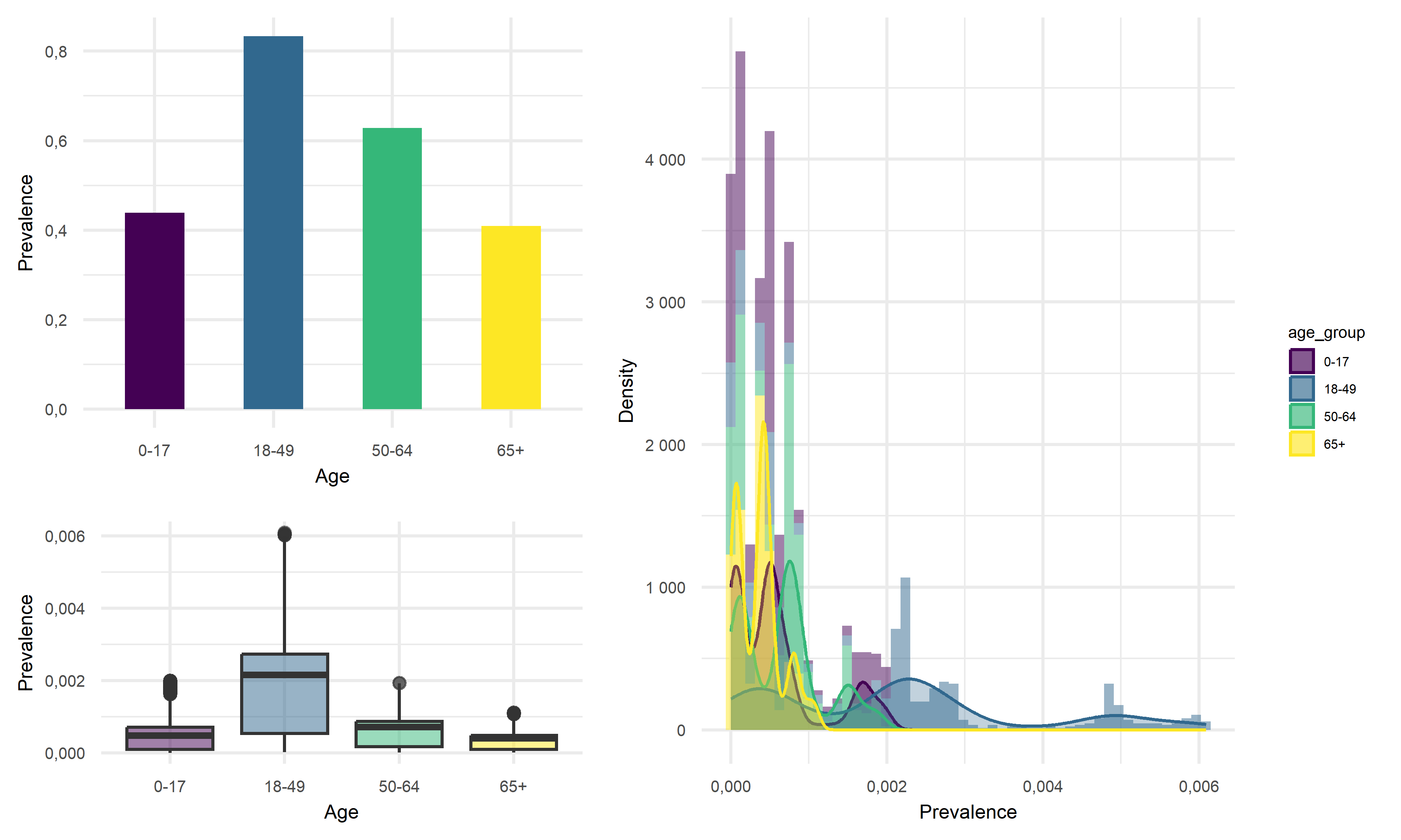
Prevalence vs Age
point <- format_format(big.mark = " ", decimal.mark = ",", scientific = FALSE)
grid.arrange(

    age %>%
    group_by(age_group) %>%
    summarise(prevalence = sum(total_cases)/(mean(percent_of_ca_population)*38066920)) %>%  # California total population = 38066920
    ggplot(aes(x = age_group, y = prevalence, fill = age_group)) +
    geom_bar(stat = "identity", width = 0.5) +
    scale_fill_viridis(discrete = TRUE) +
    theme(
      legend.position = "none"
    ) +
    xlab("Age") +
    ylab("Prevalence") +
    theme(legend.title = element_text(size = 5),
          legend.key.size = unit(0.3, 'cm'),
          legend.text = element_text(size = 4)) +
    theme(
          axis.title.x = element_text(size = 6),
          axis.text.x = element_text(size = 5),
          axis.title.y = element_text(size = 6),
          axis.text.y = element_text(size = 5)) +
          scale_y_continuous(labels = point),


    age %>%
    mutate(prevalence = total_cases/(mean(percent_of_ca_population)*38066920)) %>%  # California total population = 38066920
    ggplot(aes(x = prevalence, fill = age_group)) +
    geom_histogram(aes(y = ..density..), alpha = 0.5, bins = 50) +
    geom_density(alpha = 0.3, aes(color = age_group)) +
    scale_color_viridis(discrete = TRUE) +
    labs(x = "Prevalence",
         y = "Density") +
    theme(legend.position = "right") +
    theme(legend.title = element_text(size = 5),
          legend.key.size = unit(0.3, 'cm'),
          legend.text = element_text(size = 4)) +
    theme(
          axis.title.x = element_text(size = 6),
          axis.text.x = element_text(size = 5),
          axis.title.y = element_text(size = 6),
          axis.text.y = element_text(size = 5)) +
    scale_x_continuous(labels = point) +
    scale_y_continuous(labels = point),


    age %>%
    mutate(prevalence = total_cases/(mean(percent_of_ca_population)*38066920),
           median_prevalence = mean(prevalence)) %>%  # California total population = 38066920
    ggplot(aes(x = age_group, y = prevalence, fill = age_group)) +
    geom_boxplot(alpha = 0.5) +
    geom_hline(yintercept = age$median_prevalence, color = "red", size = 0.4, lty = "dashed") +
    scale_fill_viridis(discrete = TRUE) +
    theme(
      legend.position = "none"
    ) +
    xlab("Age") +
    ylab("Prevalence") +
        theme(legend.title = element_text(size = 5),
          legend.key.size = unit(0.3, 'cm'),
          legend.text = element_text(size = 4)) +
    theme(axis.title.x = element_text(size = 6),
          axis.text.x = element_text(size = 5),
          axis.title.y = element_text(size = 6),
          axis.text.y = element_text(size = 5)) +
          scale_y_continuous(labels = point),


layout_matrix = rbind(c(1, 1, 1, 2, 2, 2, 2),
                      c(1, 1, 1, 2, 2, 2, 2),
                      c(1, 1, 1, 2, 2, 2, 2),
                      c(3, 3, 3, 2, 2, 2, 2),
                      c(3, 3, 3, 2, 2, 2, 2)
))
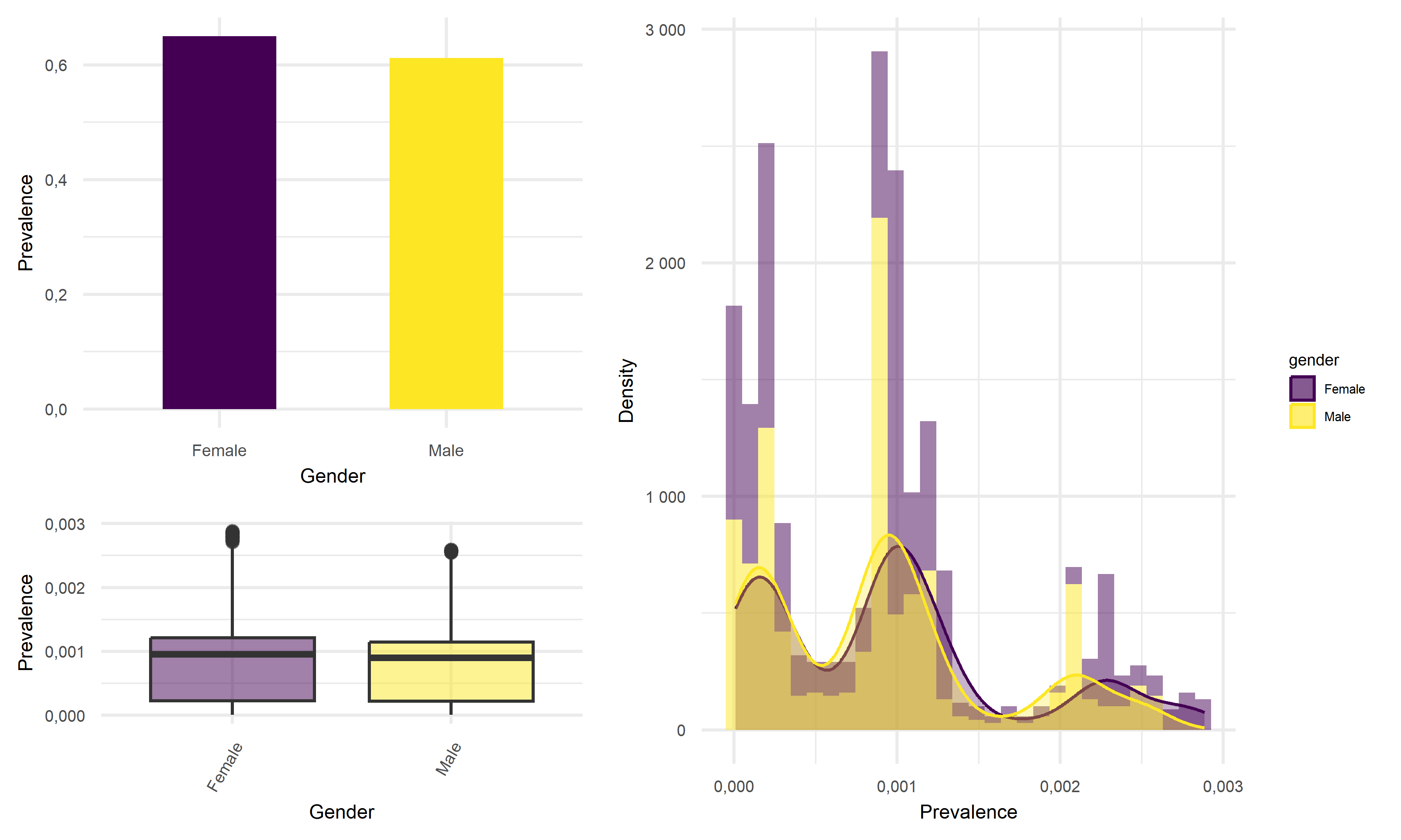
Prevalence vs Gender
point <- format_format(big.mark = " ", decimal.mark = ",", scientific = FALSE)
grid.arrange(

    gender %>%
    group_by(gender) %>%
    summarise(prevalence = sum(total_cases)/(mean(percent_of_ca_population)*38066920)) %>%  # California total population = 38066920
    ggplot(aes(x = gender, y = prevalence, fill = gender)) +
    geom_bar(stat = "identity", width = 0.5) +
    scale_fill_viridis(discrete = TRUE) +
    theme(
      legend.position = "none"
    ) +
    xlab("Gender") +
    ylab("Prevalence") +
    theme(legend.title = element_text(size = 5),
          legend.key.size = unit(0.3, 'cm'),
          legend.text = element_text(size = 4)) +
    theme(
          axis.title.x = element_text(size = 6),
          axis.text.x = element_text(size = 5),
          axis.title.y = element_text(size = 6),
          axis.text.y = element_text(size = 5)) +
    scale_y_continuous(labels = point),

    gender %>%
    mutate(prevalence = total_cases/(mean(percent_of_ca_population)*38066920)) %>%  # California total population = 38066920
    ggplot(aes(x = prevalence, fill = gender)) +
    geom_histogram(aes(y = ..density..), alpha = 0.5, bins = 30) +
    geom_density(alpha = 0.3, aes(color = gender)) +
    scale_color_viridis(discrete = TRUE) +
    labs(x = "Prevalence",
         y = "Density") +
    theme(legend.position = "right") +
    theme(legend.title = element_text(size = 5),
          legend.key.size = unit(0.3, 'cm'),
          legend.text = element_text(size = 4)) +
    theme(
          axis.title.x = element_text(size = 6),
          axis.text.x = element_text(size = 5),
          axis.title.y = element_text(size = 6),
          axis.text.y = element_text(size = 5)) +
    scale_x_continuous(labels = point) +
    scale_y_continuous(labels = point) +
    scale_fill_viridis(discrete = TRUE),


    gender %>%
    mutate(prevalence = total_cases/(mean(percent_of_ca_population)*38066920)) %>%  # California total population = 38066920
    ggplot(aes(x = gender, y = prevalence, fill = gender)) +
    geom_boxplot(alpha = 0.5) +
    geom_hline(yintercept = median(gender$prevalence, na.rm = T), color = "red", size = 0.4, lty = "dashed") +
    scale_fill_viridis(discrete = TRUE) +
    theme(
      legend.position = "none"
    ) +
    xlab("Gender") +
    ylab("Prevalence") +
        theme(legend.title = element_text(size = 5),
          legend.key.size = unit(0.3, 'cm'),
          legend.text = element_text(size = 4)) +
    theme(axis.text.x = element_text(angle = 60, hjust = 1)) +
    theme(
          axis.title.x = element_text(size = 6),
          axis.text.x = element_text(size = 5),
          axis.title.y = element_text(size = 6),
          axis.text.y = element_text(size = 5)) +
          scale_y_continuous(labels = point),


layout_matrix = rbind(c(1, 1, 1, 2, 2, 2, 2),
                      c(1, 1, 1, 2, 2, 2, 2),
                      c(1, 1, 1, 2, 2, 2, 2),
                      c(3, 3, 3, 2, 2, 2, 2),
                      c(3, 3, 3, 2, 2, 2, 2)
))
Prevalence vs Race
point <- format_format(big.mark = " ", decimal.mark = ",", scientific = FALSE)
grid.arrange(

    race %>%
    group_by(race_group) %>%
    summarise(prevalence = sum(total_cases)/(mean(percent_of_ca_population)*38066920)) %>%  # California total population = 38066920
    mutate(race_group = recode(race_group, "American Indian or Alaska Native" = "Indian/Alaska",
           "Native Hawaiian and other Pacific Islander" = "Hawaiian/Islander")) %>%
    mutate(race_group = fct_reorder(race_group, prevalence)) %>%
    ggplot(aes(x = race_group, y = prevalence, fill = race_group)) +
    geom_bar(stat = "identity", width = 0.5) +
    scale_fill_viridis(discrete = TRUE) +
    theme(
      legend.position = "none"
    ) +
    xlab("Race") +
    ylab("Prevalence") +
    theme(legend.title = element_text(size = 5),
          legend.key.size = unit(0.3, 'cm'),
          legend.text = element_text(size = 4)) +
    theme(
          axis.title.x = element_text(size = 6),
          axis.text.x = element_text(size = 5),
          axis.title.y = element_text(size = 6),
          axis.text.y = element_text(size = 5)) +
    scale_y_continuous(labels = point) +
    theme(axis.title.x = element_blank(),
         axis.text.x = element_blank(),
         axis.ticks.x = element_blank()),


    race %>%
    mutate(prevalence = total_cases/(mean(percent_of_ca_population)*38066920)) %>%  # California total population = 38066920
    mutate(race_group = recode(race_group, "American Indian or Alaska Native" = "Indian/Alaska",
           "Native Hawaiian and other Pacific Islander" = "Hawaiian/Islander")) %>%
    mutate(race_group = fct_reorder(race_group, prevalence)) %>%
    ggplot(aes(x = prevalence, fill = race_group)) +
    geom_histogram(aes(y = ..density..), alpha = 0.5, bins = 30) +
    geom_density(alpha = 0.1, aes(color = race_group)) +
    scale_color_viridis(discrete = TRUE) +
    labs(x = "Prevalence",
         y = "Density") +
    theme(legend.position = "right") +
    theme(legend.title = element_text(size = 5),
          legend.key.size = unit(0.3, 'cm'),
          legend.text = element_text(size = 4)) +
    theme(
          axis.title.x = element_text(size = 6),
          axis.text.x = element_text(size = 5),
          axis.title.y = element_text(size = 6),
          axis.text.y = element_text(size = 5)) +
          ylim(0, 5000) +
          xlim(0, 0.0035),


race %>%
    mutate(prevalence = total_cases/(mean(percent_of_ca_population)*38066920)) %>%  # California total population = 38066920
    mutate(race_group = fct_reorder(race_group, prevalence)) %>%
    mutate(race_group = recode(race_group, "American Indian or Alaska Native" = "Indian/Alaska",
           "Native Hawaiian and other Pacific Islander" = "Hawaiian/Islander")) %>%
    ggplot(aes(x = race_group, y = prevalence, fill = race_group)) +
    geom_boxplot(alpha = 0.5) +
    geom_hline(yintercept = median(race$prevalence, na.rm = T), color = "red", size = 0.4, lty = "dashed") +
    ylim(0, 30000) +
    scale_fill_viridis(discrete = TRUE) +
    theme(
      legend.position = "none"
    ) +
    xlab("Race") +
    ylab("Prevalence") +
        theme(legend.title = element_text(size = 5),
          legend.key.size = unit(0.3, 'cm'),
          legend.text = element_text(size = 4)) +
    theme(
          axis.title.x = element_text(size = 6),
          axis.text.x = element_text(size = 5),
          axis.title.y = element_text(size = 6),
          axis.text.y = element_text(size = 5)) +
          scale_y_continuous(labels = point) +
    theme(axis.text.x = element_text(angle = 60, hjust = 1)),


layout_matrix = rbind(c(1, 1, 1, 2, 2, 2, 2),
                      c(1, 1, 1, 2, 2, 2, 2),
                      c(1, 1, 1, 2, 2, 2, 2),
                      c(3, 3, 3, 2, 2, 2, 2),
                      c(3, 3, 3, 2, 2, 2, 2)
))
Death Rate vs Age, Gender, Race
age_death =
    age %>%
    group_by(age_group) %>%
    summarise(percent_deaths = mean(percent_deaths)/100) %>%
    ggplot(aes(x = age_group, y = percent_deaths, fill = age_group)) +
    geom_bar(stat = "identity", width = 0.5) +
    scale_fill_viridis(discrete = TRUE) +
    theme(
      legend.position = "none"
    ) +
    xlab("Age") +
    ylab("Percent Deaths") +
    theme(legend.title = element_text(size = 5),
          legend.key.size = unit(0.3, 'cm'),
          legend.text = element_text(size = 4)) +
    theme(
          axis.title.x = element_text(size = 6),
          axis.text.x = element_text(size = 5),
          axis.title.y = element_text(size = 6),
          axis.text.y = element_text(size = 5)) +
          scale_y_continuous(labels = point)

gender_death =
    gender %>%
    group_by(gender) %>%
    summarise(percent_deaths = mean(percent_deaths)/100) %>%
    ggplot(aes(x = gender, y = percent_deaths, fill = gender)) +
    geom_bar(stat = "identity", width = 0.5) +
    scale_fill_viridis(discrete = TRUE) +
    theme(
      legend.position = "none"
    ) +
    xlab("Gender") +
    ylab("Percent Deaths") +
    theme(legend.title = element_text(size = 5),
          legend.key.size = unit(0.3, 'cm'),
          legend.text = element_text(size = 4)) +
    theme(
          axis.title.x = element_text(size = 6),
          axis.text.x = element_text(size = 5),
          axis.title.y = element_text(size = 6),
          axis.text.y = element_text(size = 5)) +
          scale_y_continuous(labels = point)

race_death =
    race %>%
    group_by(race_group) %>%
    summarise(percent_deaths = mean(percent_deaths)/100) %>%
    mutate(race_group = recode(race_group, "American Indian or Alaska Native" = "Indian/Alaska",
           "Native Hawaiian and other Pacific Islander" = "Hawaiian/Islander")) %>%
    mutate(race_group = fct_reorder(race_group, percent_deaths)) %>%
    ggplot(aes(x = race_group, y = percent_deaths, fill = race_group)) +
    geom_bar(stat = "identity", width = 0.5) +
    scale_fill_viridis(discrete = TRUE) +
    theme(
      legend.position = "none"
    ) +
    xlab("Race") +
    ylab("Percent Death") +
    theme(legend.title = element_text(size = 5),
          legend.key.size = unit(0.3, 'cm'),
          legend.text = element_text(size = 4)) +
    theme(
          axis.title.x = element_text(size = 6),
          axis.text.x = element_text(size = 5),
          axis.title.y = element_text(size = 6),
          axis.text.y = element_text(size = 5)) +
    theme(axis.text.x = element_text(angle = 60, hjust = 1))


age_death + gender_death + race_death
# age %>%
#     mutate(date = factor(date)) %>%
#     mutate(text_label = str_c("Date: ", date,
#                               "\n Age: ", age_group,
#                               "\n Death(%): ", percent_deaths)) %>%
#     plot_ly(y = ~percent_deaths,
#           x = ~date,
#           color = ~age_group,
#           width = 950,
#           height = 300,
#           type = "scatter",
#           mode = "markers",
#           marker = list(size = 3),
#           colors = "inferno",
#           text = ~ text_label) %>%
#     layout(xaxis = list(
#            title = "Date",
#            tickangle = 60),
#            yaxis = list(
#            title = "Death Rate"))
# gender %>%
#     mutate(date = factor(date)) %>%
#     mutate(text_label = str_c("Date: ", date,
#                               "\n Gender: ", gender,
#                               "\n Death(%): ", percent_deaths)) %>%
#     plot_ly(y = ~percent_deaths,
#           x = ~date,
#           color = ~gender,
#           width = 950,
#           height = 300,
#           type = "scatter",
#           mode = "markers",
#           marker = list(size = 3),
#           colors = "viridis",
#           text = ~ text_label) %>%
#     layout(xaxis = list(
#            title = "Date",
#            tickangle = 60),
#            yaxis = list(
#            title = "Death Rate"))
Looking at the result figures of exploratory analysis above, we can observe many interesting things about our data set. To start with, For the Prevalence vs. Age graph, we can see that the age group 18-49 has the highest prevalence, followed by 50-64, followed by 0-17 and ends with the age group of 65+. For the graph of Prevalence vs. Gender, although female tend to have a higher prevalence according to the graph, the difference between the two gender is really not that large. When considering the graph of Prevalence vs. Race, we see that Latino people have significantly higher prevalence compared to other races.
One of the most insightful graph we obtained is the graph of Death Rate vs. Age. In this graph we see that although the 65+ age group previously had relatively low disease prevalence, they still have significantly higher death rate compared to other age groups. This finding suggests that the elder citizens are especially vulnerable to COVID. For the graph of Death Rate vs. Gender, we find males to have higher death rate than female. Lastly, for the graph of Death Rate vs. Race, it followed the pattern we previously observed in the Prevalence vs. Race graph, which is reasonable.
Inference Analysis: Regression
Multiple linear Regression for prevalence
For model building purpose of this investigation, a multiple linear regression model is considered to investigate on disease prevalence. The underlying logic for this model is relatively simple, analysts extract data that includes disease prevalence, area, population, location and tests. The hypothetical multiple linear regression function for this particular inference analysis is shown as below:
\[\widehat{Prevalence}=-69.049+9.251 \cdot ln(unemployment)+1.495 \cdot ln(area)+0.642 \cdot ln(population)+9.389 \cdot ln(test)\]
In the above equation, disease prevalence is the desired outcome while the amount of tests, unemployment, area, location, and population are predictors. B1, B2, B3, B4 and B5 are the factors for each predictors respectively. Under ideal circumstances, we would expect our model to be able to predict the death counts in a region, given its number of tests, population, and unemployment rate.
It is necessary to mention that in the original dataset on which this
model looked at, analysts observed strong correlation within the some
other data variables such as vaccination and
labor_rate. After some data exploratory works, some
right-skewness is noticed so analysts decided to apply natural
logarithms to each continuous variables.
Another thing to look at was the correlation between the predictors to avoid the potential effect of multicollinearity, which is a statistical concept that describes the incidence of several independent variables in a model are in fact correlated within themselves. This correlation test is later combined with criterion based model selection to select which predictors to put in for the final model.
The three criterion based model selection method are Cp criterion, adjusted R squared criterion, and LASSO. The results of these model selection method all gave similar predictor size, so in the end the analysts chose four predictors to construct the final model as shown in the equation above. After the construction of this model, a corss validation process is performed to further assess the prediction ability of this model.
Multiple linear Regression for fatality
Using similar logic as for the MLR model for prevalence, investigate on a MLR model for fatality. The hypothetical multiple linear regression function for this particular inference analysis is shown as below:
\[\widehat{DR} = -0.572 + 0.079\cdot lnI(location = inland)+0.002 \cdot vacci-0.004 \cdot labor + 0.066 \cdot ln(test)+ 0.034 \cdot ln(area) + 0.073 \cdot ln(unemploy)\]
Statistical test
The Statistical test used in this investigation is Analysis of Variance(ANOVA), which is used to determine if there is a statistically significant difference between categorical groups. After checking that there are no relationship between the subjects, groups of interest have equal sample size, dependent variable is normally distributed, population variances are equal, the ANOVA test can be conducted to our linear regression together with an F-test to determine whether the variable fits the data as well as the model.
In total, two ANOVA tests are performed, one on the MLR model for disease Prevalence and one on the MLR model for death cases.
Result
ANOVA result for the model on fatality:
mlr_model = lm(death_rate~location+vaccinated+labor_rate+ln_tests+ln_area+ln_unemployment+ln_bed,data = ca_model_data)
anova(mlr_model) %>% broom::tidy()
## # A tibble: 8 × 6
## term df sumsq meansq statistic p.value
## <chr> <int> <dbl> <dbl> <dbl> <dbl>
## 1 location 1 0.0915 0.0915 20.7 0.0000365
## 2 vaccinated 1 0.00149 0.00149 0.337 0.564
## 3 labor_rate 1 0.0535 0.0535 12.1 0.00108
## 4 ln_tests 1 0.0180 0.0180 4.07 0.0493
## 5 ln_area 1 0.0478 0.0478 10.8 0.00189
## 6 ln_unemployment 1 0.0168 0.0168 3.80 0.0571
## 7 ln_bed 1 0.0272 0.0272 6.14 0.0167
## 8 Residuals 48 0.212 0.00442 NA NAFrom the table above, we can see that the Variables,such as \(location\),\(labor\ rate\),\(ln(tests)\),\(ln(area)\),\(ln(unemployment)\),\(ln(bed)\) are statistically significant, which means their p-value smaller than 0.05. Only variable \(vaccinated\) has p-value greater than 0.05.
ANOVA result for the model on disease prevalence:
mlr_model = lm(prevalence~location+ln_test+ln_unemployment+ln_area+ln_population,data = ca_model_data)
sd_function <- lm(abs(mlr_model$residuals) ~ mlr_model$fitted.values)

var_fitted <- sd_function$fitted.values^2

wt <- 1/var_fitted

wls_prevalence <- lm(prevalence~location+ln_test+ln_unemployment+ln_area+ln_population,data = ca_model_data, weights = wt)
aov(wls_prevalence) %>% summary()
## Df Sum Sq Mean Sq F value Pr(>F)
## location 1 6.15 6.15 3.45 0.068913 .
## ln_test 1 191.51 191.51 107.45 2.96e-14 ***
## ln_unemployment 1 47.63 47.63 26.72 3.80e-06 ***
## ln_area 1 24.60 24.60 13.80 0.000497 ***
## ln_population 1 19.91 19.91 11.17 0.001544 **
## Residuals 52 92.68 1.78
## ---
## Signif. codes: 0 '***' 0.001 '**' 0.01 '*' 0.05 '.' 0.1 ' ' 1From the table above, we can see that the Variables,such as \(ln(test)\),\(ln(unemployment)\),\(ln(area)\),\(ln(population)\) are statistically significant, which means their p-value smaller than 0.05. Only variable \(location\) has p-value greater than 0.05.
source("data_preprocessing_backbone.R")
labor_data = read_csv("./data/CA_Labor.csv") %>%
    janitor::clean_names() %>%
    dplyr::select(-employment,-unemployment,-rank) %>%
    rename(unemployment=unemployment_rate_per_cent)

population_data = read_csv("./data/CA_Land_Area.csv") %>%
    janitor::clean_names() %>%
    dplyr::select(-rank, -state) %>%
    mutate(
        location = ifelse(county %in% c("Los Angeles", "Orange", "San Diego", "Monterey", "San Benito", "San Luis Obispo", "Santa Barbara", "Santa Cruz", "Ventura", "Alameda", "Contra Costa", "Marin", "Napa", "San Francisco", "San Mateo", "Santa Clara", "Solano", "Sonoma", "Del Norte", "Humboldt", "Mendocino"), "costal", "inland"))

ca_nonmedical_data = left_join(population_data, labor_data, by = c("county")) %>%
    mutate(labor_rate = labor_force/population*100) %>%
    dplyr::select(-labor_force)

demo_covid = demo %>%
    mutate(cumulative_deaths= as.numeric(population),
           cumulative_cases = as.numeric(cumulative_cases),
        prevalence=cumulative_cases/population*100,
        test = cumulative_total_tests/population*100,
        ) %>%
    dplyr::select(county_name, prevalence, test, population) %>%
    rename(county=county_name) %>%
    group_by(county) %>%
    summarize(prevalence=max(prevalence),
              test = max(test)) %>%
    filter(!county %in% c("Out of state","Unknown"))

vaccine = read_csv("./data/CA_covid19vaccines.csv") %>%
    janitor::clean_names() %>%
    group_by(county) %>%
    summarise(
        fully_vaccinated = sum(fully_vaccinated)
        # total number of fully vaccinated people
            ) %>%
    arrange(county) %>%
    drop_na() %>%
    filter(!county %in% c("Unknown", "All CA Counties", "All CA and Non-CA Counties"))

ca_medical_data = left_join(demo_covid, vaccine, by =c("county"))
ca_premodel_data = left_join(ca_medical_data, ca_nonmedical_data, by = c("county")) %>%
    mutate(
        vaccination=fully_vaccinated/population*100) %>%
    dplyr::select(-fully_vaccinated)

skimr::skim(ca_premodel_data)| Name | ca_premodel_data |
| Number of rows | 58 |
| Number of columns | 9 |
| _______________________ | |
| Column type frequency: | |
| character | 2 |
| numeric | 7 |
| ________________________ | |
| Group variables | None |
Variable type: character
| skim_variable | n_missing | complete_rate | min | max | empty | n_unique | whitespace |
|---|---|---|---|---|---|---|---|
| county | 0 | 1 | 4 | 15 | 0 | 58 | 0 |
| location | 0 | 1 | 6 | 6 | 0 | 2 | 0 |
Variable type: numeric
| skim_variable | n_missing | complete_rate | mean | sd | p0 | p25 | p50 | p75 | p100 | hist |
|---|---|---|---|---|---|---|---|---|---|---|
| prevalence | 0 | 1 | 22.53 | 5.77 | 9.45 | 19.54 | 22.51 | 25.47 | 38.64 | ▂▆▇▂▁ |
| test | 0 | 1 | 367.42 | 171.84 | 104.51 | 277.33 | 312.06 | 402.06 | 983.95 | ▅▇▂▁▁ |
| land_area_sq_mi | 0 | 1 | 2685.85 | 3102.32 | 46.87 | 959.49 | 1535.34 | 3454.40 | 20056.92 | ▇▂▁▁▁ |
| population | 0 | 1 | 656326.21 | 1443528.73 | 1202.00 | 47277.50 | 179992.50 | 656486.00 | 9974203.00 | ▇▁▁▁▁ |
| unemployment | 0 | 1 | 7.33 | 2.12 | 4.42 | 5.97 | 6.96 | 8.22 | 17.37 | ▇▆▁▁▁ |
| labor_rate | 0 | 1 | 45.90 | 6.86 | 27.46 | 41.68 | 47.42 | 50.03 | 65.86 | ▁▃▇▂▁ |
| vaccination | 0 | 1 | 65.81 | 15.11 | 26.84 | 54.55 | 64.62 | 76.02 | 101.87 | ▁▆▇▆▃ |
point <- format_format(big.mark = " ", decimal.mark = ",", scientific = FALSE)
rawplot_prevalence = ca_premodel_data %>%
    ggplot(aes(x = prevalence)) +
    geom_density(fill = "#69b3a2", color = "#e9ecef", alpha = .8) +
    scale_y_continuous(labels = point)

rawplot_unemployment = ca_premodel_data %>%
    ggplot(aes(x = unemployment)) +
    geom_density(fill = "#69b3a2", color = "#e9ecef", alpha = .8) +
    scale_y_continuous(labels = point) +
    scale_x_continuous(labels = point)

rawplot_labor = ca_premodel_data %>%
    ggplot(aes(x = labor_rate)) +
    geom_density(fill = "#69b3a2", color = "#e9ecef", alpha = .8) +
    scale_y_continuous(labels = point) +
    scale_x_continuous(labels = point)

rawplot_population = ca_premodel_data %>%
    ggplot(aes(x = population)) +
    geom_density(fill = "#69b3a2", color = "#e9ecef", alpha = .8) +
    scale_y_continuous(labels = point) +
    scale_x_continuous(labels = point)

plot_area = ca_premodel_data %>%
    ggplot(aes(x = land_area_sq_mi)) +
    geom_density(fill = "#69b3a2", color = "#e9ecef", alpha = .8)

plot_test = ca_premodel_data %>%
    ggplot(aes(x = test)) +
    geom_density(fill = "#69b3a2", color = "#e9ecef", alpha = .8)

ca_model_data = ca_premodel_data %>%
    mutate(ln_unemployment = log(unemployment),
           ln_area = log(land_area_sq_mi),
           ln_population = log(population),
           ln_test = log(test)) %>%
    dplyr::select(-unemployment,-land_area_sq_mi,-population,-test,-county)

plot_ln_test = ca_model_data %>%
    ggplot(aes(x = ln_test)) +
    geom_density(fill = "#69b3a2", color = "#e9ecef", alpha = .8)

plot_ln_unemployment = ca_model_data %>%
    ggplot(aes(x = ln_unemployment)) +
    geom_density(fill = "#69b3a2", color = "#e9ecef", alpha = .8)

plot_ln_area = ca_model_data %>%
    ggplot(aes(x = ln_area)) +
    geom_density(fill = "#69b3a2", color = "#e9ecef", alpha = .8)

plot_ln_population = ca_model_data %>%
    ggplot(aes(x = ln_population)) +
    geom_density(fill = "#69b3a2", color = "#e9ecef", alpha = .8)

(rawplot_prevalence + rawplot_unemployment + plot_area + rawplot_population+plot_test)/(rawplot_labor + plot_ln_unemployment + plot_ln_area+plot_ln_population+plot_ln_test)
ca_model_data %>%
    gtsummary::tbl_summary() %>%
    gtsummary::bold_labels() %>%
    as.tibble() %>%
knitr::kable()| Characteristic | N = 58 |
|---|---|
| prevalence | 23 (20, 25) |
| location | NA |
| costal | 21 (36%) |
| inland | 37 (64%) |
| labor_rate | 47 (42, 50) |
| vaccination | 65 (55, 76) |
| ln_unemployment | 1.94 (1.79, 2.11) |
| ln_area | 7.34 (6.87, 8.15) |
| ln_population | 12.10 (10.76, 13.39) |
| ln_test | 5.74 (5.63, 6.00) |
Correlation
ca_model_data %>%
    dplyr::select(-location) %>%
    GGally::ggpairs()
- The overall correlation and covariance between the independent
variables are not obvious, but among them we can see that there is a
large trend of correlation and covariance between
vaccinationandlabor_rate, implying that both of these variables in the model could result in poor coefficient estimation and inflated standard errors (due to multicollinearity). Our model selection techniques are able to figure this out.
Modelling Fit
reg_full = lm(prevalence ~ ., data = ca_model_data)

reg_intercept = lm(prevalence ~ 1, data = ca_model_data)- We fitted a model with all potential predictors and a model including only the intercept for proceeding automatic model selection.
Model Selection
Automatic and Criterion Model selection Methods
#forward Selection
step(reg_intercept, direction='forward', scope=formula(reg_full),trace=0)
##
## Call:
## lm(formula = prevalence ~ ln_test + ln_unemployment + ln_area +
## ln_population + location, data = ca_model_data)
##
## Coefficients:
## (Intercept) ln_test ln_unemployment ln_area
## -71.4474 9.8152 8.0663 1.3412
## ln_population locationinland
## 0.8201 1.9559#backwards elimination
step(reg_full, direction='backward', scope=formula(reg_full),trace=0)##
## Call:
## lm(formula = prevalence ~ location + ln_unemployment + ln_area +
## ln_population + ln_test, data = ca_model_data)
##
## Coefficients:
## (Intercept) locationinland ln_unemployment ln_area
## -71.4474 1.9559 8.0663 1.3412
## ln_population ln_test
## 0.8201 9.8152#stepwise Selection
step(reg_full, direction = "both", scope=formula(reg_full),trace=0)##
## Call:
## lm(formula = prevalence ~ location + ln_unemployment + ln_area +
## ln_population + ln_test, data = ca_model_data)
##
## Coefficients:
## (Intercept) locationinland ln_unemployment ln_area
## -71.4474 1.9559 8.0663 1.3412
## ln_population ln_test
## 0.8201 9.8152# Use criterion-based procedures to guide your selection of the ‘best subset’
# chosen using SSE/RSS (smaller is better)
criterion_selected = regsubsets(prevalence ~ ., data = ca_model_data)
criterion_plot = summary(criterion_selected)
# plot of Cp and Adj-R2 as functions of parameters
x_new = (2:8)
y_new = criterion_plot$cp
z_new = criterion_plot$adjr2
cp_new_p =
cbind(x_new, y_new, z_new) %>%
as.tibble() %>%
rename(`Number of parameter` = x_new,
`Cp value` = y_new,
`Adj R-square` = z_new) %>%
mutate(p = `Number of parameter`)
cp_fe_new_1 =
cp_new_p %>%
ggplot() +
geom_point(aes(x = `Number of parameter`, y = `Cp value`, color = `Cp value`)) +
theme(legend.position = "none") +
geom_abline(intercept = 0, slope = 1, color = "red")
cp_fe_new_2 =
cp_new_p %>%
ggplot() +
geom_point(aes(x = `Number of parameter`, y = `Adj R-square`, color = `Adj R-square`)) +
theme(legend.position = "none")
cp_fe_new_1 + cp_fe_new_2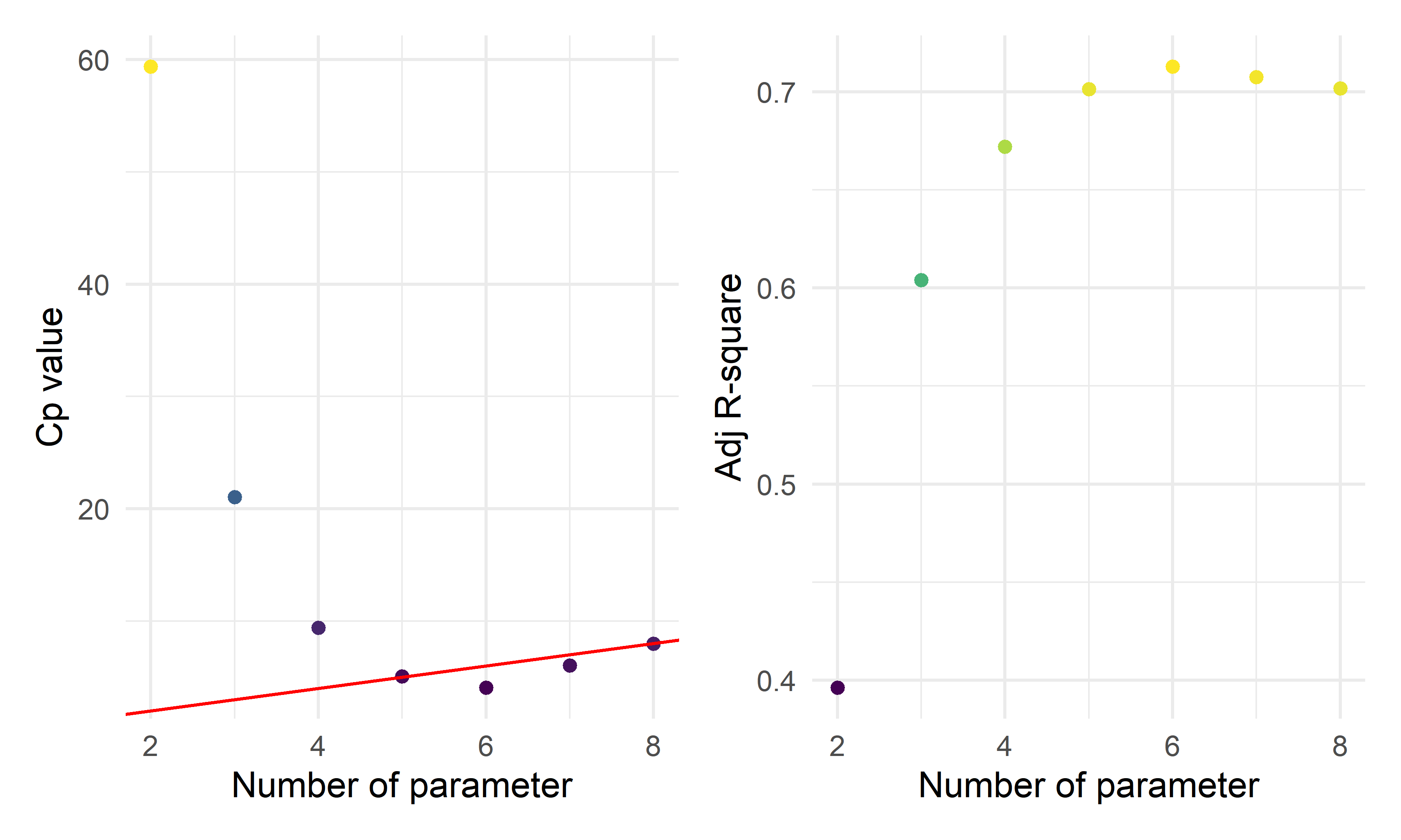
- By the three automatic model selection models: forward selection, backward elimination and stepwise selection, we got the same result containing six parameters (five predictors):
\(\hat{prevalence}=-71.4474+1.9559*I(location=inland)+8.0663*ln(unemployment)+1.3412*ln(area)+0.8201*ln(population)+9.8152*ln(test)\)
Penalized Model Selection Method: LASSO
ca_lasso_data = ca_model_data %>% mutate(
    location=ifelse(location =="costal", 1,0))
# using cross validation to choose lambda
lambda_seq = 10^seq(-5, 0, by = .01)
set.seed(2022)
cv_object <- cv.glmnet(as.matrix(ca_lasso_data[2:8]), ca_lasso_data$prevalence,
lambda = lambda_seq, nfolds = 5)
cv_object
##
## Call: cv.glmnet(x = as.matrix(ca_lasso_data[2:8]), y = ca_lasso_data$prevalence, lambda = lambda_seq, nfolds = 5)
##
## Measure: Mean-Squared Error
##
## Lambda Index Measure SE Nonzero
## min 0.2818 56 11.76 3.542 5
## 1se 0.9550 3 15.21 5.401 4# plot the CV results
tibble(lambda = cv_object$lambda,
mean_cv_error = cv_object$cvm) %>%
mutate(text_label = str_c("Lambda: ", lambda,
"\n Mean CV error: ", mean_cv_error)) %>%
plotly::plot_ly(y = ~mean_cv_error, x = ~lambda,
color = ~lambda,
width = 900,
height = 500,
type = "scatter",
mode = "markers",
marker = list(size = 6),
colors = "magma",
text = ~ text_label)# refit the lasso model with the "best" lambda
fit_bestcv <- glmnet(as.matrix(ca_lasso_data[2:8]), ca_lasso_data$prevalence, lambda = cv_object$lambda.min)
fit_bestcv %>%
broom::tidy() %>%
mutate(term = str_replace(term, "^location", "Location: ")) %>%
knitr::kable(digits = 3)| term | step | estimate | lambda | dev.ratio |
|---|---|---|---|---|
| (Intercept) | 1 | -59.142 | 0.282 | 0.724 |
| Location: | 1 | -0.884 | 0.282 | 0.724 |
| ln_unemployment | 1 | 7.620 | 0.282 | 0.724 |
| ln_area | 1 | 1.131 | 0.282 | 0.724 |
| ln_population | 1 | 0.637 | 0.282 | 0.724 |
| ln_test | 1 | 8.767 | 0.282 | 0.724 |
Fitting the seleted final model
mlr_model = lm(prevalence~location+ln_test+ln_unemployment+ln_area+ln_population,data = ca_model_data)
mlr_model %>%
  broom::tidy() %>%
  mutate(term = str_replace(term, "^location", "Location: ")) %>%
knitr::kable(digits = 3)| term | estimate | std.error | statistic | p.value |
|---|---|---|---|---|
| (Intercept) | -71.447 | 8.097 | -8.823 | 0.000 |
| Location: inland | 1.956 | 1.108 | 1.765 | 0.083 |
| ln_test | 9.815 | 1.128 | 8.703 | 0.000 |
| ln_unemployment | 8.066 | 1.855 | 4.349 | 0.000 |
| ln_area | 1.341 | 0.472 | 2.839 | 0.006 |
| ln_population | 0.820 | 0.270 | 3.038 | 0.004 |
As almost all the terms has p-value < 0.05, with the
locationvariable < 0.1, we can conclude that all the predictor coefficients are statistical significant at 0.1 significance level forlocationand 0.05 significance level for others, hence all the five variables will be included in the model. All these methods agree on the same suggested model or predictors. This might give good evidence that we should explore this model further.From the outputs above, we see that location had a p-value close to 0.05. This might mean that the relationship between prevalence and location is weak. Also, the highly correlated variables
vaccinationandlabor_rateneither was included in the final models.
Prevalence Model Diagnosis
check_model(mlr_model, check = c("linearity", "qq", "normality", "outliers", "homogeneity", "vif"))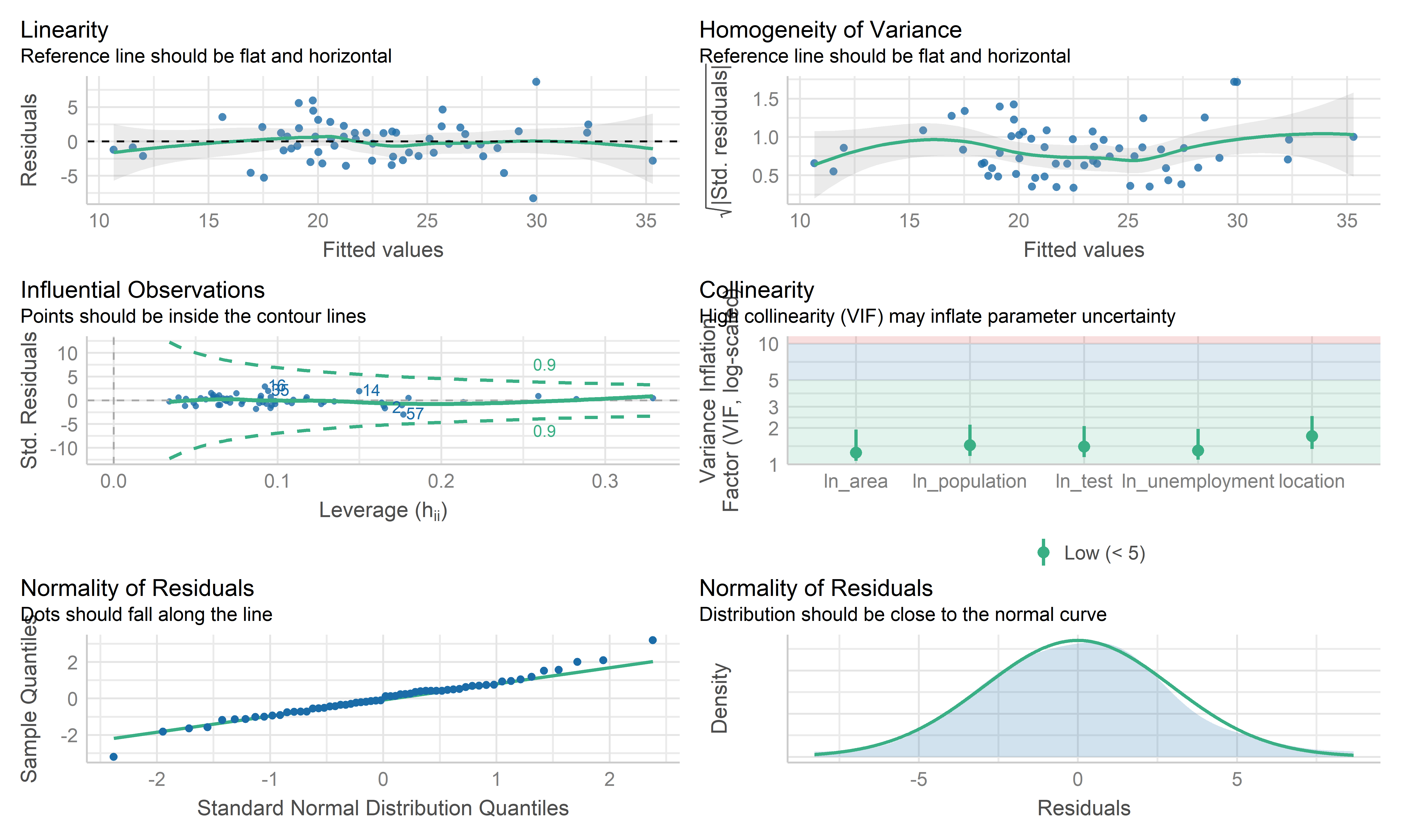
- Overall, these plots look like this model is fitting the data well. No influential point detected. However the residual points showed some kinds trend and the horizontal line is not such stable on the edge area, it may be worth investigating further by weighted least squares regression.
Weighted Least Squares Regression
# define sd function
sd_function <- lm(abs(reg_full$residuals) ~ reg_full$fitted.values)

var_fitted <- sd_function$fitted.values^2

#define weight
wt <- 1/var_fitted

wls_full = lm(prevalence~.,data = ca_model_data, weights = wt)

wls_prevalence = step(wls_full, direction='backward', scope=formula(wls_full),trace=0)

wls_prevalence %>%
  broom::tidy() %>%
  mutate(term = str_replace(term, "^location", "Location: ")) %>%
knitr::kable(digits = 3)| term | estimate | std.error | statistic | p.value |
|---|---|---|---|---|
| (Intercept) | -73.046 | 7.992 | -9.140 | 0.000 |
| Location: inland | 2.131 | 1.099 | 1.938 | 0.058 |
| ln_unemployment | 7.619 | 1.884 | 4.045 | 0.000 |
| ln_area | 1.344 | 0.464 | 2.898 | 0.005 |
| ln_population | 0.904 | 0.265 | 3.406 | 0.001 |
| ln_test | 10.044 | 1.144 | 8.779 | 0.000 |
check_model(wls_prevalence, check = c("linearity", "qq", "normality", "outliers", "homogeneity", "vif"))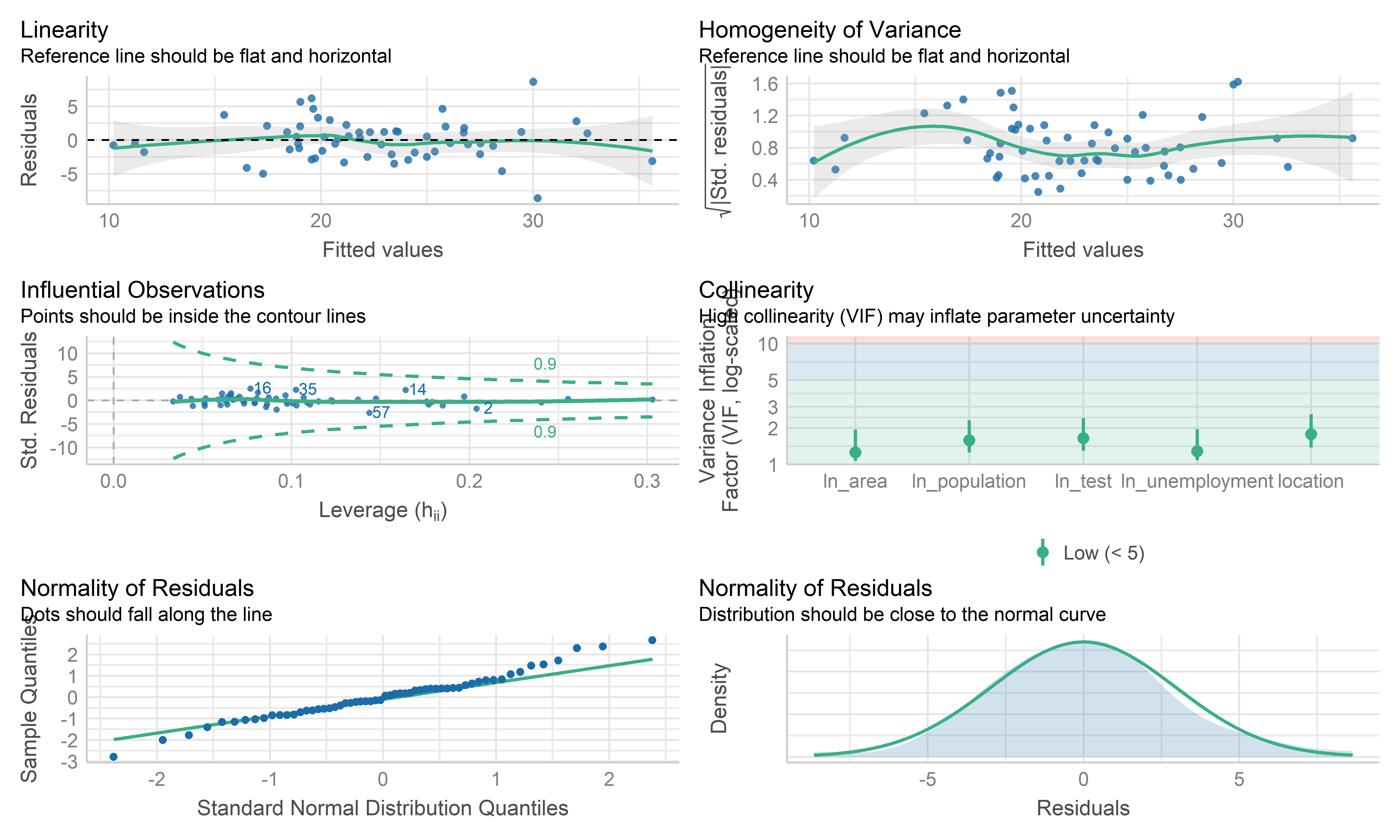
- The coefficient estimate for the predictors variable changed somewhat and the model fit improved.
- The residual standard error per coefficient slightly changed in the weighted LS model. This shows that the predictions from the WLS model are much closer to the actual observations than those from the ordinary LS model.
- \(R^2\) improved in the WLS model. WLS model is able to explain more of the variation in prevalence compared to the OLS model.
- Therefore, I regard both MLR’s mod and WLS’s mod as good models. Because the data are collected from the overall California county-level big data, each observation may contain some special information rather than typo or anything else. This modeling mainly focuses on exploring the predictors used to explain the prevalence, therefore, the MLR model is used here as the final model, while WLS can be used for potential prediction.
Cross Validation
set.seed(2022)
# use 10-fold validation and create the training sets
train = trainControl(method = "cv", number = 10)
# fit the 4-variables model that we selected as our final model
model_caret = train(prevalence~location+ln_test+ln_unemployment+ln_area+ln_population, data = ca_model_data, trControl = train, method = 'lm', na.action = na.pass)
model_caret
## Linear Regression
##
## 58 samples
## 5 predictor
##
## No pre-processing
## Resampling: Cross-Validated (10 fold)
## Summary of sample sizes: 53, 52, 51, 53, 52, 52, ...
## Resampling results:
##
## RMSE Rsquared MAE
## 3.079446 0.7261623 2.558792
##
## Tuning parameter 'intercept' was held constant at a value of TRUEmodel_caret$resample## RMSE Rsquared MAE Resample
## 1 2.825007 0.76359260 2.519925 Fold01
## 2 3.190194 0.71590015 2.853202 Fold02
## 3 1.433165 0.88045483 1.304306 Fold03
## 4 1.979195 0.92212958 1.704161 Fold04
## 5 1.933953 0.96590869 1.669703 Fold05
## 6 3.339120 0.53507207 2.909027 Fold06
## 7 3.306837 0.71923646 2.572679 Fold07
## 8 3.019968 0.87696581 2.490659 Fold08
## 9 4.714584 0.78563673 3.646323 Fold09
## 10 5.052439 0.09672592 3.917936 Fold10- From the output above, the overall RMSE (root mean squared error) is 3.079, which would mean our MSE is 9.483. Our MAE (mean absolute error) is 2.559. These measures show that this model is doing a good job at predicting responses for “new” data points. Additionally, the variance for these measures is relatively small, showing that these estimates are probably pretty close to the true predictive ability. This means that the MLR model can still be used to predict the COVID prevalence.
Conclusion
- We employed automatic search procedures, criterion based approaches, and the LASSO technique to select a final model:
\(\hat{prevalence}=-71.4474+1.9559*I(location=inland)+8.0663*ln(unemployment)+1.3412*ln(area)+0.8201*ln(population)+9.8152*ln(test)\)
From this model, we can see that as the while the location is inland, unemployment, land area, population and test participation increases, the predicted prevalence increases. This is probably because inland counties, counties with high unemployment generally have poor economy so that poor medical conditions, which may finally lead to increased prevalence; while the large size of the county and the high population of the county may lead to increased prevalence due to dense population, but still needs further investigation. In addition, the high prevalence is from increased test participation is somewhat surprising, but it may be because more potential positive patients are able to be detected.
Overall, from our 10-fold cross validation, we see that our model has pretty good predictive ability for new points. However, this model was only built on data on the county level, so there may be some special information missing, but the overall model reflects the correlation and relationship between the prevalence and some predictors in California.
Discussion
Project Obstacle
One of the first obstacles this project met was related with data scraping and cleaning. It was the groups’ intention to perform similar investigations about COVID, but on a much more broader scale such as across the whole country. The reason that analysts didn’t follow this starting plan is because data sets from different parts of the country simply are organized quite differently. So it would take analysts a lot of time to do the necessary bindings to forge a complete data set to work on. Also it is questioned whether the equipment that analysts use can efficiently process such large amount of data in reasonable time during later analysis process.
After deciding to put our focus on the state of California, the next
obstacle analysts met was related to data pre-processing. There were
lots of data variables retrieved from the original database that aren’t
going to be used in this investigation and also certain variable columns
need to be created using the mutate function. As team
members excahnged a lot of ideas when discussing and planning on which
specific data to throw out and which ones to keep, sometimes there were
even data manipulations going “back and forth”, the website building
process didn’t really start for quite a long time.
Formulating the right regression model and choosing the right variables to draw graphs were challenges as well. Due to lots of multicolinearity in our original data set, analysts had to run multiple model selection to decide which variables to include in the final model. A larger issue was that some originally designed plotting turned out to be just not feasible due to errors from the data set, for example in some cases, the death rate of a county was 100%, which is clearly wrong. It was also a challenge overall to interpret correlations after the model is built and summarization of the model given using code because most of the correlations aren’t perfect, there could be confounders that we haven’t considered in the model.
Findings
This investigations finding started off from exploratory analysis, where we first looked at the prevalence across counties. Until November 2022, COVID prevalence in California ranges from 0.094 to 0.386, with the lowest being the county of Modoc and highest being the county of Kings. Majority of the regions had experienced a prevalence between 0.15 to 0.25.
Another parameter we looked at was the death rate across different counties. The county with the lowest death rate in California was Alpine, where the death rate was 0 while the county with the highest death rate was Siskiyou, at about 1.76%. The majority death rate across counties fall within the bound of 0.25% to 1.25%.
We further looked at the correlation between prevalence and death rates. It is interesting for us to notice that the correlation between these two factors was very low, with a correlation factor of -0.086. Meaning that in general, the disease prevalence in a county doesn’t affect the death rate in that county. This is quite counter intuitive as logically, higher disease prevalence means more pressure on the health care system of that county, which is likely to lead to higher death rate as patients not being able to get the medical attention they need.
One possible explanation that we would offer for observing this phenomenon is that places with high disease prevalence may also tend to be places with high population density and better medical system. Thus although the prevalence is high, those counties are still able to control their death rate.
To examine our guess, we decide to take population by county into consideration for a further test on the association between outcomes. The finding of this test shows a relatively weak, but positive relationship between prevalence and death rates. So we still conclude that prevalence and death rate are very weakly correlated.
To determine if there is a statistically significant relationship
between the categorical groups that we considered to put in for our
prediction model. Two ANOVA tests were run, one focusing on the
predictors for fatality and the other one focusing on prevalence. The
ANOVA test for fatality shows that only the variable
vaccinated isn’t significant as a predictor. We consider
this finding as suggesting that vaccination, although certainly can help
prevent someone from getting COVID, can’t affect an individual’s chance
of dying from COVID.
The ANOVA test for disease prevalence shows that location is the only predictor that is not significant, which is understandable as the location of a county shouldn’t be linked to its ability on treating the COVID patients.
For the two MLR models constructed in our Inference Analysis session, we first claim the disease prevalence in each county is a linear combination of four predictor variables, we found unemployment, area of the county, population and amount of tests all positively associated with disease prevalence.
For the second model, we claim death rate in each county is a linear combination of seven predictor variables. The death rate is positively correlated with whether the county being an inland county, vaccination situation, unemployment rate, area of the county, amount of tests while being negatively correlated with the proportion of labor forces in the population.
Next Steps
After looking back on our investigation, we would suggested future research to try to understand more on the association between socioeconomic factors and COVID prevalence/death rate. According to our models, although vaccine definitely has its value in disease control, it doesn’t seem to stand out among all the other variables such as unemployment and proportion of labor forces in the population. Researches should also be done to investigate on how to better protect the non-labor force population, which tends to be our elders in the society since our investigation suggests that lower labor proportion population has higher death rate from COVID.