Overview of Outcomes
On this page, we’ll explore overall trends for our key outcomes –
COVID prevalence and COVID death rate – across
counties in California, as well as the high-level trends for how these
outcomes correlate with census predictors, including major demographic
variables such as age, gender, and race, and other independent
variables, such as unemployment rate, hospitalization percentage,
vaccination rate, and land areas.[TBD***]
1. Outcomes by county
1a. Prevalence across county
Considering the different population bases for each county, we
decided to convert the values in the total case count into
the prevalence proportion. Prevalence is defined as the
proportion of persons in a population who have a particular disease or
attribute at a specified point in time or over a specified period of
time. By utilizing prevalence, we are able to conduct a
more comparable analysis of their respective pandemic responses across
counties.
point <- format_format(big.mark = " ", decimal.mark = ",", scientific = FALSE)

demo_plot = demo %>%
    filter(!county_name %in% "Out of state") %>%
    group_by(county_name, population) %>%
    summarize(total_cases = sum(reported_cases),
              total_deaths = sum(reported_deaths),
              prevalence = total_cases/mean(population)) %>%
    ungroup() %>%
    mutate(county_name = fct_reorder(county_name, prevalence)) %>%
    ggplot(aes(x = county_name, y = prevalence, color = county_name)) +
    geom_point(alpha = 1) +
    theme(
      legend.position = "none"
    ) +
    labs(x = "County",
         y = "Prevalence",
         title = "Prevalence Across County") +
    theme(axis.text.x = element_text(angle = 60, hjust = 1)) +
    scale_y_continuous(labels = point)

ggplotly(demo_plot, width = 800, height = 500)
point <- format_format(big.mark = " ", decimal.mark = ",", scientific = FALSE)
demo %>%
filter(!county_name %in% "Out of state") %>%
group_by(county_name, population) %>%
summarize(total_cases = sum(reported_cases),
total_deaths = sum(reported_deaths),
prevalence = total_cases/mean(population)) %>%
mutate(county_name = fct_reorder(county_name, prevalence)) %>%
ggplot(aes(x = prevalence, fill = county_name)) +
geom_histogram(alpha = 0.7) +
labs(x = "Prevalence",
y = "Count") +
theme(
legend.position = "bottom"
) +
theme(legend.title = element_text(size = 5),
legend.key.size = unit(0.3, 'cm'),
legend.text = element_text(size = 4)) +
theme(
axis.title.x = element_text(size = 6),
axis.text.x = element_text(size = 5),
axis.title.y = element_text(size = 6),
axis.text.y = element_text(size = 5)) +
scale_y_continuous(labels = point) +
scale_x_continuous(labels = point)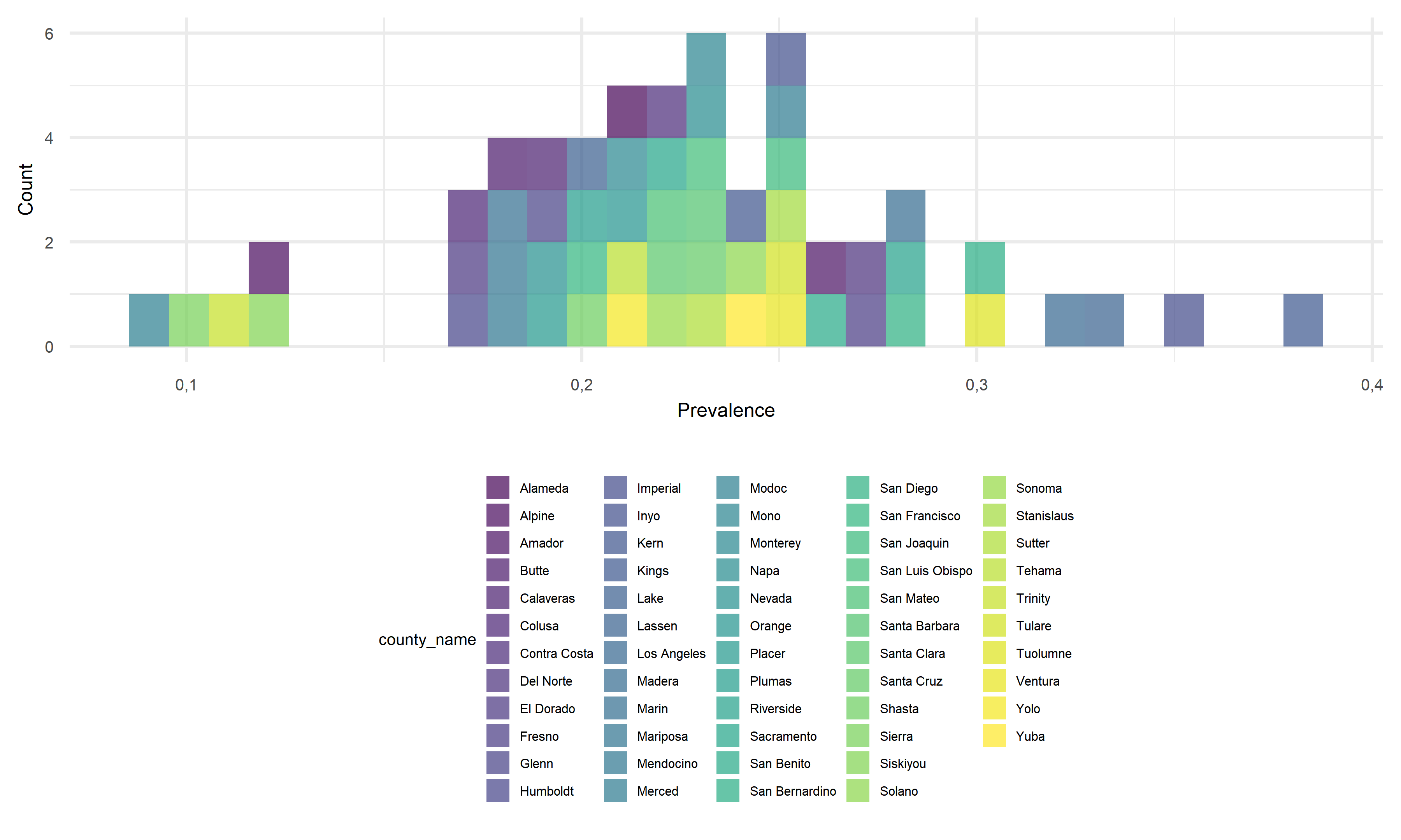
Until November 2022 (information given by data source), we can observe that the COVID prevalence ranges from as low as 0.094 to nearly 0.386 by county in California, suggesting a roughly 4.1x difference between the minimum and maximum. As a new study from the Centers for Disease Control and Prevention (CDC) revealed, the percentage of Americans who have been infected with COVID-19 is approximately 30% in November 2022. Taking the prevalence of 30% as the baseline for further comparisons, it is worth noticing that around 80% of counties in California have a moderate level of prevalence falling between around 16% to 29%, and around 10% of counties show a quite low prevalence below 15%. Only 6 out of 58 counties in California shows prevalence of above 30%. The COVID infection in California seems relatively controllable to a large extent compared to the general prevalence level across the United States. As for the prevalence differences, it may be caused by some other differentiable factors across counties, and we would like to further discuss about it in later parts.
1b. Death rate across county
The death rate, or called case-fatality ratio, is defined as the ratio of deaths to the population of a particular area or during a particular period of time. Analyzing death rate help us track the social economical and geographical characteristics of those dying due to COVID in California, and allow comparisons of death trends across counties.
point <- format_format(big.mark = " ", decimal.mark = ",", scientific = FALSE)

demo_plot_1 = demo %>%
    filter(!county_name %in% "Out of state") %>%
    group_by(county_name) %>%
    summarize(total_cases = sum(reported_cases),
              total_deaths = sum(reported_deaths),
              death_rate = total_deaths / total_cases) %>%
    mutate(county_name = fct_reorder(county_name, death_rate)) %>%
    ggplot(aes(x = county_name, y = death_rate, color = county_name)) +
    geom_point(alpha = 1) +
    theme(
      legend.position = "none"
    ) +
    labs(x = "County",
         y = "Death Rate",
         title = "Death Rate Across County") +
    theme(axis.text.x = element_text(angle = 60, hjust = 1)) +
    scale_y_continuous(labels = point)

ggplotly(demo_plot_1, width = 800, height = 500)
point <- format_format(big.mark = " ", decimal.mark = ",", scientific = FALSE)
demo %>%
filter(!county_name %in% "Out of state") %>%
group_by(county_name, population) %>%
summarize(total_cases = sum(reported_cases),
total_deaths = sum(reported_deaths),
death_rate = total_deaths / total_cases) %>%
mutate(county_name = fct_reorder(county_name, death_rate)) %>%
ggplot(aes(x = death_rate, fill = county_name)) +
geom_histogram(alpha = 0.7) +
labs(x = "Death Rate",
y = "Count") +
theme(
legend.position = "bottom"
) +
theme(legend.title = element_text(size = 5),
legend.key.size = unit(0.3, 'cm'),
legend.text = element_text(size = 4)) +
theme(
axis.title.x = element_text(size = 6),
axis.text.x = element_text(size = 5),
axis.title.y = element_text(size = 6),
axis.text.y = element_text(size = 5)) +
scale_y_continuous(labels = point) +
scale_x_continuous(labels = point)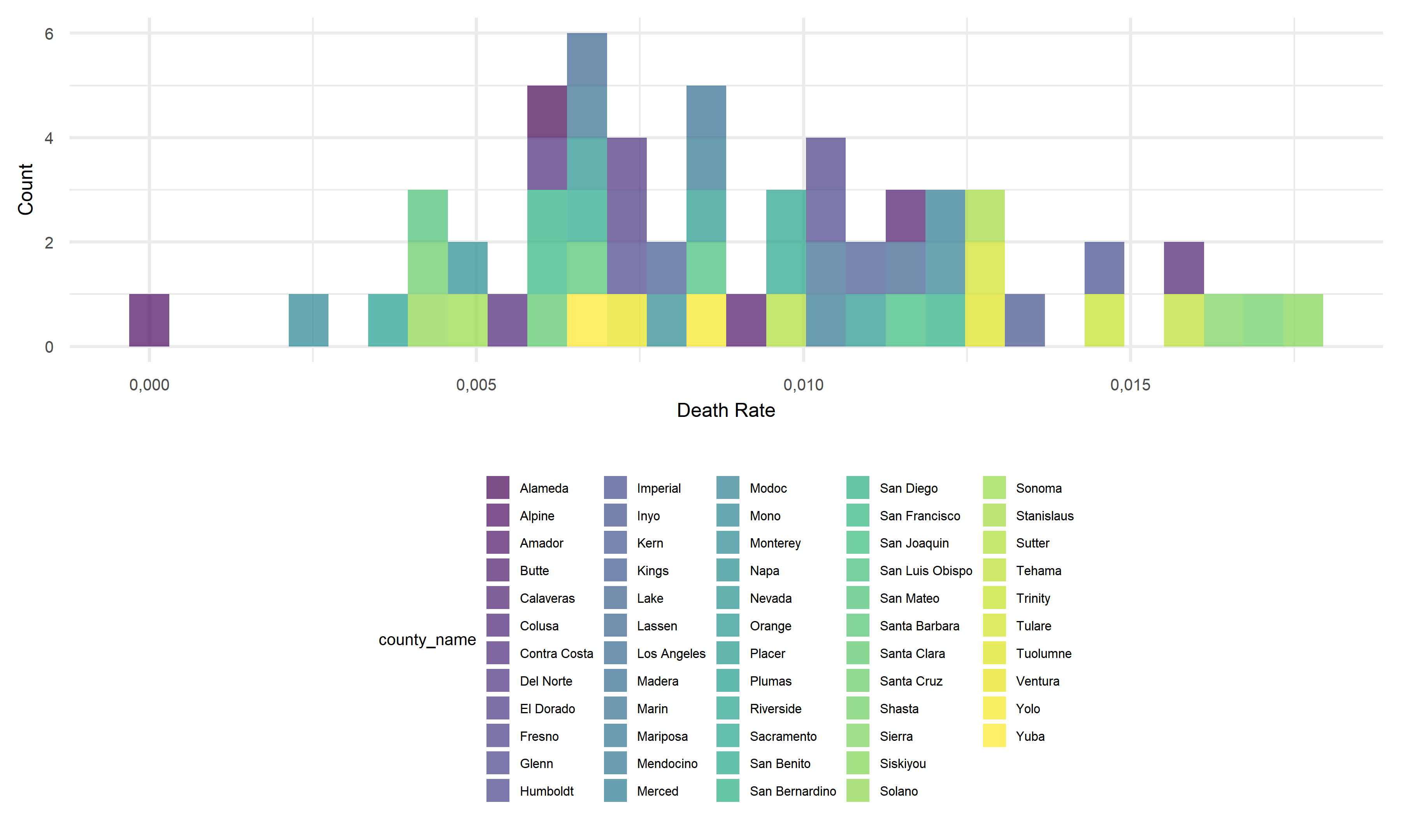
We can observe that the death rates range from as low as 0.00% to 1.76% by county in California. The density graph suggests a quite centralized distribution of death rates across counties, that most counties’ death rates fall between 0.25% to 1.25%. As for the minimum value from this data set, there is so far no recorded death so as 0% death rate in Alpine. As for the maximum, Siskiyou’s recorded death rate is 1.76% in November 2022, which is a little bit higher than the average country-wide death rate of 1.09% (data reported by John Hopkins University’s Coronavirus Resource Center). Considering the difference shown in death rates across counties, we will investigate the associations between this outcome variable and other potential factors in the following section.
2. Worst & Best conties for outcomes
2a. Worst counties for each COVID outcome
Furthermore, we zoom in on the pandemic responses and extract the 10 worst COVID outcome results, i.e. highest prevalence and highest death rates, in corresponding counties, and plot them as bar charts for a more straightforward visualization.
demo_worst_1 =
    demo %>%
    filter(!county_name %in% "Out of state") %>%
    group_by(county_name, population) %>%
    summarize(total_cases = sum(reported_cases),
              total_deaths = sum(reported_deaths),
              prevalence = total_cases/mean(population)) %>%
    select(county_name, prevalence) %>%
    arrange(desc(prevalence)) %>%
    head(10)

demo_worst_2 =
    demo %>%
    filter(!county_name %in% "Out of state") %>%
    group_by(county_name, population) %>%
    summarize(total_cases = sum(reported_cases),
              total_deaths = sum(reported_deaths),
              death_rates = total_deaths/total_cases) %>%
    select(county_name, death_rates) %>%
    arrange(desc(death_rates)) %>%
    head(10)

cbind(demo_worst_1, demo_worst_2) %>%
    knitr::kable(digits = 4,
                 caption = "Worst counties for each COVID outcome",
col.names = c("County for Prevalence", "Prevelence", "County for Death Rate", "Death Rate"))| County for Prevalence | Prevelence | County for Death Rate | Death Rate |
|---|---|---|---|
| Kings | 0.3864 | Siskiyou | 0.0176 |
| Imperial | 0.3483 | Shasta | 0.0168 |
| Lassen | 0.3356 | Sierra | 0.0162 |
| Los Angeles | 0.3249 | Calaveras | 0.0156 |
| San Bernardino | 0.3065 | Tehama | 0.0156 |
| Tuolumne | 0.3034 | Trinity | 0.0147 |
| Riverside | 0.2853 | Imperial | 0.0144 |
| San Diego | 0.2785 | Inyo | 0.0132 |
| Madera | 0.2780 | Tuolumne | 0.0130 |
| Del Norte | 0.2722 | Stanislaus | 0.0128 |
demo_worst_pre_plot =
    demo_worst_1 %>%
    mutate(county_name = fct_reorder(county_name, prevalence)) %>%
    ggplot(aes(x = reorder(county_name, prevalence, decreasing = T), y = prevalence, fill = county_name)) +
    geom_bar(stat = "identity", width = 0.5) +
    theme(
      legend.position = "none"
    ) +
    labs(x = '',
         y = "Prevalence",
         title = "Worst Prevalence") +
    theme(legend.title = element_text(size = 5),
          legend.key.size = unit(0.3, 'cm'),
          legend.text = element_text(size = 4)) +
    theme(axis.text.x = element_text(angle = 60, hjust = 1)) +
    theme(
          axis.title.x = element_text(size = 6),
          axis.text.x = element_text(size = 5),
          axis.title.y = element_text(size = 6),
          axis.text.y = element_text(size = 5)) +
          scale_y_continuous(labels = point)

demo_worst_dea_plot =
    demo_worst_2 %>%
    mutate(county_name = fct_reorder(county_name, death_rates)) %>%
    ggplot(aes(x = reorder(county_name, death_rates, decreasing = T), y = death_rates, fill = county_name)) +
    geom_bar(stat = "identity", width = 0.5) +
    theme(
      legend.position = "none"
    ) +
    labs(x = '',
         y = "Death Rate",
         title = "Worst Death Rate") +
    theme(legend.title = element_text(size = 5),
          legend.key.size = unit(0.3, 'cm'),
          legend.text = element_text(size = 4)) +
    theme(axis.text.x = element_text(angle = 60, hjust = 1)) +
    theme(
          axis.title.x = element_text(size = 6),
          axis.text.x = element_text(size = 5),
          axis.title.y = element_text(size = 6),
          axis.text.y = element_text(size = 5)) +
          scale_y_continuous(labels = point)

demo_worst_pre_plot + demo_worst_dea_plot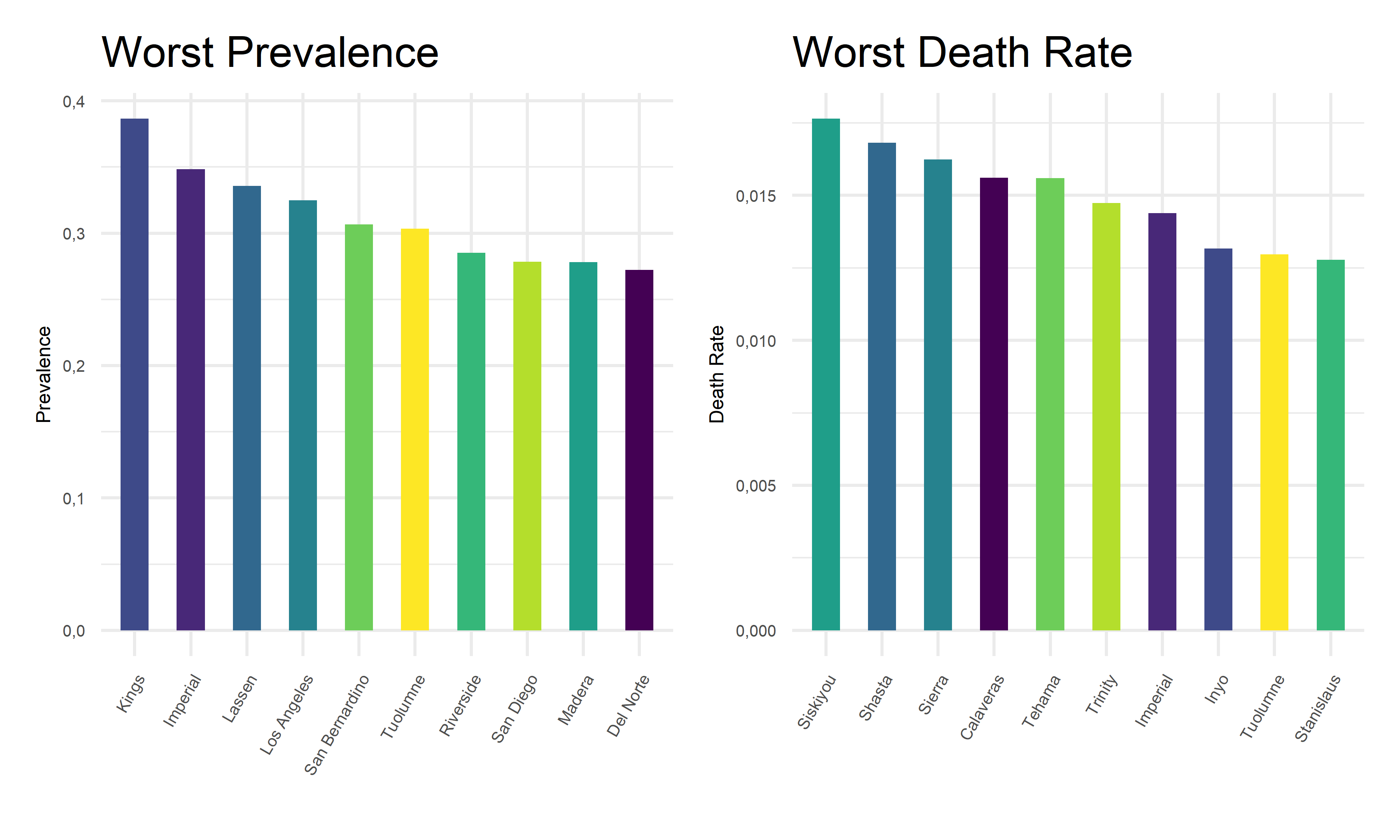
2b. Best counties for each COVID outcome
Also, we extract the 10 best covid outcome results, i.e. lowest prevalence and lowest death rates, in corresponding counties.
demo_best_1 =
    demo %>%
    filter(!county_name %in% "Out of state") %>%
    group_by(county_name, population) %>%
    summarize(total_cases = sum(reported_cases),
              total_deaths = sum(reported_deaths),
              prevalence = total_cases/mean(population)) %>%
    select(county_name, prevalence) %>%
    arrange(prevalence) %>%
    head(10)

demo_best_2 =
    demo %>%
    filter(!county_name %in% "Out of state") %>%
    group_by(county_name, population) %>%
    summarize(total_cases = sum(reported_cases),
              total_deaths = sum(reported_deaths),
              death_rates = total_deaths/total_cases) %>%
    select(county_name, death_rates) %>%
    arrange(death_rates) %>%
    head(10)

cbind(demo_best_1, demo_best_2) %>%
    knitr::kable(digits = 4,
                 caption = "Best counties for each COVID outcome",
col.names = c("County for Prevalence", "Prevelence", "County for Death Rate", "Death Rate"))| County for Prevalence | Prevelence | County for Death Rate | Death Rate |
|---|---|---|---|
| Modoc | 0.0945 | Alpine | 0.0000 |
| Sierra | 0.0989 | Mono | 0.0025 |
| Trinity | 0.1067 | Plumas | 0.0035 |
| Siskiyou | 0.1225 | Santa Cruz | 0.0042 |
| Alpine | 0.1235 | San Mateo | 0.0043 |
| Humboldt | 0.1667 | Solano | 0.0044 |
| Colusa | 0.1700 | Sonoma | 0.0049 |
| El Dorado | 0.1712 | Napa | 0.0049 |
| Mariposa | 0.1774 | Colusa | 0.0057 |
| Marin | 0.1775 | Alameda | 0.0058 |
demo_best_pre_plot =
    demo_best_1 %>%
    mutate(county_name = fct_reorder(county_name, prevalence)) %>%
    ggplot(aes(x = reorder(county_name, prevalence, decreasing = F), y = prevalence, fill = county_name)) +
    geom_bar(stat = "identity", width = 0.5) +
    theme(
      legend.position = "none"
    ) +
    labs(x = '',
         y = "Prevalence",
         title = "Best Prevalence") +
    theme(legend.title = element_text(size = 5),
          legend.key.size = unit(0.3, 'cm'),
          legend.text = element_text(size = 4)) +
    theme(axis.text.x = element_text(angle = 60, hjust = 1)) +
    theme(
          axis.title.x = element_text(size = 6),
          axis.text.x = element_text(size = 5),
          axis.title.y = element_text(size = 6),
          axis.text.y = element_text(size = 5)) +
          scale_y_continuous(labels = point)

demo_best_dea_plot =
    demo_best_2 %>%
    mutate(county_name = fct_reorder(county_name, death_rates)) %>%
    ggplot(aes(x = reorder(county_name, death_rates, decreasing = F), y = death_rates, fill = county_name)) +
    geom_bar(stat = "identity", width = 0.5) +
    theme(
      legend.position = "none"
    ) +
     labs(x = '',
         y = "Death Rate",
         title = "Best Death Rate") +
    theme(legend.title = element_text(size = 5),
          legend.key.size = unit(0.3, 'cm'),
          legend.text = element_text(size = 4)) +
    theme(axis.text.x = element_text(angle = 60, hjust = 1)) +
    theme(
          axis.title.x = element_text(size = 6),
          axis.text.x = element_text(size = 5),
          axis.title.y = element_text(size = 6),
          axis.text.y = element_text(size = 5)) +
          scale_y_continuous(labels = point)

demo_best_pre_plot + demo_best_dea_plot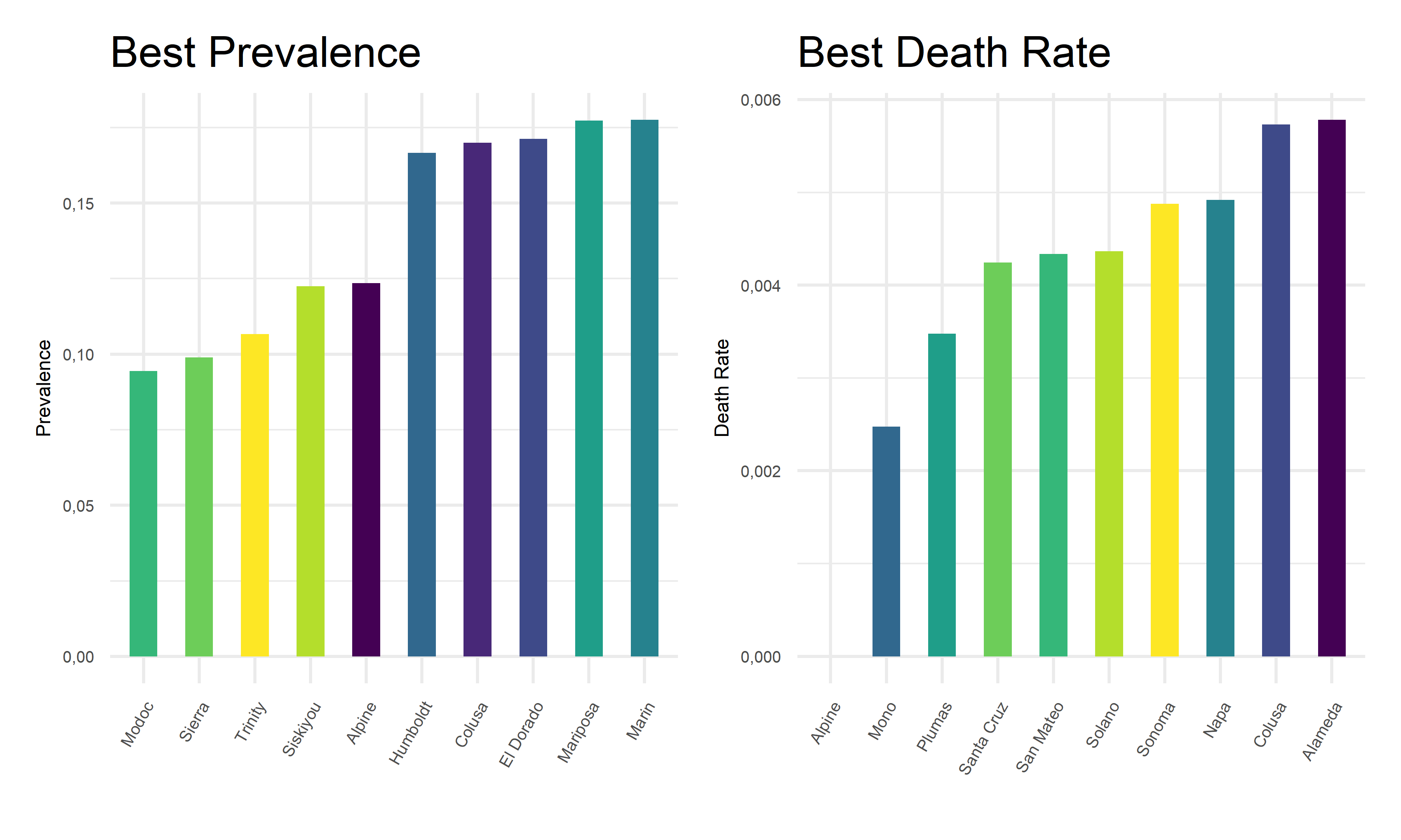
From the above tables and bar charts, Kings County responses to COVID with highest prevalence of 38.64%, and Siskiyou responses to covid with highest death rate of 1.76%. In comparison, Modoc has the lowest prevalence of 9.45% in California, and Alpine has no recorded death until November 2022. Upon observations, two out of ten counties with top prevalence, Imperial and Tuolumne, also have top death rates. And two out of ten counties with lowest prevalence, Alpine and Colusa, also have lowest death rates. While to be highlighted here, Siskiyou County has one of the lowest prevalence but the highest death rate among all counties. This preliminary observation indicates that it is hard to obtain an apparent relationship between the prevalence and death rates. Further steps are required to take in order to explore the associations and correlations between our two outcome variables, COVID prevalence and death rates.
3. Correlation between outcomes
    demo %>%
    filter(!county_name %in% "Out of state") %>%
    group_by(county_name, population) %>%
    summarize(total_cases = sum(reported_cases),
              total_deaths = sum(reported_deaths),
              prevalence = total_cases/mean(population),
              death_rates = total_deaths/total_cases) %>%
    ungroup() %>%
    dplyr::select(prevalence, death_rates) %>%
    GGally::ggpairs() %>%
    ggplotly(width = 650, height = 400)
The points fall quite randomly on the plot, which indicates that there is no obvious or strong relationship between the outcome variables. Moreover, the correlation coefficient can range in value from −1 to +1. The larger the absolute value of the coefficient, the stronger the relationship between the variables. In our case, the correlation coefficient of -0.086 means that the relationship between outcomes are very weak and it is not statistically significant at all. Before this procedure, we made a reasonable guess that as prevalence increases, the death rates may increase. However, this plot result contradicts our hypothesis by showing a negative correlation in nature. Hence, in order to gather more comprehensive evidence on this relationship, we decide to take population by county into consideration for a further test on the association between outcomes.
4. Associations between outcomes across county
To find out the associations between two outcomes across counties, we decide to use bubble chart to visualize relationships between three numeric variables, death rates, prevalence proportion, and the population size for each county.
 demo_asso =
    demo %>%
    filter(!county_name %in% "Out of state") %>%
    group_by(county_name, population) %>%
    summarize(total_cases = sum(reported_cases),
              total_deaths = sum(reported_deaths),
              prevalence = total_cases/mean(population),
              death_rates = total_deaths/total_cases) %>%
    ggplot(aes(x = prevalence, y = death_rates)) +
      geom_point(aes(color = county_name, size = population)) +
      geom_smooth(method = lm, se = FALSE, color = "red", size = 0.4, aes(weight = population)) +
      labs(
        x = "Prevalence",
        y = "Death Rate",
        size = "Population",
        col = "County",
        title = "Associations Between Outcomes Across County"
      ) +
        theme(legend.title = element_text(size = 5),
          legend.key.size = unit(0.3, 'cm'),
          legend.text = element_text(size = 4)) +
    theme(axis.text.x = element_text(angle = 60, hjust = 1)) +
    theme(
          axis.title.x = element_text(size = 6),
          axis.text.x = element_text(size = 5),
          axis.title.y = element_text(size = 6),
          axis.text.y = element_text(size = 5))

ggplotly(demo_asso, width = 800, height = 500)
As we plotted, the values for each bubble are encoded by its horizontal position on the x-axis of prevalence, its vertical position on the y-axis of death rates, and the size of the bubble depends on the population size. The color of each bubble represent different counties in California to provide a visual sense.
On one hand, there is a positive best-fit trend line drawn on this plot which indicates a positive relationship between prevalence and death rates across counties, although this relationship is considerably weak. On the other hand, as the values on the horizontal and vertical scale decreases, we can only observe small bubbles on the bottom-left corners. And as the values on the horizontal or vertical scale increases, relatively large bubbles start to appear. To add on, the largest bubble of Los Angeles located on the top-right corner on this graph, indicating its relatively high prevalence and high death rate. These two perspective of findings may coincide with each other, suggesting a positive but weak relationship between outcomes across county.
Combining our findings in part 3 and 4, we can primarily conclude
that across counties in California, prevalence and
death rate are very weakly correlated.