MLR prevalence
Data Importing
source("data_preprocessing_backbone.R")
labor_data = read_csv("./data/CA_Labor.csv") %>%
    janitor::clean_names() %>%
    dplyr::select(-employment,-unemployment,-rank) %>%
    rename(unemployment=unemployment_rate_per_cent)

population_data = read_csv("./data/CA_Land_Area.csv") %>%
    janitor::clean_names() %>%
    dplyr::select(-rank, -state) %>%
    mutate(
        location = ifelse(county %in% c("Los Angeles", "Orange", "San Diego", "Monterey", "San Benito", "San Luis Obispo", "Santa Barbara", "Santa Cruz", "Ventura", "Alameda", "Contra Costa", "Marin", "Napa", "San Francisco", "San Mateo", "Santa Clara", "Solano", "Sonoma", "Del Norte", "Humboldt", "Mendocino"), "costal", "inland"))

ca_nonmedical_data = left_join(population_data, labor_data, by = c("county")) %>%
    mutate(labor_rate = labor_force/population*100) %>%
    dplyr::select(-labor_force)

demo_covid = demo %>%
    mutate(cumulative_deaths= as.numeric(population),
           cumulative_cases = as.numeric(cumulative_cases),
        prevalence=cumulative_cases/population*100,
        test = cumulative_total_tests/population*100,
        ) %>%
    dplyr::select(county_name, prevalence, test, population) %>%
    rename(county=county_name) %>%
    group_by(county) %>%
    summarize(prevalence=max(prevalence),
              test = max(test)) %>%
    filter(!county %in% c("Out of state","Unknown"))

vaccine = read_csv("./data/CA_covid19vaccines.csv") %>%
    janitor::clean_names() %>%
    group_by(county) %>%
    summarise(
        fully_vaccinated = sum(fully_vaccinated)
        # total number of fully vaccinated people
            ) %>%
    arrange(county) %>%
    drop_na() %>%
    filter(!county %in% c("Unknown", "All CA Counties", "All CA and Non-CA Counties"))

ca_medical_data = left_join(demo_covid, vaccine, by =c("county"))
ca_premodel_data = left_join(ca_medical_data, ca_nonmedical_data, by = c("county")) %>%
    mutate(
        vaccination=fully_vaccinated/population*100) %>%
    dplyr::select(-fully_vaccinated)

skimr::skim(ca_premodel_data)| Name | ca_premodel_data |
| Number of rows | 58 |
| Number of columns | 9 |
| _______________________ | |
| Column type frequency: | |
| character | 2 |
| numeric | 7 |
| ________________________ | |
| Group variables | None |
Variable type: character
| skim_variable | n_missing | complete_rate | min | max | empty | n_unique | whitespace |
|---|---|---|---|---|---|---|---|
| county | 0 | 1 | 4 | 15 | 0 | 58 | 0 |
| location | 0 | 1 | 6 | 6 | 0 | 2 | 0 |
Variable type: numeric
| skim_variable | n_missing | complete_rate | mean | sd | p0 | p25 | p50 | p75 | p100 | hist |
|---|---|---|---|---|---|---|---|---|---|---|
| prevalence | 0 | 1 | 22.53 | 5.77 | 9.45 | 19.54 | 22.51 | 25.47 | 38.64 | ▂▆▇▂▁ |
| test | 0 | 1 | 367.42 | 171.84 | 104.51 | 277.33 | 312.06 | 402.06 | 983.95 | ▅▇▂▁▁ |
| land_area_sq_mi | 0 | 1 | 2685.85 | 3102.32 | 46.87 | 959.49 | 1535.34 | 3454.40 | 20056.92 | ▇▂▁▁▁ |
| population | 0 | 1 | 656326.21 | 1443528.73 | 1202.00 | 47277.50 | 179992.50 | 656486.00 | 9974203.00 | ▇▁▁▁▁ |
| unemployment | 0 | 1 | 7.33 | 2.12 | 4.42 | 5.97 | 6.96 | 8.22 | 17.37 | ▇▆▁▁▁ |
| labor_rate | 0 | 1 | 45.90 | 6.86 | 27.46 | 41.68 | 47.42 | 50.03 | 65.86 | ▁▃▇▂▁ |
| vaccination | 0 | 1 | 65.81 | 15.11 | 26.84 | 54.55 | 64.62 | 76.02 | 101.87 | ▁▆▇▆▃ |
Background
- We were curious about what medical and non-medical factors were associated with infection rates or prevalence, so we collected labor force data, population data as non-medical data for each county in California, using the percentage value of the largest labor force to population over a three-year range as an important indicator of local economic conditions, in addition to unemployment rate data, which is the ratio of the unemployed population divided by the labor force. Also, we collected COVID infection death data, vaccination data from each county, and defined the infection rate (prevalence) as \(\frac{total\ cases}{maximum\ total\ population}\) over 2020-2022, and the vaccination rate as \(\frac{fully\ vaccinated\ population}{maximum\ total\ population}\) over the three-year period.
Data processing
- Labor force data: Because total population data are not available in this dataset, calculating the labor force rate requires demographic variables from the population dataset. Therefore, I extracted the county name, unemployment rate, and labor force variables.
- Demographic data: We extracted county area, population, and divided the counties into coastal and inland counties based on the official definition of coastal counties as another important potential economic indicator.
- Labor force data and total population data were combined by
left_joinand divided by labor force by population as labor force percentage - COVID data: daily covid infection death data for each county, I divided the total number of infections by the population as the prevalence rate and the total number of tests by the population as the nucleic acid detection rate, and finally the county was used as the county, and the largest value over three years was taken as the indicator for that county.
- Vaccine data: Similar to COVID data, the number of full vaccination completions divided by the total population was extracted as the vaccination rate, and the largest value over three years was taken as the indicator for that county.
- The above data were combined to obtain pre-modeling pre-modelling data, including county, prevalence, test, land_area_sq_mi, population, location, unemployment, labor_rate, vaccination. This pre-modelling data includes 58 observations and 9 variables, without empty cells in each variables. Now we are interested on whether the death cases are associated with these selected variables.
Data Description
point <- format_format(big.mark = " ", decimal.mark = ",", scientific = FALSE)
rawplot_prevalence = ca_premodel_data %>%
    ggplot(aes(x = prevalence)) +
    geom_density(fill = "#69b3a2", color = "#e9ecef", alpha = .8) +
    scale_y_continuous(labels = point)

rawplot_unemployment = ca_premodel_data %>%
    ggplot(aes(x = unemployment)) +
    geom_density(fill = "#69b3a2", color = "#e9ecef", alpha = .8) +
    scale_y_continuous(labels = point) +
    scale_x_continuous(labels = point)

rawplot_labor = ca_premodel_data %>%
    ggplot(aes(x = labor_rate)) +
    geom_density(fill = "#69b3a2", color = "#e9ecef", alpha = .8) +
    scale_y_continuous(labels = point) +
    scale_x_continuous(labels = point)

rawplot_population = ca_premodel_data %>%
    ggplot(aes(x = population)) +
    geom_density(fill = "#69b3a2", color = "#e9ecef", alpha = .8) +
    scale_y_continuous(labels = point) +
    scale_x_continuous(labels = point)

plot_area = ca_premodel_data %>%
    ggplot(aes(x = land_area_sq_mi)) +
    geom_density(fill = "#69b3a2", color = "#e9ecef", alpha = .8)

plot_test = ca_premodel_data %>%
    ggplot(aes(x = test)) +
    geom_density(fill = "#69b3a2", color = "#e9ecef", alpha = .8)

ca_model_data = ca_premodel_data %>%
    mutate(ln_unemployment = log(unemployment),
           ln_area = log(land_area_sq_mi),
           ln_population = log(population),
           ln_test = log(test)) %>%
    dplyr::select(-unemployment,-land_area_sq_mi,-population,-test,-county)

plot_ln_test = ca_model_data %>%
    ggplot(aes(x = ln_test)) +
    geom_density(fill = "#69b3a2", color = "#e9ecef", alpha = .8)

plot_ln_unemployment = ca_model_data %>%
    ggplot(aes(x = ln_unemployment)) +
    geom_density(fill = "#69b3a2", color = "#e9ecef", alpha = .8)

plot_ln_area = ca_model_data %>%
    ggplot(aes(x = ln_area)) +
    geom_density(fill = "#69b3a2", color = "#e9ecef", alpha = .8)

plot_ln_population = ca_model_data %>%
    ggplot(aes(x = ln_population)) +
    geom_density(fill = "#69b3a2", color = "#e9ecef", alpha = .8)

(rawplot_prevalence + rawplot_unemployment + plot_area + rawplot_population+plot_test)/(rawplot_labor + plot_ln_unemployment + plot_ln_area+plot_ln_population+plot_ln_test)
ca_model_data %>%
    gtsummary::tbl_summary() %>%
    gtsummary::bold_labels() %>%
    as.tibble() %>%
knitr::kable()| Characteristic | N = 58 |
|---|---|
| prevalence | 23 (20, 25) |
| location | NA |
| costal | 21 (36%) |
| inland | 37 (64%) |
| labor_rate | 47 (42, 50) |
| vaccination | 65 (55, 76) |
| ln_unemployment | 1.94 (1.79, 2.11) |
| ln_area | 7.34 (6.87, 8.15) |
| ln_population | 12.10 (10.76, 13.39) |
| ln_test | 5.74 (5.63, 6.00) |
- The cleaned data includes 58 states and 8 variables including prevalence, location, labor_rate, vaccination, ln_unemployment, ln_area, ln_population, ln_test. For those variables whose data is extremely right-skewed and the natural logarithms are applied to each exploratory continuous variables. By the plots and summary table we can see all the variables are almost bell-shaped, so in the modelling dataset we deleted the original variables that need to be transformed, keep the transformed variables, and delete the county variable because the county variable itself does not play a role in the model.
Correlation
ca_model_data %>%
    dplyr::select(-location) %>%
    GGally::ggpairs(upper = list(continuous = GGally::wrap("cor", size = 3)))
- The overall correlation and covariance between the independent
variables are not obvious, but among them we can see that there is a
large trend of correlation and covariance between
vaccinationandlabor_rate, implying that including that including both of these variables in the model could result in poor coefficient estimation and inflated standard errors (due to multicollinearity). Our model selection techniques are able to figure this out.
Modelling Fit
reg_full = lm(prevalence ~ ., data = ca_model_data)

reg_intercept = lm(prevalence ~ 1, data = ca_model_data)- We fitted a model with all potential predictors and a model including only the intercept for proceeding automatic model selection.
Model Selection
Automatic and Criterion Model selection Methods
#forward Selection
step(reg_intercept, direction='forward', scope=formula(reg_full),trace=0) %>%
    broom::tidy() %>%
  mutate(term = str_replace(term, "^location", "Location: ")) %>%
knitr::kable(digits = 3)| term | estimate | std.error | statistic | p.value |
|---|---|---|---|---|
| (Intercept) | -71.447 | 8.097 | -8.823 | 0.000 |
| ln_test | 9.815 | 1.128 | 8.703 | 0.000 |
| ln_unemployment | 8.066 | 1.855 | 4.349 | 0.000 |
| ln_area | 1.341 | 0.472 | 2.839 | 0.006 |
| ln_population | 0.820 | 0.270 | 3.038 | 0.004 |
| Location: inland | 1.956 | 1.108 | 1.765 | 0.083 |
#backwards elimination
step(reg_full, direction='backward', scope=formula(reg_full),trace=0) %>%
    broom::tidy() %>%
  mutate(term = str_replace(term, "^location", "Location: ")) %>%
knitr::kable(digits = 3)| term | estimate | std.error | statistic | p.value |
|---|---|---|---|---|
| (Intercept) | -71.447 | 8.097 | -8.823 | 0.000 |
| Location: inland | 1.956 | 1.108 | 1.765 | 0.083 |
| ln_unemployment | 8.066 | 1.855 | 4.349 | 0.000 |
| ln_area | 1.341 | 0.472 | 2.839 | 0.006 |
| ln_population | 0.820 | 0.270 | 3.038 | 0.004 |
| ln_test | 9.815 | 1.128 | 8.703 | 0.000 |
#stepwise Selection
step(reg_full, direction = "both", scope=formula(reg_full),trace=0) %>%
    broom::tidy() %>%
  mutate(term = str_replace(term, "^location", "Location: ")) %>%
knitr::kable(digits = 3)| term | estimate | std.error | statistic | p.value |
|---|---|---|---|---|
| (Intercept) | -71.447 | 8.097 | -8.823 | 0.000 |
| Location: inland | 1.956 | 1.108 | 1.765 | 0.083 |
| ln_unemployment | 8.066 | 1.855 | 4.349 | 0.000 |
| ln_area | 1.341 | 0.472 | 2.839 | 0.006 |
| ln_population | 0.820 | 0.270 | 3.038 | 0.004 |
| ln_test | 9.815 | 1.128 | 8.703 | 0.000 |
# Use criterion-based procedures to guide your selection of the ‘best subset’
# chosen using SSE/RSS (smaller is better)
criterion_selected = regsubsets(prevalence ~ ., data = ca_model_data)
criterion_plot = summary(criterion_selected)

# plot of Cp and Adj-R2 as functions of parameters
x_new = (2:8)
y_new = criterion_plot$cp
z_new = criterion_plot$adjr2
cp_new_p =
cbind(x_new, y_new, z_new) %>%
    as.tibble() %>%
    rename(`Number of parameter` = x_new,
           `Cp value` = y_new,
           `Adj R-square` = z_new) %>%
    mutate(p = `Number of parameter`)
cp_fe_new_1 =
    cp_new_p %>%
    ggplot() +
    geom_point(aes(x = `Number of parameter`, y = `Cp value`, color = `Cp value`)) +
    theme(legend.position = "none") +
    geom_abline(intercept = 0, slope = 1, color = "red")
cp_fe_new_2 =
    cp_new_p %>%
    ggplot() +
    geom_point(aes(x = `Number of parameter`, y = `Adj R-square`, color = `Adj R-square`)) +
    theme(legend.position = "none")

cp_fe_new_1 + cp_fe_new_2
- By the three automatic model selection models: forward selection, backward elimination and stepwise selection, we got the same result containing six parameters (five predictors):
\(\hat{prevalence}=-71.4474+1.9559*I(location=inland)+8.0663*ln(unemployment)+1.3412*ln(area)+0.8201*ln(population)+9.8152*ln(test)\)
- The plots above show the \(C_p\) index and Adjusted \(R^2\) for various numbers of parameters. When choosing a model based on \(C_p\) criterion, we want to choose a model for which \(C_p \leq p\), where p is the number of parameters. From the \(C_p\) plot above, we should have either 6 parameters (5 predictors), 7 parameters (6 predictors), or 8 parameters (7 predictors). If we consider the principle of parsimony as well, i.e. the model should be as simple as possible while keeping the same descriptive and prediction ability, this would suggest the 6 parameters (5 predictors) model. Also, it has the lowest value for \(C_p\) compared with the number of parameters and the highest \(R^2\).
Penalized Model Selection Method: LASSO
ca_lasso_data = ca_model_data %>% mutate(
    location=ifelse(location =="costal", 1,0))
# using cross validation to choose lambda
lambda_seq = 10^seq(-5, 0, by = .01)
set.seed(2022)
cv_object <- cv.glmnet(as.matrix(ca_lasso_data[2:8]), ca_lasso_data$prevalence,
lambda = lambda_seq, nfolds = 5)
cv_object
##
## Call: cv.glmnet(x = as.matrix(ca_lasso_data[2:8]), y = ca_lasso_data$prevalence, lambda = lambda_seq, nfolds = 5)
##
## Measure: Mean-Squared Error
##
## Lambda Index Measure SE Nonzero
## min 0.2818 56 11.76 3.542 5
## 1se 0.9550 3 15.21 5.401 4# plot the CV results
tibble(lambda = cv_object$lambda,
mean_cv_error = cv_object$cvm) %>%
mutate(text_label = str_c("Lambda: ", lambda,
"\n Mean CV error: ", mean_cv_error)) %>%
plotly::plot_ly(y = ~mean_cv_error, x = ~lambda,
color = ~lambda,
width = 900,
height = 500,
type = "scatter",
mode = "markers",
marker = list(size = 6),
colors = "magma",
text = ~ text_label)# refit the lasso model with the "best" lambda
fit_bestcv <- glmnet(as.matrix(ca_lasso_data[2:8]), ca_lasso_data$prevalence, lambda = cv_object$lambda.min)
fit_bestcv %>%
broom::tidy() %>%
mutate(term = str_replace(term, "^location", "Location: ")) %>%
knitr::kable(digits = 3)| term | step | estimate | lambda | dev.ratio |
|---|---|---|---|---|
| (Intercept) | 1 | -59.142 | 0.282 | 0.724 |
| Location: | 1 | -0.884 | 0.282 | 0.724 |
| ln_unemployment | 1 | 7.620 | 0.282 | 0.724 |
| ln_area | 1 | 1.131 | 0.282 | 0.724 |
| ln_population | 1 | 0.637 | 0.282 | 0.724 |
| ln_test | 1 | 8.767 | 0.282 | 0.724 |
To make it easier for LASSO to proceed, I converted the
positionvariables to 0 and 1. Using the LASSO method to perform variable selection, the key step is to make sure choosing the optimal \(\lambda\) to efficiently reduce the complexity of the model while some descriptive prediction ability maintained. Thus a five-fold cross validation was performed.Since the stepwise selection techniques and the criterion techniques all chose the same model with 5 predictors, we recommend this as our final model. Also, the LASSO gave a very similar suggested model.
Fitting the seleted final model
mlr_model = lm(prevalence~location+ln_test+ln_unemployment+ln_area+ln_population,data = ca_model_data)
mlr_model %>%
  broom::tidy() %>%
  mutate(term = str_replace(term, "^location", "Location: ")) %>%
knitr::kable(digits = 3)| term | estimate | std.error | statistic | p.value |
|---|---|---|---|---|
| (Intercept) | -71.447 | 8.097 | -8.823 | 0.000 |
| Location: inland | 1.956 | 1.108 | 1.765 | 0.083 |
| ln_test | 9.815 | 1.128 | 8.703 | 0.000 |
| ln_unemployment | 8.066 | 1.855 | 4.349 | 0.000 |
| ln_area | 1.341 | 0.472 | 2.839 | 0.006 |
| ln_population | 0.820 | 0.270 | 3.038 | 0.004 |
As almost all the terms has p-value < 0.05, with the
locationvariable < 0.1, we can conclude that all the predictor coefficients are statistical significant at 0.1 significance level forlocationand 0.05 significance level for others, hence all the five variables will be included in the model. All these methods agree on the same suggested model or predictors. This might give good evidence that we should explore this model further.From the outputs above, we see that location had a p-value close to 0.05. This might mean that the relationship between prevalence and location is weak. Also, the highly correlated variables
vaccinationandlabor_rateneither was included in the final models.
Modelling Diagnosis
check_model(mlr_model, check = c("linearity", "qq", "normality", "outliers", "homogeneity", "vif"))
- Overall, these plots look like this model is fitting the data well. No influential point detected. However the residual points showed some kinds trend and the horizontal line is not such stable on the edge area, it may be worth investigating further by weighted least squares regression.
Weighted Least Squares Regression
# define sd function
sd_function <- lm(abs(reg_full$residuals) ~ reg_full$fitted.values)

var_fitted <- sd_function$fitted.values^2

#define weight
wt <- 1/var_fitted

wls_full = lm(prevalence~.,data = ca_model_data, weights = wt)

wls_prevalence = step(wls_full, direction='backward', scope=formula(wls_full),trace=0)

wls_prevalence %>%
  broom::tidy() %>%
  mutate(term = str_replace(term, "^location", "Location: ")) %>%
knitr::kable(digits = 3)| term | estimate | std.error | statistic | p.value |
|---|---|---|---|---|
| (Intercept) | -73.046 | 7.992 | -9.140 | 0.000 |
| Location: inland | 2.131 | 1.099 | 1.938 | 0.058 |
| ln_unemployment | 7.619 | 1.884 | 4.045 | 0.000 |
| ln_area | 1.344 | 0.464 | 2.898 | 0.005 |
| ln_population | 0.904 | 0.265 | 3.406 | 0.001 |
| ln_test | 10.044 | 1.144 | 8.779 | 0.000 |
check_model(wls_prevalence, check = c("linearity", "qq", "normality", "outliers", "homogeneity", "vif"))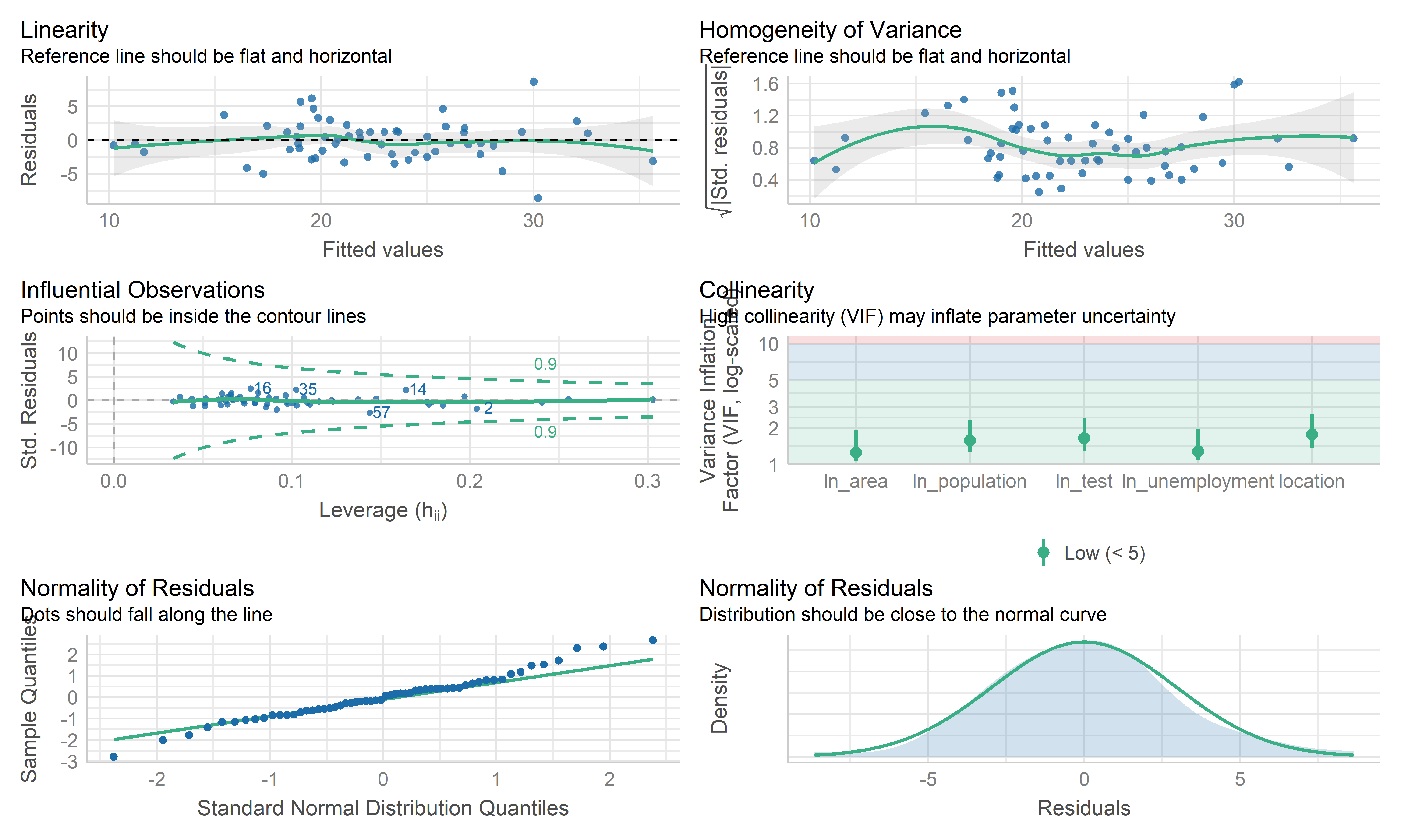
- The coefficient estimate for the predictors variable changed somewhat and the model fit improved.
- The residual standard error per coefficient slightly changed in the weighted LS model. This shows that the predictions from the WLS model are much closer to the actual observations than those from the ordinary LS model.
- \(R^2\) improved in the WLS model. WLS model is able to explain more of the variation in prevalence compared to the OLS model.
- Therefore, I regard both MLR’s mod and WLS’s mod as good models. Because the data are collected from the overall California county-level big data, each observation may contain some special information rather than typo or anything else. This modeling mainly focuses on exploring the predictors used to explain the prevalence, therefore, the MLR model is used here as the final model, while WLS can be used for potential prediction.
Cross Validation
set.seed(2022)
# use 10-fold validation and create the training sets
train = trainControl(method = "cv", number = 10)
# fit the 4-variables model that we selected as our final model
model_caret = train(prevalence~location+ln_test+ln_unemployment+ln_area+ln_population, data = ca_model_data, trControl = train, method = 'lm', na.action = na.pass)
model_caret
## Linear Regression
##
## 58 samples
## 5 predictor
##
## No pre-processing
## Resampling: Cross-Validated (10 fold)
## Summary of sample sizes: 53, 52, 51, 53, 52, 52, ...
## Resampling results:
##
## RMSE Rsquared MAE
## 3.079446 0.7261623 2.558792
##
## Tuning parameter 'intercept' was held constant at a value of TRUEmodel_caret$resample## RMSE Rsquared MAE Resample
## 1 2.825007 0.76359260 2.519925 Fold01
## 2 3.190194 0.71590015 2.853202 Fold02
## 3 1.433165 0.88045483 1.304306 Fold03
## 4 1.979195 0.92212958 1.704161 Fold04
## 5 1.933953 0.96590869 1.669703 Fold05
## 6 3.339120 0.53507207 2.909027 Fold06
## 7 3.306837 0.71923646 2.572679 Fold07
## 8 3.019968 0.87696581 2.490659 Fold08
## 9 4.714584 0.78563673 3.646323 Fold09
## 10 5.052439 0.09672592 3.917936 Fold10- From the output above, the overall RMSE (root mean squared error) is 3.079, which would mean our MSE is 9.483. Our MAE (mean absolute error) is 2.559. These measures show that this model is doing a good job at predicting responses for “new” data points. Additionally, the variance for these measures is relatively small, showing that these estimates are probably pretty close to the true predictive ability. This means that the MLR model can still be used to predict the COVID prevalence.
Conclusion
- We employed automatic search procedures, criterion based approaches, and the LASSO technique to select a final model:
\(\hat{prevalence}=-71.4474+1.9559*I(location=inland)+8.0663*ln(unemploy)+1.3412*ln(area)+0.8201*ln(population)+9.8152*ln(test)\)
From this model, we can see that as the while the location is inland, unemployment, land area, population and test participation increases, the predicted prevalence increases. This is probably because inland counties, counties with high unemployment generally have poor economy so that poor medical conditions, which may finally lead to increased prevalence; while the large size of the county and the high population of the county may lead to increased prevalence due to dense population, but still needs further investigation. In addition, the high prevalence is from increased test participation is somewhat surprising, but it may be because more potential positive patients are able to be detected.
Overall, from our 10-fold cross validation, we see that our model has pretty good predictive ability for new points. However, this model was only built on data on the county level, so there may be some special information missing, but the overall model reflects the correlation and relationship between the prevalence and some predictors in California.