Outcome by Demographics
Summarizing data by key demographic variables provides a comprehensive characterization of the outbreak, such as geographic distribution (place) and the populations (persons) affected by the disease. Characterization of the outbreak by person provides a description of whom the case-patients are and who is at risk of COVID. Person characteristics that are usually described include both host characteristics (age, gender, race and medical status) and possible exposures (occupations, physical activities, medications, tobacco, and drugs). Both of these influence susceptibility to disease and opportunities for exposure.
The three most commonly described host characteristics are age, gender, and race because they are easily collected information and because they are often closely related to exposure and to the risk of disease. Epidemiological studies often use inclusion or exclusion criteria that explicitly restrict study populations to a specific subset for each of these variables. Then, the following stratification analysis may be possibly used to reduce bias.
In this project, we found it interesting to discuss the different COVID responses under different host characteristics (age, gender, and race) of the population at risk in California.
Prevalence by demographics
In the first section, we would like to discuss the prevalence among different demographic subgroups.
Prevalence vs Age
point <- format_format(big.mark = " ", decimal.mark = ",", scientific = FALSE)
grid.arrange(

    age %>%
    group_by(age_group) %>%
    summarise(prevalence = sum(total_cases)/(mean(percent_of_ca_population)*38066920)) %>%  # California total population = 38066920
    ggplot(aes(x = age_group, y = prevalence, fill = age_group)) +
    geom_bar(stat = "identity", width = 0.5) +
    scale_fill_viridis(discrete = TRUE) +
    theme(
      legend.position = "none"
    ) +
    xlab("Age") +
    ylab("Prevalence") +
    theme(legend.title = element_text(size = 5),
          legend.key.size = unit(0.3, 'cm'),
          legend.text = element_text(size = 4)) +
    theme(
          axis.title.x = element_text(size = 6),
          axis.text.x = element_text(size = 5),
          axis.title.y = element_text(size = 6),
          axis.text.y = element_text(size = 5)) +
          scale_y_continuous(labels = point),


    age %>%
    mutate(prevalence = total_cases/(mean(percent_of_ca_population)*38066920)) %>%  # California total population = 38066920
    ggplot(aes(x = prevalence, fill = age_group)) +
    geom_histogram(aes(y = ..density..), alpha = 0.5, bins = 50) +
    geom_density(alpha = 0.3, aes(color = age_group)) +
    scale_color_viridis(discrete = TRUE) +
    labs(x = "Prevalence",
         y = "Density") +
    theme(legend.position = "right") +
    theme(legend.title = element_text(size = 5),
          legend.key.size = unit(0.3, 'cm'),
          legend.text = element_text(size = 4)) +
    theme(
          axis.title.x = element_text(size = 6),
          axis.text.x = element_text(size = 5),
          axis.title.y = element_text(size = 6),
          axis.text.y = element_text(size = 5)) +
    scale_x_continuous(labels = point) +
    scale_y_continuous(labels = point),


    age %>%
    mutate(prevalence = total_cases/(mean(percent_of_ca_population)*38066920),
           median_prevalence = mean(prevalence)) %>%  # California total population = 38066920
    ggplot(aes(x = age_group, y = prevalence, fill = age_group)) +
    geom_boxplot(alpha = 0.5) +
    geom_hline(yintercept = age$median_prevalence, color = "red", size = 0.4, lty = "dashed") +
    scale_fill_viridis(discrete = TRUE) +
    theme(
      legend.position = "none"
    ) +
    xlab("Age") +
    ylab(" ") +
        theme(legend.title = element_text(size = 5),
          legend.key.size = unit(0.3, 'cm'),
          legend.text = element_text(size = 4)) +
    theme(axis.title.x = element_text(size = 6),
          axis.text.x = element_text(size = 5),
          axis.title.y = element_text(size = 6),
          axis.text.y = element_text(size = 5)) +
          scale_y_continuous(labels = point),


layout_matrix = rbind(c(1, 1, 1, 2, 2, 2, 2),
                      c(1, 1, 1, 2, 2, 2, 2),
                      c(1, 1, 1, 2, 2, 2, 2),
                      c(3, 3, 3, 2, 2, 2, 2),
                      c(3, 3, 3, 2, 2, 2, 2)
))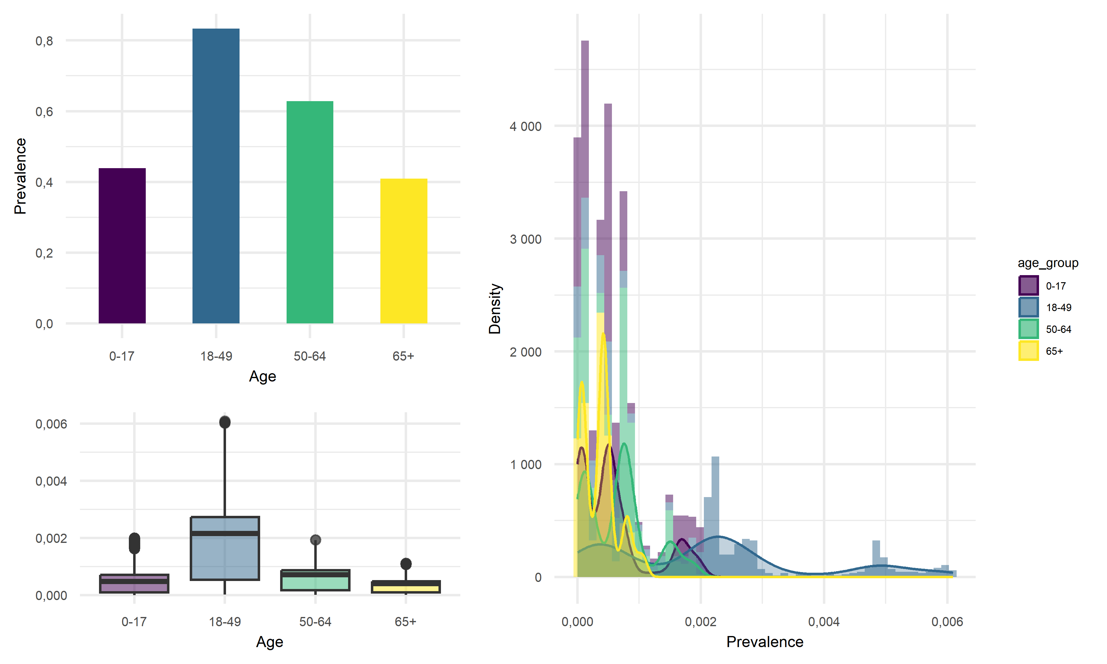
Across four age groups in California, people of 18-49 years old tend to have the highest average prevalence of above 80%, whereas children of 0-17 years old and elderly of 65+ years old tend to have roughly the same lowest average prevalence of around 40%. Thus, we would like to suggest that the young and middle-aged people are more likely to be infected with COVID, and children and the elderly are less likely to acquire infection.
Prevalence vs Gender
point <- format_format(big.mark = " ", decimal.mark = ",", scientific = FALSE)
grid.arrange(

    gender %>%
    group_by(gender) %>%
    summarise(prevalence = sum(total_cases)/(mean(percent_of_ca_population)*38066920)) %>%  # California total population = 38066920
    ggplot(aes(x = gender, y = prevalence, fill = gender)) +
    geom_bar(stat = "identity", width = 0.5) +
    scale_fill_viridis(discrete = TRUE) +
    theme(
      legend.position = "none"
    ) +
    xlab("Gender") +
    ylab("Prevalence") +
    theme(legend.title = element_text(size = 5),
          legend.key.size = unit(0.3, 'cm'),
          legend.text = element_text(size = 4)) +
    theme(
          axis.title.x = element_text(size = 6),
          axis.text.x = element_text(size = 5),
          axis.title.y = element_text(size = 6),
          axis.text.y = element_text(size = 5)) +
    scale_y_continuous(labels = point),

    gender %>%
    mutate(prevalence = total_cases/(mean(percent_of_ca_population)*38066920)) %>%  # California total population = 38066920
    ggplot(aes(x = prevalence, fill = gender)) +
    geom_histogram(aes(y = ..density..), alpha = 0.5, bins = 30) +
    geom_density(alpha = 0.3, aes(color = gender)) +
    scale_color_viridis(discrete = TRUE) +
    labs(x = "Prevalence",
         y = "Density") +
    theme(legend.position = "right") +
    theme(legend.title = element_text(size = 5),
          legend.key.size = unit(0.3, 'cm'),
          legend.text = element_text(size = 4)) +
    theme(
          axis.title.x = element_text(size = 6),
          axis.text.x = element_text(size = 5),
          axis.title.y = element_text(size = 6),
          axis.text.y = element_text(size = 5)) +
    scale_x_continuous(labels = point) +
    scale_y_continuous(labels = point) +
    scale_fill_viridis(discrete = TRUE),


    gender %>%
    mutate(prevalence = total_cases/(mean(percent_of_ca_population)*38066920)) %>%  # California total population = 38066920
    ggplot(aes(x = gender, y = prevalence, fill = gender)) +
    geom_boxplot(alpha = 0.5) +
    geom_hline(yintercept = median(gender$prevalence, na.rm = T), color = "red", size = 0.4, lty = "dashed") +
    scale_fill_viridis(discrete = TRUE) +
    theme(
      legend.position = "none"
    ) +
    xlab("Gender") +
    ylab(" ") +
        theme(legend.title = element_text(size = 5),
          legend.key.size = unit(0.3, 'cm'),
          legend.text = element_text(size = 4)) +
    theme(axis.text.x = element_text(angle = 60, hjust = 1)) +
    theme(
          axis.title.x = element_text(size = 6),
          axis.text.x = element_text(size = 5),
          axis.title.y = element_text(size = 6),
          axis.text.y = element_text(size = 5)) +
          scale_y_continuous(labels = point),


layout_matrix = rbind(c(1, 1, 1, 2, 2, 2, 2),
                      c(1, 1, 1, 2, 2, 2, 2),
                      c(1, 1, 1, 2, 2, 2, 2),
                      c(3, 3, 3, 2, 2, 2, 2),
                      c(3, 3, 3, 2, 2, 2, 2)
))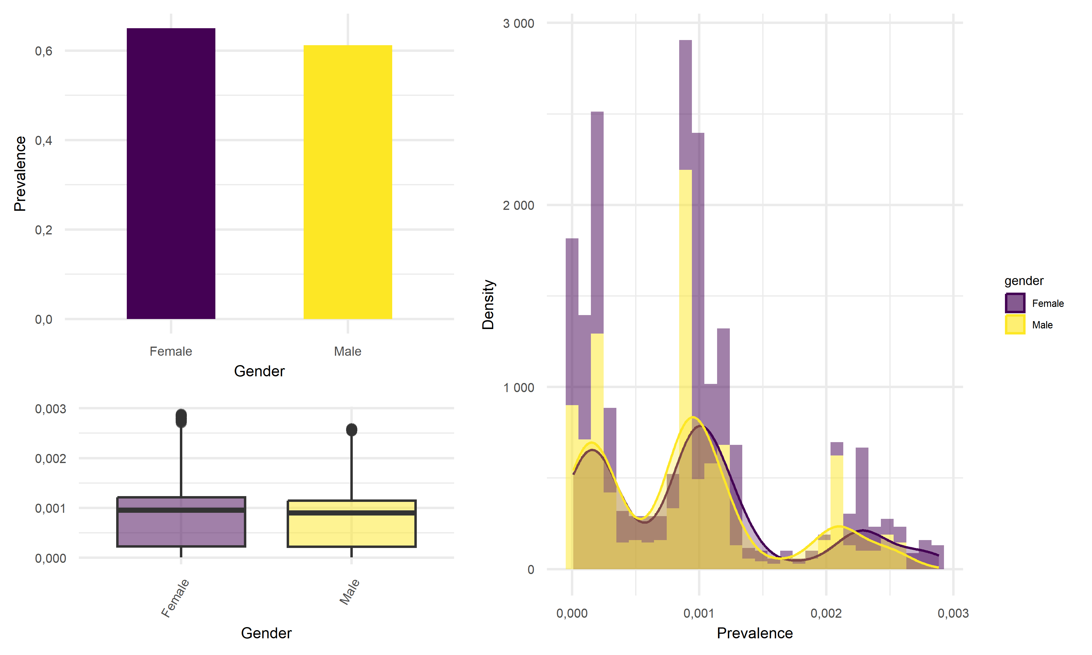
Based on above plots, the average prevalence for female tend to be 2% higher than that of male in California, which the difference in mean prevalence is very little. Thus, we would like to suggest that female are equally likely to infect with COVID as male in California.
Prevalence vs Race
point <- format_format(big.mark = " ", decimal.mark = ",", scientific = FALSE)
grid.arrange(

    race %>%
    group_by(race_group) %>%
    summarise(prevalence = sum(total_cases)/(mean(percent_of_ca_population)*38066920)) %>%  # California total population = 38066920
    mutate(race_group = recode(race_group, "American Indian or Alaska Native" = "Indian/Alaska",
           "Native Hawaiian and other Pacific Islander" = "Hawaiian/Islander")) %>%
    mutate(race_group = fct_reorder(race_group, prevalence)) %>%
    ggplot(aes(x = race_group, y = prevalence, fill = race_group)) +
    geom_bar(stat = "identity", width = 0.5) +
    scale_fill_viridis(discrete = TRUE) +
    theme(
      legend.position = "none"
    ) +
    xlab("Race") +
    ylab("Prevalence") +
    theme(legend.title = element_text(size = 5),
          legend.key.size = unit(0.3, 'cm'),
          legend.text = element_text(size = 4)) +
    theme(
          axis.title.x = element_text(size = 6),
          axis.text.x = element_text(size = 5),
          axis.title.y = element_text(size = 6),
          axis.text.y = element_text(size = 5)) +
    scale_y_continuous(labels = point),


    race %>%
    mutate(prevalence = total_cases/(mean(percent_of_ca_population)*38066920)) %>%  # California total population = 38066920
    mutate(race_group = recode(race_group, "American Indian or Alaska Native" = "Indian/Alaska",
           "Native Hawaiian and other Pacific Islander" = "Hawaiian/Islander")) %>%
    mutate(race_group = fct_reorder(race_group, prevalence)) %>%
    ggplot(aes(x = prevalence, fill = race_group)) +
    geom_histogram(aes(y = ..density..), alpha = 0.5, bins = 30) +
    geom_density(alpha = 0.1, aes(color = race_group)) +
    scale_color_viridis(discrete = TRUE) +
    labs(x = "Prevalence",
         y = "Density") +
    theme(legend.position = "right") +
    theme(legend.title = element_text(size = 5),
          legend.key.size = unit(0.3, 'cm'),
          legend.text = element_text(size = 4)) +
    theme(
          axis.title.x = element_text(size = 6),
          axis.text.x = element_text(size = 5),
          axis.title.y = element_text(size = 6),
          axis.text.y = element_text(size = 5)) +
          ylim(0, 5000) +
          xlim(0, 0.0035),


race %>%
    mutate(prevalence = total_cases/(mean(percent_of_ca_population)*38066920)) %>%  # California total population = 38066920
    mutate(race_group = fct_reorder(race_group, prevalence)) %>%
    mutate(race_group = recode(race_group, "American Indian or Alaska Native" = "Indian/Alaska",
           "Native Hawaiian and other Pacific Islander" = "Hawaiian/Islander")) %>%
    ggplot(aes(x = race_group, y = prevalence, fill = race_group)) +
    geom_boxplot(alpha = 0.5) +
    geom_hline(yintercept = median(race$prevalence, na.rm = T), color = "red", size = 0.4, lty = "dashed") +
    ylim(0, 30000) +
    scale_fill_viridis(discrete = TRUE) +
    theme(
      legend.position = "none"
    ) +
    xlab("Race") +
    ylab(" ") +
        theme(legend.title = element_text(size = 5),
          legend.key.size = unit(0.3, 'cm'),
          legend.text = element_text(size = 4)) +
    theme(
          axis.title.x = element_text(size = 6),
          axis.text.x = element_text(size = 5),
          axis.title.y = element_text(size = 6),
          axis.text.y = element_text(size = 5)) +
          scale_y_continuous(labels = point),


layout_matrix = rbind(c(1, 1, 1, 2, 2, 2, 2),
                      c(1, 1, 1, 2, 2, 2, 2),
                      c(1, 1, 1, 2, 2, 2, 2),
                      c(3, 3, 3, 2, 2, 2, 2),
                      c(3, 3, 3, 2, 2, 2, 2)
))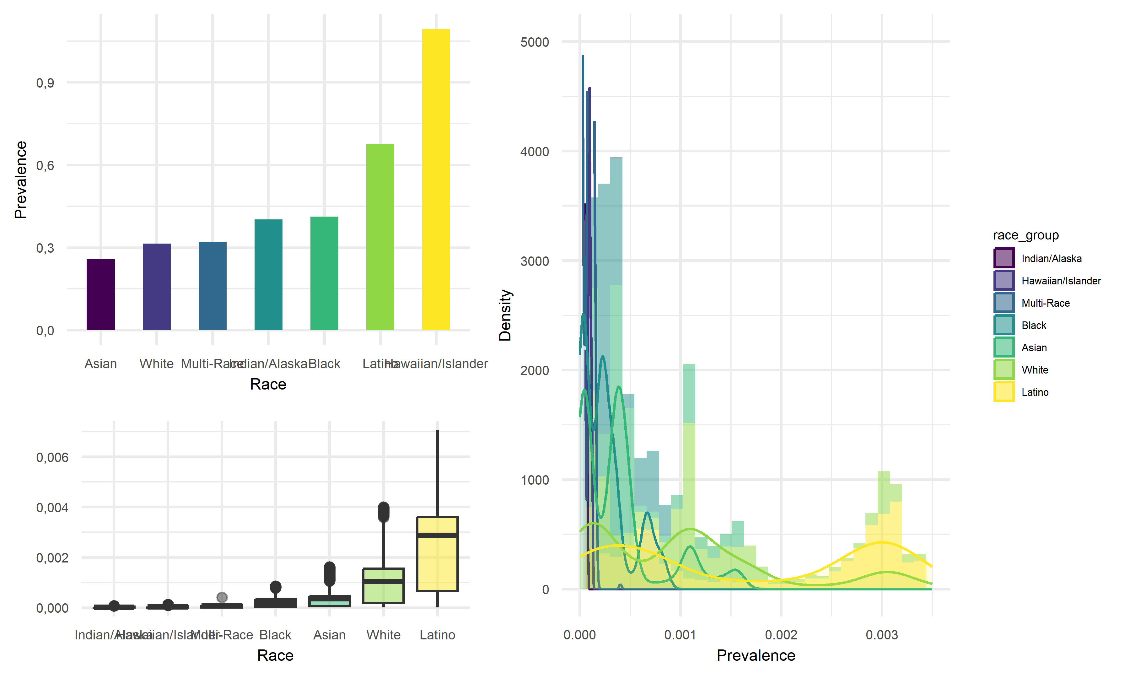
Across seven race groups in California, Indian/Alaska subgroup tend to have the lowest average prevalence of 25.7%, whereas the Hawaiian/Islander subgroup tend to have highest average prevalence with above 1. As for the value above 1, it should be an error data as prevalence should be within the range of 0 to 1, and it may due to the repeated data entry or the reinfection of COVID, or this mean value is heavily influenced by the extreme data. By double-checking with the box-plot and median values, Latino should be considered as the race group with highest prevalence instead. Thus, we would like to suggest that Latino people are more likely to be infected with COVID, and Indian/Alaska people are less likely to acquire infection.
Death Rate by demographics
In the second section, we would like to discuss the death rates among different demographic subgroups.
Death Rate vs Age
point <- format_format(big.mark = " ", decimal.mark = ",", scientific = FALSE)
grid.arrange(

    age %>%
    group_by(age_group) %>%
    summarize(percent_deaths = mean(percent_deaths)/100) %>%
    ggplot(aes(x = age_group, y = percent_deaths, fill = age_group)) +
    geom_bar(stat = "identity", width = 0.5) +
    scale_fill_viridis(discrete = TRUE) +
    theme(
      legend.position = "none"
    ) +
    xlab("Age") +
    ylab("Death Rate") +
    theme(legend.title = element_text(size = 5),
          legend.key.size = unit(0.3, 'cm'),
          legend.text = element_text(size = 4)) +
    theme(
          axis.title.x = element_text(size = 6),
          axis.text.x = element_text(size = 5),
          axis.title.y = element_text(size = 6),
          axis.text.y = element_text(size = 5)) +
          scale_y_continuous(labels = point),


    age %>%
    ggplot(aes(x = percent_deaths, fill = age_group)) +
    geom_histogram(aes(y = ..density..), alpha = 0.5, bins = 50) +
    geom_density(alpha = 0.3, aes(color = age_group)) +
    scale_color_viridis(discrete = TRUE) +
    labs(x = "Death Rtae",
         y = "Density") +
    theme(legend.position = "right") +
    theme(legend.title = element_text(size = 5),
          legend.key.size = unit(0.3, 'cm'),
          legend.text = element_text(size = 4)) +
    theme(
          axis.title.x = element_text(size = 6),
          axis.text.x = element_text(size = 5),
          axis.title.y = element_text(size = 6),
          axis.text.y = element_text(size = 5)) +
    scale_x_continuous(labels = point) +
    scale_y_continuous(labels = point) +
        ylim(0, 0.75),


    age %>%
    ggplot(aes(x = age_group, y = percent_deaths, fill = age_group)) +
    geom_boxplot(alpha = 0.5) +
    scale_fill_viridis(discrete = TRUE) +
    theme(
      legend.position = "none"
    ) +
    xlab("Age") +
    ylab("Death Rate") +
        theme(legend.title = element_text(size = 5),
          legend.key.size = unit(0.3, 'cm'),
          legend.text = element_text(size = 4)) +
    theme(axis.title.x = element_text(size = 6),
          axis.text.x = element_text(size = 5),
          axis.title.y = element_text(size = 6),
          axis.text.y = element_text(size = 5)) +
          scale_y_continuous(labels = point),


layout_matrix = rbind(c(1, 1, 1, 2, 2, 2, 2),
                      c(1, 1, 1, 2, 2, 2, 2),
                      c(1, 1, 1, 2, 2, 2, 2),
                      c(3, 3, 3, 2, 2, 2, 2),
                      c(3, 3, 3, 2, 2, 2, 2)
))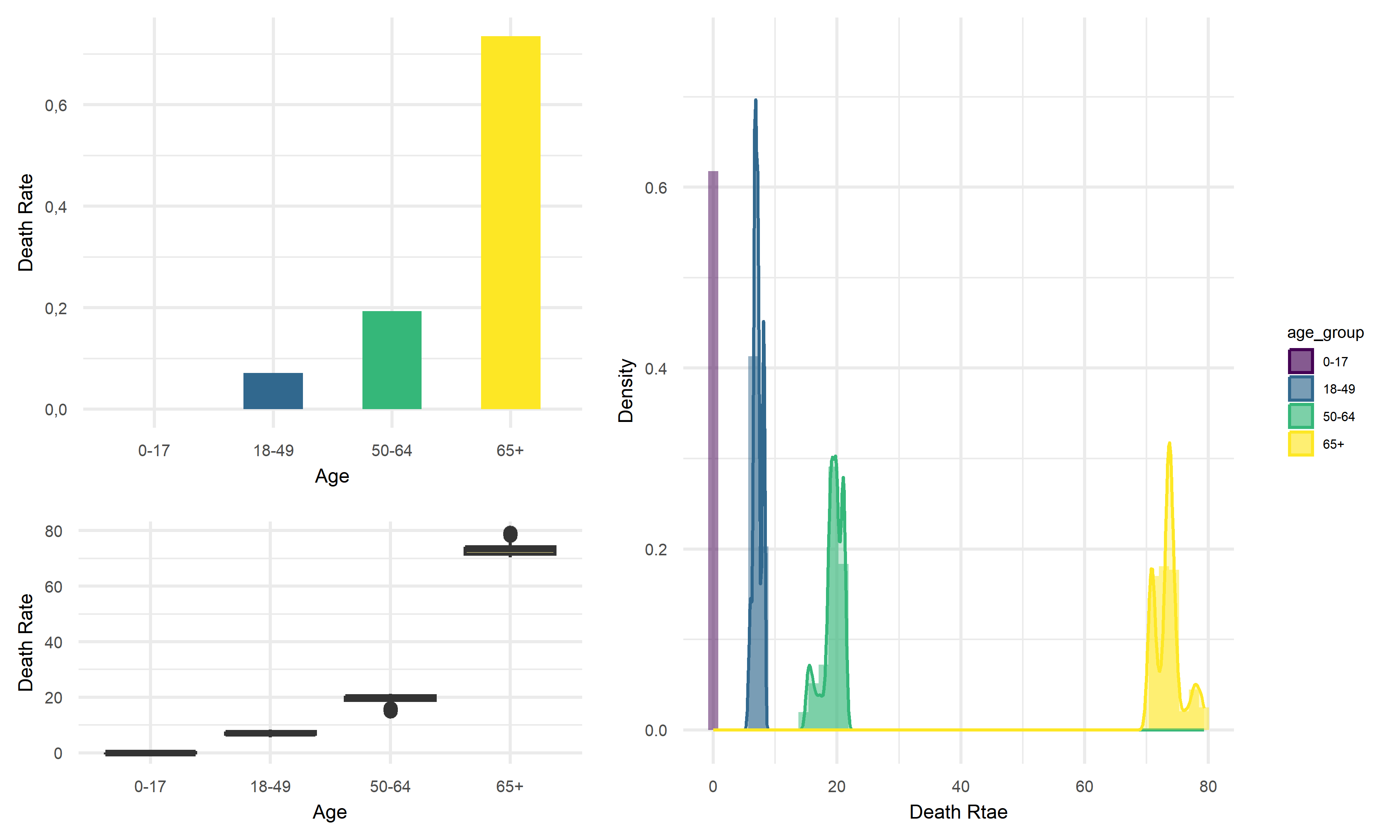
Across four age groups in California, people of 65+ years old tend to have the highest average death rate of above 70%, whereas children of 0-17 years old tend to have nearly zero average death rate. Thus, we would like to suggest that children are at very low risk of death from infection, and the elderly are more likely to die from COVID.
Death Rate vs Gender
point <- format_format(big.mark = " ", decimal.mark = ",", scientific = FALSE)
grid.arrange(
gender %>%
group_by(gender) %>%
summarize(percent_deaths = mean(percent_deaths)/100) %>%
ggplot(aes(x = gender, y = percent_deaths, fill = gender)) +
geom_bar(stat = "identity", width = 0.5) +
scale_fill_viridis(discrete = TRUE) +
theme(
legend.position = "none"
) +
xlab("Gender") +
ylab("Death Rate") +
theme(legend.title = element_text(size = 5),
legend.key.size = unit(0.3, 'cm'),
legend.text = element_text(size = 4)) +
theme(
axis.title.x = element_text(size = 6),
axis.text.x = element_text(size = 5),
axis.title.y = element_text(size = 6),
axis.text.y = element_text(size = 5)) +
scale_y_continuous(labels = point),
gender %>%
ggplot(aes(x = percent_deaths, fill = gender)) +
geom_histogram(aes(y = ..density..), alpha = 0.5, bins = 30) +
geom_density(alpha = 0.3, aes(color = gender)) +
scale_color_viridis(discrete = TRUE) +
labs(x = "Death Rate",
y = "Density") +
theme(legend.position = "right") +
theme(legend.title = element_text(size = 5),
legend.key.size = unit(0.3, 'cm'),
legend.text = element_text(size = 4)) +
theme(
axis.title.x = element_text(size = 6),
axis.text.x = element_text(size = 5),
axis.title.y = element_text(size = 6),
axis.text.y = element_text(size = 5)) +
scale_x_continuous(labels = point) +
scale_y_continuous(labels = point) +
scale_fill_viridis(discrete = TRUE),
gender %>%
ggplot(aes(x = gender, y = percent_deaths, fill = gender)) +
geom_boxplot(alpha = 0.5) +
scale_fill_viridis(discrete = TRUE) +
theme(
legend.position = "none"
) +
xlab("Gender") +
ylab("Death Rate") +
theme(legend.title = element_text(size = 5),
legend.key.size = unit(0.3, 'cm'),
legend.text = element_text(size = 4)) +
theme(
axis.title.x = element_text(size = 6),
axis.text.x = element_text(size = 5),
axis.title.y = element_text(size = 6),
axis.text.y = element_text(size = 5)) +
scale_y_continuous(labels = point),
layout_matrix = rbind(c(1, 1, 1, 2, 2, 2, 2),
c(1, 1, 1, 2, 2, 2, 2),
c(1, 1, 1, 2, 2, 2, 2),
c(3, 3, 3, 2, 2, 2, 2),
c(3, 3, 3, 2, 2, 2, 2)
))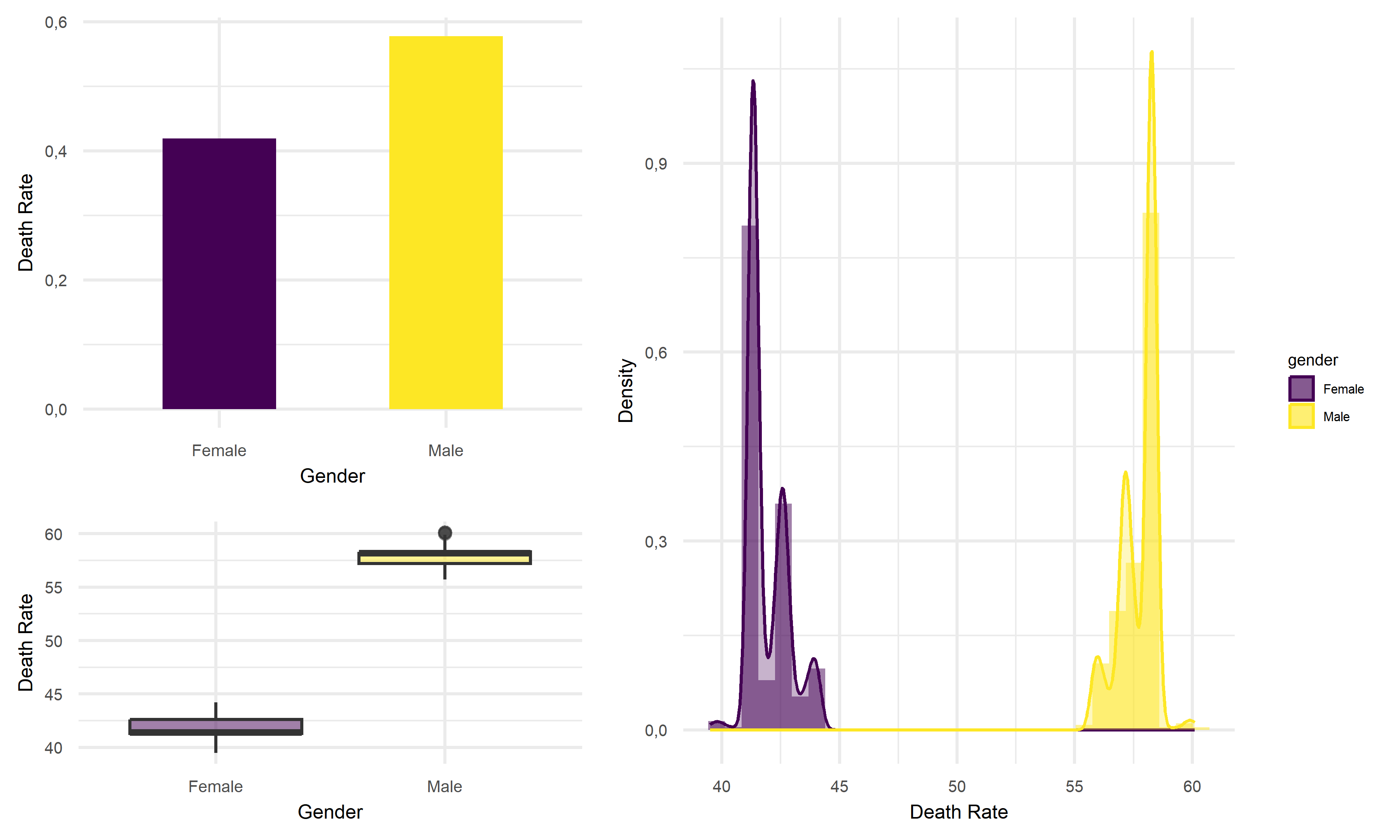 Based on above plots, the average death rate for male tend to 10% higher
than that of female in California, which the difference in mean death
rate is worth to be noticed. Thus, we would like to suggest that female
are less likely to face the death risk from infection with COVID in
California.
Based on above plots, the average death rate for male tend to 10% higher
than that of female in California, which the difference in mean death
rate is worth to be noticed. Thus, we would like to suggest that female
are less likely to face the death risk from infection with COVID in
California.
Death Rate vs Race
point <- format_format(big.mark = " ", decimal.mark = ",", scientific = FALSE)
grid.arrange(

    race %>%
    group_by(race_group) %>%
    summarise(percent_deaths = mean(percent_deaths)/100) %>%
    mutate(race_group = recode(race_group, "American Indian or Alaska Native" = "Indian/Alaska",
           "Native Hawaiian and other Pacific Islander" = "Hawaiian/Islander")) %>%
    mutate(race_group = fct_reorder(race_group, percent_deaths)) %>%
    ggplot(aes(x = race_group, y = percent_deaths, fill = race_group)) +
    geom_bar(stat = "identity", width = 0.5) +
    scale_fill_viridis(discrete = TRUE) +
    theme(
      legend.position = "none"
    ) +
    xlab("Race") +
    ylab("Death Rate") +
    theme(legend.title = element_text(size = 5),
          legend.key.size = unit(0.3, 'cm'),
          legend.text = element_text(size = 4)) +
    theme(
          axis.title.x = element_text(size = 6),
          axis.text.x = element_text(size = 5),
          axis.title.y = element_text(size = 6),
          axis.text.y = element_text(size = 5)) +
    theme(axis.text.x = element_text(angle = 60, hjust = 1)),


    race %>%
    mutate(race_group = recode(race_group, "American Indian or Alaska Native" = "Indian/Alaska",
           "Native Hawaiian and other Pacific Islander" = "Hawaiian/Islander")) %>%
    mutate(race_group = fct_reorder(race_group, percent_deaths)) %>%
    ggplot(aes(x = percent_deaths, fill = race_group)) +
    geom_histogram(aes(y = ..density..), alpha = 0.5, bins = 30) +
    geom_density(alpha = 0.1, aes(color = race_group)) +
    scale_color_viridis(discrete = TRUE) +
    labs(x = "Death Rate",
         y = "Density") +
    theme(legend.position = "right") +
    theme(legend.title = element_text(size = 5),
          legend.key.size = unit(0.3, 'cm'),
          legend.text = element_text(size = 4)) +
    theme(
          axis.title.x = element_text(size = 6),
          axis.text.x = element_text(size = 5),
          axis.title.y = element_text(size = 6),
          axis.text.y = element_text(size = 5)) +
          ylim(0, 2),


race %>%
    mutate(race_group = fct_reorder(race_group, percent_deaths)) %>%
    mutate(race_group = recode(race_group, "American Indian or Alaska Native" = "Indian/Alaska",
           "Native Hawaiian and other Pacific Islander" = "Hawaiian/Islander")) %>%
    ggplot(aes(x = race_group, y = percent_deaths, fill = race_group, color = "transparent")) +
    geom_boxplot(alpha = 0.5) +
    scale_fill_viridis(discrete = TRUE) +
    theme(
      legend.position = "none"
    ) +
    xlab("Race") +
    ylab("Death Rate") +
        theme(legend.title = element_text(size = 5),
          legend.key.size = unit(0.3, 'cm'),
          legend.text = element_text(size = 4)) +
    theme(
          axis.title.x = element_text(size = 6),
          axis.text.x = element_text(size = 5),
          axis.title.y = element_text(size = 6),
          axis.text.y = element_text(size = 5)) +
          scale_y_continuous(labels = point) +
    theme(axis.text.x = element_text(angle = 60, hjust = 1)),


layout_matrix = rbind(c(1, 1, 1, 2, 2, 2, 2),
                      c(1, 1, 1, 2, 2, 2, 2),
                      c(1, 1, 1, 2, 2, 2, 2),
                      c(3, 3, 3, 2, 2, 2, 2),
                      c(3, 3, 3, 2, 2, 2, 2)
))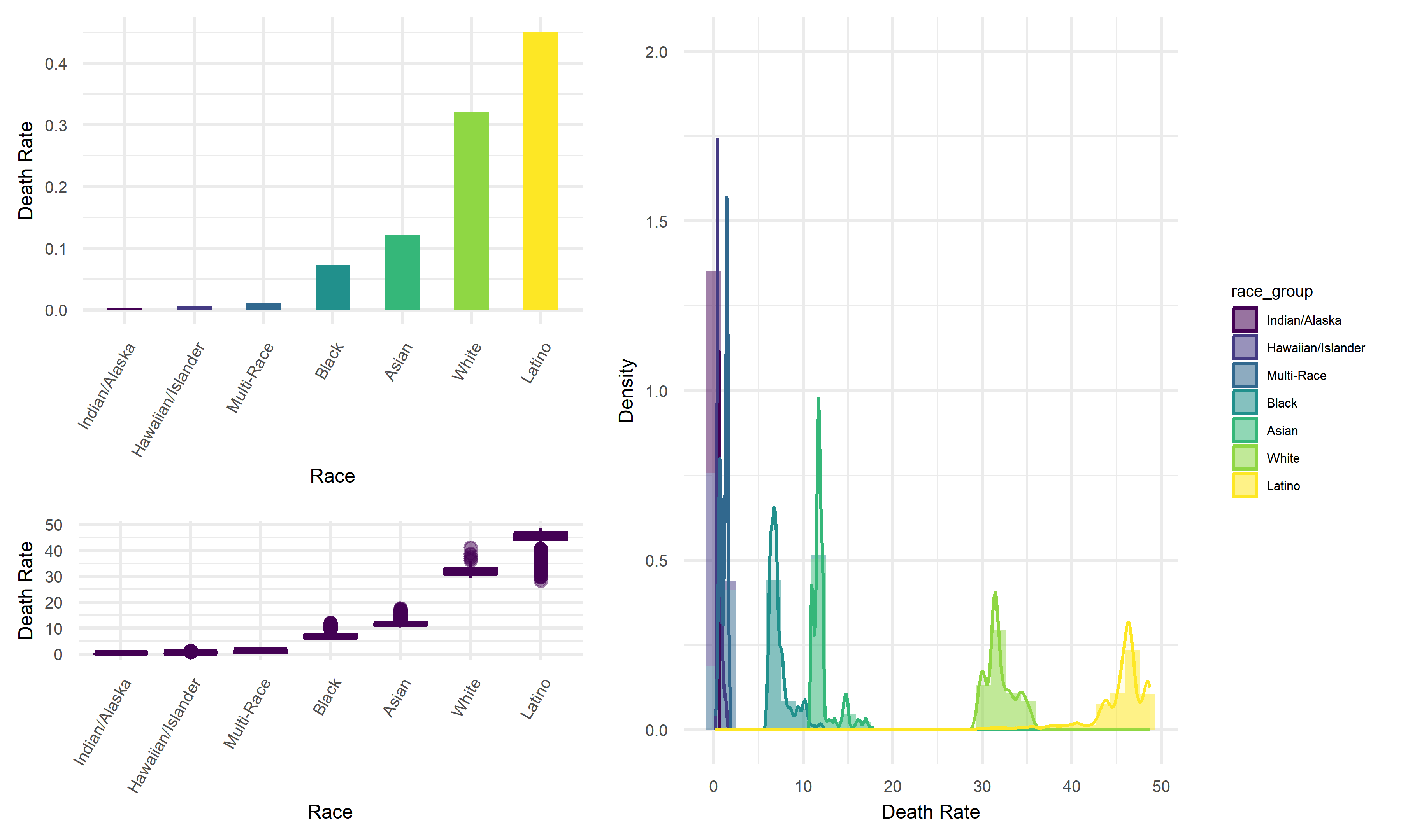
Across seven race groups in California, Indian/Alaska subgroup tend to have the lowest average death rate, whereas Latino subgroup tend to have highest average death. Thus, we would like to suggest that latino people are more likely to die from COVID, and Indian/Alaska people are less likely to face this death risk.
Daily growth rate of cases by demographics
In the last section, we would like to discuss the daily growth rates in the total number of infection cases among different demographic subgroups.
Daily growth rate of total cases by age
age_17 =
  age %>%
  filter(age_group == "0-17") %>%
  arrange(date) %>%
  mutate(lag = lag(total_cases)) %>%
  mutate(growth_perc = (((total_cases - lag) / total_cases)) * 100) %>%
  select(date, age_group, growth_perc)


age_49 =
  age %>%
  filter(age_group == "18-49") %>%
  arrange(date) %>%
  mutate(lag = lag(total_cases)) %>%
  mutate(growth_perc = (((total_cases - lag) / total_cases)) * 100) %>%
  select(date, age_group, growth_perc)


age_64 =
  age %>%
  filter(age_group == "50-64") %>%
  arrange(date) %>%
  mutate(lag = lag(total_cases)) %>%
  mutate(growth_perc = (((total_cases - lag) / total_cases)) * 100) %>%
  select(date, age_group, growth_perc)


age_65 =
  age %>%
  filter(age_group == "65+") %>%
  arrange(date) %>%
  mutate(lag = lag(total_cases)) %>%
  mutate(growth_perc = (((total_cases - lag) / total_cases)) * 100) %>%
  select(date, age_group, growth_perc)


age_all =
    rbind(age_17, age_49, age_64, age_65) %>%
    filter(date != "2020-04-22")
age_all_1 =
rbind(age_17, age_49, age_64, age_65) %>%
arrange(growth_perc) %>%
select(date, age_group, growth_perc) %>%
filter(date != "2020-12-23")
age_all_2 =
cbind(age_all, age_all_1)
head(age_all_2) %>%
knitr::kable(
caption = "Highest & Lowest Total Cases Growth Rate by Age",
col.names = c("Date", "Age", "Growth rate", "Date", "Age", "Growth rate"),
digits = 2
)| Date | Age | Growth rate | Date | Age | Growth rate |
|---|---|---|---|---|---|
| 2020-04-23 | 0-17 | 8.65 | 2021-06-29 | 65+ | -0.17 |
| 2020-04-24 | 0-17 | 7.42 | 2021-06-29 | 50-64 | -0.13 |
| 2020-04-25 | 0-17 | 2.69 | 2021-06-29 | 18-49 | -0.11 |
| 2020-04-26 | 0-17 | 4.24 | 2021-06-29 | 0-17 | -0.10 |
| 2020-04-27 | 0-17 | 8.82 | 2021-04-23 | 65+ | -0.01 |
| 2020-04-28 | 0-17 | 5.78 | 2020-12-30 | 0-17 | 0.00 |
Generally, we find that the young people aged of 0-17 experiences the top 6 daily increase in the infection cases of above 5 times the prior day volumn in April. However, the elder people aged from 50 to 65+ have the lowest and negative growth rate in number of daily cases. Put it specifically, the number of daily new cases among people from age group of 50-64 and 65+ even decreases slightly by 17% at the end of June. Based on this preliminary observation, younger people tend to have higher daily increase in the infection case number, which suggests that the young are more vulnerable in the face of COVID attack. This finding looks reasonable to us as it may be attributed to the more active in-person interactions, weaker immune system, wider physical activity range, and etc. among the teenagers.
Daily growth rate of total cases by gender
gender_M =
  gender %>%
  filter(gender == "Male") %>%
  arrange(date) %>%
  mutate(lag = lag(total_cases)) %>%
  mutate(growth_perc = (((total_cases - lag) / total_cases)) * 100) %>%
    select(date, gender, growth_perc)

gender_F =
  gender %>%
  filter(gender == "Female") %>%
  arrange(date) %>%
  mutate(lag = lag(total_cases)) %>%
  mutate(growth_perc = (((total_cases - lag) / total_cases)) * 100) %>%
  select(date, gender, growth_perc)

gender_all =
    rbind(gender_M, gender_F) %>%
    arrange(desc(growth_perc)) %>%
    select(date, gender, growth_perc)
gender_all_1 =
    rbind(gender_M, gender_F) %>%
    arrange(growth_perc) %>%
    select(date, gender, growth_perc)

gender_all_2 =
    cbind(gender_all, gender_all_1)
head(gender_all_2) %>%
    knitr::kable(
    caption = "Highest & Lowest Total Cases Growth Rate by Gender",
    col.names = c("Date", "Gender", "Growth rate", "Date", "Gender", "Growth rate"),
    digits = 2
)| Date | Gender | Growth rate | Date | Gender | Growth rate |
|---|---|---|---|---|---|
| 2020-04-29 | Male | 5.44 | 2021-06-29 | Male | -0.12 |
| 2022-01-09 | Female | 5.31 | 2021-06-29 | Female | -0.11 |
| 2020-04-23 | Female | 5.15 | 2020-12-23 | Male | 0.00 |
| 2020-04-24 | Female | 4.91 | 2020-12-30 | Male | 0.00 |
| 2022-01-09 | Male | 4.89 | 2020-12-23 | Female | 0.00 |
| 2022-01-16 | Female | 4.80 | 2020-12-30 | Female | 0.00 |
Among the highest and lowest case growth rate by gender, both male and female subgroups show almost equal appearances with very closed rate values in our summary tables. This observation suggests that the daily growth rate of infection cases at the extreme ends does not differentiate much by gender.
Daily growth rate of total cases by race
race_ia =
    race %>%
    mutate(race_group = fct_reorder(race_group, total_cases)) %>%
    mutate(race_group = recode(race_group, "American Indian or Alaska Native" = "Indian/Alaska",
           "Native Hawaiian and other Pacific Islander" = "Hawaiian/Islander")) %>%
    filter(race_group == "Indian/Alaska") %>%
    arrange(date) %>%
    mutate(lag = lag(total_cases)) %>%
    mutate(growth_perc = (((total_cases - lag) / total_cases)) * 100)
race_asian =
    race %>%
    mutate(race_group = fct_reorder(race_group, total_cases)) %>%
    mutate(race_group = recode(race_group, "American Indian or Alaska Native" = "Indian/Alaska",
           "Native Hawaiian and other Pacific Islander" = "Hawaiian/Islander")) %>%
    filter(race_group == "Asian") %>%
    arrange(date) %>%
    mutate(lag = lag(total_cases)) %>%
    mutate(growth_perc = (((total_cases - lag) / total_cases)) * 100)
race_black =
    race %>%
    mutate(race_group = fct_reorder(race_group, total_cases)) %>%
    mutate(race_group = recode(race_group, "American Indian or Alaska Native" = "Indian/Alaska",
           "Native Hawaiian and other Pacific Islander" = "Hawaiian/Islander")) %>%
    filter(race_group == "Black") %>%
    arrange(date) %>%
    mutate(lag = lag(total_cases)) %>%
    mutate(growth_perc = (((total_cases - lag) / total_cases)) * 100)
race_latino =
    race %>%
    mutate(race_group = fct_reorder(race_group, total_cases)) %>%
    mutate(race_group = recode(race_group, "American Indian or Alaska Native" = "Indian/Alaska",
           "Native Hawaiian and other Pacific Islander" = "Hawaiian/Islander")) %>%
    filter(race_group == "Latino") %>%
    arrange(date) %>%
    mutate(lag = lag(total_cases)) %>%
    mutate(growth_perc = (((total_cases - lag) / total_cases)) * 100)
race_multi =
    race %>%
    mutate(race_group = fct_reorder(race_group, total_cases)) %>%
    mutate(race_group = recode(race_group, "American Indian or Alaska Native" = "Indian/Alaska",
           "Native Hawaiian and other Pacific Islander" = "Hawaiian/Islander")) %>%
    filter(race_group == "Multi-Race") %>%
    arrange(date) %>%
    mutate(lag = lag(total_cases)) %>%
    mutate(growth_perc = (((total_cases - lag) / total_cases)) * 100)
race_hi =
    race %>%
    mutate(race_group = fct_reorder(race_group, total_cases)) %>%
    mutate(race_group = recode(race_group, "American Indian or Alaska Native" = "Indian/Alaska",
           "Native Hawaiian and other Pacific Islander" = "Hawaiian/Islander")) %>%
    filter(race_group == "Hawaiian/Islander") %>%
    arrange(date) %>%
    mutate(lag = lag(total_cases)) %>%
    mutate(growth_perc = (((total_cases - lag) / total_cases)) * 100)
race_white =
    race %>%
    mutate(race_group = fct_reorder(race_group, total_cases)) %>%
    mutate(race_group = recode(race_group, "American Indian or Alaska Native" = "Indian/Alaska",
           "Native Hawaiian and other Pacific Islander" = "Hawaiian/Islander")) %>%
    filter(race_group == "White") %>%
    arrange(date) %>%
    mutate(lag = lag(total_cases)) %>%
    mutate(growth_perc = (((total_cases - lag) / total_cases)) * 100)

race_all =
    rbind(race_ia, race_asian, race_black, race_latino, race_multi, race_hi) %>%
    arrange(desc(growth_perc)) %>%
    select(date, race_group, growth_perc)

race_all_1 =
    rbind(race_ia, race_asian, race_black, race_latino, race_multi, race_hi) %>%
    arrange(growth_perc) %>%
    select(date, race_group, growth_perc)

race_all_2 =
    cbind(race_all, race_all_1)
head(race_all_2) %>%
    knitr::kable(
    caption = "Highest & Lowest Total Cases Growth Rate by Race",
    col.names = c("Date", "Race", "Growth rate", "Date", "Race", "Growth rate"),
    digits = 2
)| Date | Race | Growth rate | Date | Race | Growth rate |
|---|---|---|---|---|---|
| 2022-10-25 | Multi-Race | 61.37 | 2020-04-21 | Multi-Race | -363.49 |
| 2020-04-20 | Multi-Race | 54.57 | 2022-11-01 | Multi-Race | -158.00 |
| 2020-04-21 | Indian/Alaska | 14.00 | 2020-04-30 | Indian/Alaska | -10.61 |
| 2020-04-14 | Multi-Race | 11.55 | 2021-04-30 | Indian/Alaska | -3.28 |
| 2020-04-28 | Indian/Alaska | 11.27 | 2020-04-15 | Indian/Alaska | -3.12 |
| 2020-04-14 | Latino | 10.73 | 2021-05-27 | Multi-Race | -2.17 |
The subgroup of Multi-race shows extremely high (~60 x in growth) and abnormally low (~ - 360x drop) growth rates in daily detective cases. The Indian/Alaska subgroup faces the similar problem as Multi-race group. This finding raises our attention to the disparities existed in pandemic responses across racial and ethnical subgroups. In other words, there is a great possibility that Multi-race and Indian/Alaska people may experience more vulnerable and unstable COVID protections.