Association Between Predictors and Outcomes
After exploring our outcomes geographically by county, as well as the
results on key demographic figures(age, gender, race), we proceeded with
next step to include all potential predictors and then determine which
predictors among our large data set, were significantly associated with
our outcome variables, prevalence and
death rate, at 5% significance level.
1. Correlation Matrix between predictors and outcomes
ca_model_comp_df %>%
    select(-county) %>%
GGally::ggpairs(upper = list(continuous = GGally::wrap("cor", size = 2))) +
          theme(legend.title = element_text(size = 5),
          legend.key.size = unit(0.3, 'cm'),
          legend.text = element_text(size = 4)) +
    theme(
          axis.title.x = element_text(size = 5),
          axis.text.x = element_text(size = 5),
          axis.title.y = element_text(size = 5),
          axis.text.y = element_text(size = 5)) +
          scale_y_continuous(labels = point)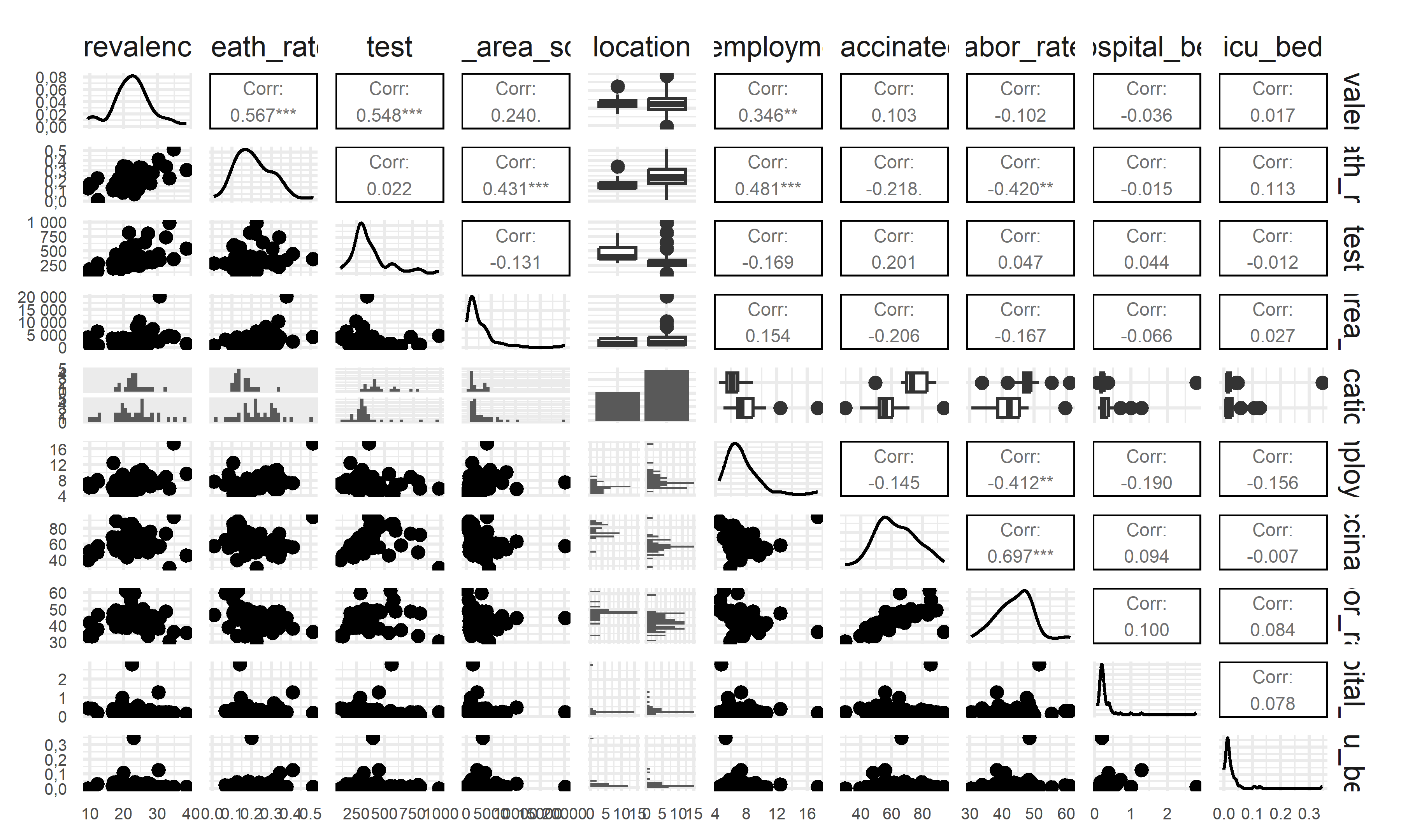
Associations between Predictors and Outcomes After exploring our
outcomes geographically by county, as well as the results on key
demographic figures(age, gender, race), we proceeded with next step to
include all potential predictors and then determine which predictors
among our large data set, were significantly associated with our outcome
variables, prevalence and death rate, at 5%
significance level.
This correlated matrix plot clearly illustrates the relationship between each variables and our possible outcomes. Besides, there is no abnormal multicollinearity indicating our data is reasonable for further regressions. Since the LS estimate and big likelihood function may be distorted by the variable with abnormally high correlation and lose the predictive ability and accuracy.
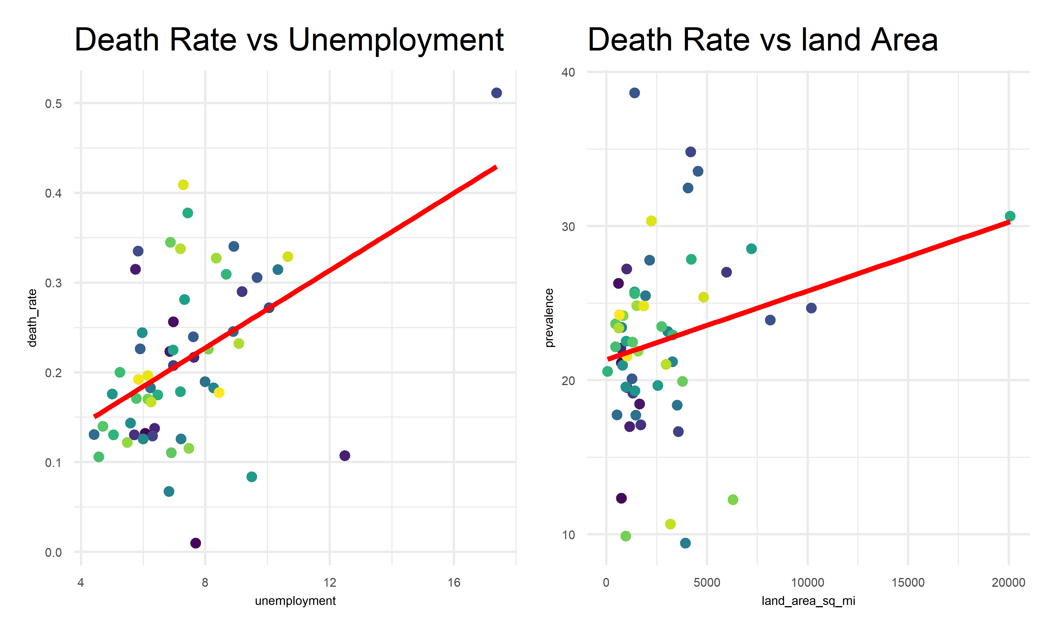
In the correlation matrix above, we find out that the correlates of worse outcomes: * Variables highly correlated with highest prevalence: unemployment % , test participation % * Variables highly correlated with highest death rates: unemployment %, land area
The following graphs explore the associations between the selected highly-correlated predictors and each outcome variables across county.
2. Association between prevalence and selected predictors
pre_best_1 =
    ca_model_comp_df %>%
    mutate(county = factor(county)) %>%
    ggplot(aes(x = test, y = prevalence, color = county)) +
    geom_point() +
    geom_smooth(formula = y ~ x, method = "lm", color = "red", se = F) +
    theme(
          axis.title.x = element_text(size = 5),
          axis.text.x = element_text(size = 5),
          axis.title.y = element_text(size = 5),
          axis.text.y = element_text(size = 5)) +
    theme(legend.position = "none") +
    labs(title = "Prevalence vs Test Participation")

pre_best_2 =
    ca_model_comp_df %>%
    mutate(county = factor(county)) %>%
    ggplot(aes(x = unemployment, y = prevalence, color = county)) +
    geom_point() +
    geom_smooth(formula = y ~ x, method = "lm", color = "red", se = F) +
    theme(
          axis.title.x = element_text(size = 5),
          axis.text.x = element_text(size = 5),
          axis.title.y = element_text(size = 5),
          axis.text.y = element_text(size = 5)) +
    theme(legend.position = "none") +
    labs(title = "Prevalence vs Test Unemployment")


pre_best_1 + pre_best_2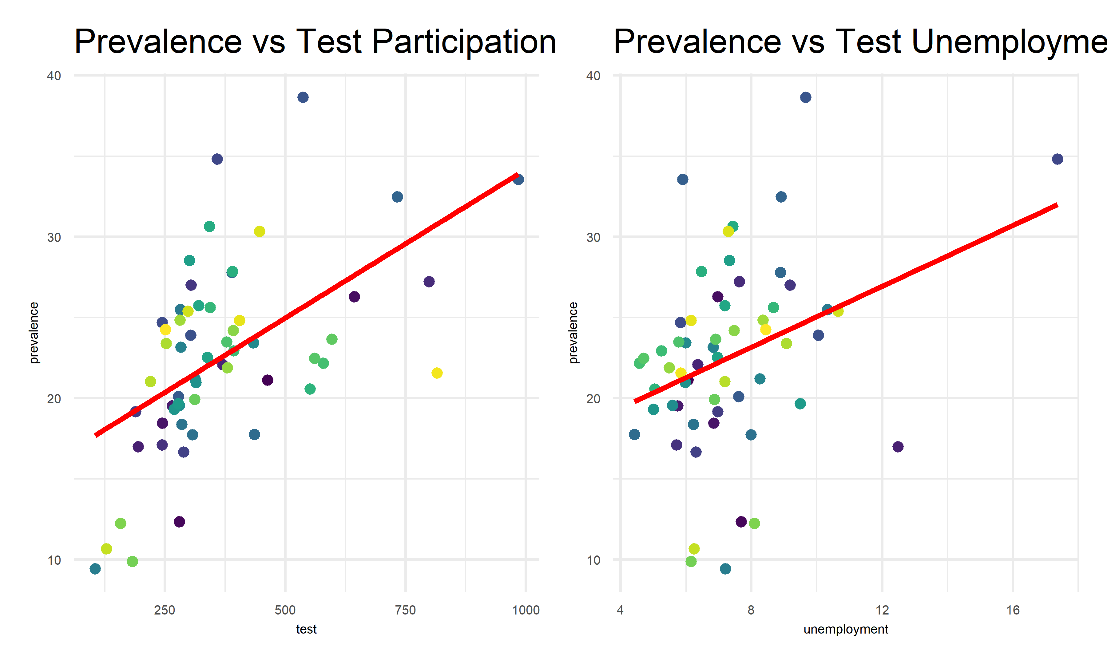
Association between death rate and selected predictors
pre_best_3 =
    ca_model_comp_df %>%
    mutate(county = factor(county)) %>%
    ggplot(aes(x = unemployment, y = death_rate, color = county)) +
    geom_point() +
    geom_smooth(formula = y ~ x, method = "lm", color = "red", se = F) +
    theme(
          axis.title.x = element_text(size = 5),
          axis.text.x = element_text(size = 5),
          axis.title.y = element_text(size = 5),
          axis.text.y = element_text(size = 5)) +
    theme(legend.position = "none") +
    labs(title = "Death Rate vs Unemployment")

pre_best_4 =
    ca_model_comp_df %>%
    mutate(county = factor(county)) %>%
    ggplot(aes(x = land_area_sq_mi, y = prevalence, color = county)) +
    geom_point() +
    geom_smooth(formula = y ~ x, method = "lm", color = "red", se = F) +
    theme(
          axis.title.x = element_text(size = 5),
          axis.text.x = element_text(size = 5),
          axis.title.y = element_text(size = 5),
          axis.text.y = element_text(size = 5)) +
    theme(legend.position = "none") +
    labs(title = "Death Rate vs land Area")


pre_best_3 + pre_best_4